
SaaS Pricing Page: 3 Top Examples to Boost Conversions

par
Wiktoria Slowikowska
16 sept. 2024
Identifiez et convertissez vos utilisateurs les plus importants

Créer un compte
Your pricing page isn't just a list of numbers – it's a powerful conversion tool that can make or break your sales. Let's dive into the best practices that can transform your pricing page from a mere information source to a customer-converting powerhouse.
Transparency is Key
Gone are the days of "Contact us for pricing" (unless you're exclusively in the enterprise game). Today's savvy customers want clarity from the get-go. Be upfront about your prices and any additional fees. Remember, surprises are great for birthdays, not so much for billing.
But transparency goes beyond just showing numbers. It's about clearly communicating the value your customers will receive. Your pricing page should scream, "This is how we're going to make your life easier!" For each plan, highlight the key benefits and how they align with different customer needs. It's not just about features; it's about painting a picture of a brighter, more efficient future.
The Power of Choice (But Not Too Much)
Think of your pricing tiers as a "good, better, best" buffet. Offer a range of options to cater to different needs and budgets. The key is to create a clear progression in value as the price increases. You want your customers thinking, "Well, for just a bit more, I could get all these extra goodies!"
To make this comparison easy, create a scannable feature comparison table. Pro tip: use check marks or simple icons instead of text where possible. Your goal is to make it so clear and simple.
Be wary of decision fatigue. Too many options can paralyze potential customers. Help them out by highlighting a recommended or most popular plan. This will simplify the decision-making process.
Build Trust and Reduce Friction
Trust is the currency of the digital age, and your pricing page is the perfect place to showcase it. Sprinkle some client logos or glowing testimonials throughout.
Another trust-builder? Offering a free trial or freemium option. Let's face it – commitment can be scary. Ease your customers into a relationship with your product by letting them experience the value firsthand. They'll be more likely to upgrade once they've had a taste of what you offer.
Clarify with Comparisons and FAQs
When it comes to helping customers choose the right plan, nothing beats a clear feature comparison. Create an easy-to-scan table that shows exactly what's included in each tier. This visual aid can be a game-changer, allowing potential customers to quickly see the value progression across your offerings.
But don't stop there. An often-overlooked hero of the pricing page is the humble FAQ section. This powerhouse can address common concerns before they become roadblocks to purchase.
From "Can I change my plan later?" to "What happens after my free trial?", a well-crafted FAQ anticipates and answers the questions swimming in your prospects' minds.
Social Proof: Let Your Customers Do the Talking
Social proof is a powerful tool for your pricing page. Sprinkle customer logos, especially recognizable brands, throughout your page. It's a silent but powerful way of saying, "Look who trusts us!"
But don't stop at logos. Short, punchy testimonials can be conversion gold. A quote from a happy customer explaining how your product solved their problem can be the final push a prospect needs to click that "Buy Now" button. It's like word-of-mouth marketing, but on steroids.
This approach leverages the psychological principle of social proof, where people tend to follow the actions of others, especially in uncertain situations. By showcasing well-known customers and positive experiences, you're building trust and credibility with potential buyers, making them more likely to choose your product or service.
Call-to-Action: Make It Impossible to Ignore
Your CTA buttons should be so clear and enticing that customers can't help but click them. Use action-oriented language like "Start Your Free Trial" or "Upgrade Now" instead of the boring old "Submit." And please, make them stand out – this is no time for subtlety in design.
The Impact on Conversions
Now that we've covered the "what," let's talk about the "why." A well-designed pricing page does more than just list options – it guides customers towards the best choice for their needs. It's like being a GPS for their purchasing journey, saying, "In 100 feet, turn right towards the Enterprise plan."
Your pricing page also acts as a natural filter, helping to qualify leads. Those who stick around after seeing your prices are more likely to convert. It saves time for both you and your potential customers – no one likes to get to the checkout only to find out they're in the wrong store.
By reducing friction in the buying process, you're greasing the wheels of your sales machine. The easier you make it to say yes, the more likely customers are to do so. And don't forget about the upselling opportunities. Smart pricing page design can gently nudge customers towards higher-tier plans or additional services, increasing your average order value.
The Numbers Don't Lie
Let's talk results. Companies that optimize their pricing pages see significant improvements in conversion rates. For example, one SaaS company saw a 25% increase in conversions after redesigning their pricing page to highlight value propositions more clearly. Another reported a 310% increase in sign-ups after introducing a free trial option prominently on their pricing page.
The Impact of Optimized Pricing Pages
Your pricing page is more than just a list of features and dollar signs. It's a crucial touchpoint in your customer's journey, capable of turning browsing into buying. By implementing these best practices – focusing on transparency, clear value communication, smart design, and trust-building elements..
Remember, optimization is an ongoing process. Keep testing, tweaking, and refining your pricing page. Your future customers (and your bottom line) will thank you for it. With a well-optimized pricing page, you're not just informing visitors – you're persuading them, guiding them, and ultimately converting them into loyal customers. And in the SaaS world, that's what it's all about.
3 Top SaaS Pricing Page Examples & Analysis
Rows brings a fresh, user-friendly approach to spreadsheets, making data work easier and more intuitive for everyone. With its smart features and clean design, it takes the headache out of number crunching and helps teams collaborate more effectively.
Their pricing page is a standout example of clarity and user-focused design, and we'll explore its key elements to understand why it's so effective.
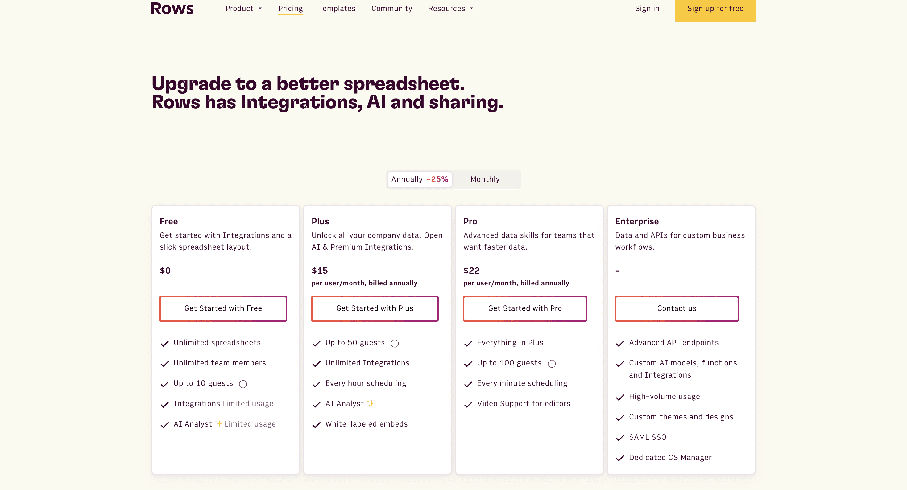
On the screenshot above we can see:
Transparent Pricing: Prices are clearly displayed for each tier, with the Enterprise option requiring contact for custom pricing. This transparency builds trust and helps users quickly determine if the product fits their budget, reducing friction in the decision-making process.
Clear Pricing Tiers: It offers four distinct tiers - Free, Plus, Pro, and Enterprise - catering to different user needs and budgets. This variety ensures that a wide range of potential customers can find a suitable option, maximizing the potential customer base.
Feature Comparison: Each tier lists key features, allowing users to easily compare offerings. This clear comparison helps users understand the value proposition of each tier and select the most appropriate plan for their needs, potentially driving upgrades to higher tiers.
Free Option: The inclusion of a free tier lowers the barrier to entry for new users. This allows potential customers to try the product without financial commitment, potentially leading to conversions to paid plans once they experience the value.
Annual Discount: There's a prominent -25% discount for annual billing, encouraging longer commitments. The annual billing option is highlighted with a distinct color, making it more attractive to users. This incentivizes longer-term commitments, improving customer retention and providing more stable revenue for the company.
Clear CTAs: Each tier has a distinct "Get Started" button, making it easy for users to take action. These buttons feature eye-catching pink borders, effortlessly drawing attention and guiding users towards making a selection. This clear path to action reduces hesitation and encourages immediate sign-ups, potentially increasing conversion rates.
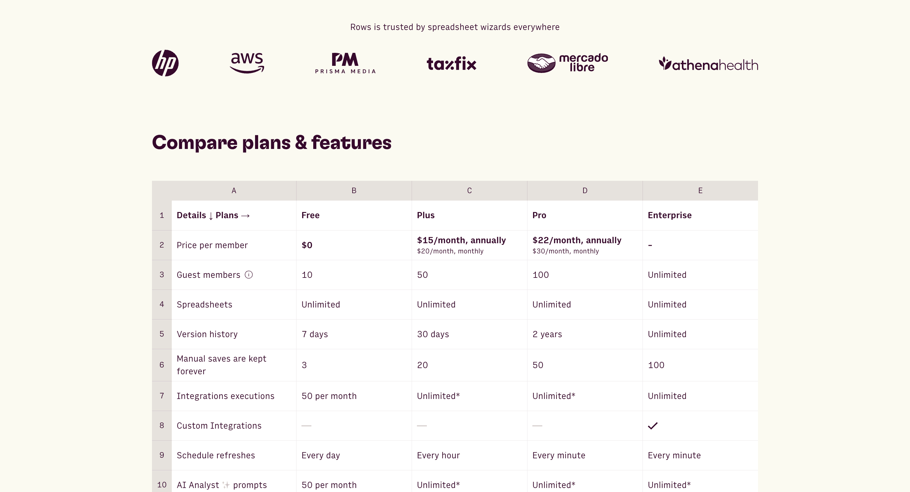
On another screenshot above we see Rows effectively using social proof and detailed feature comparisons:
Social Proof: The page showcases logos of well-known companies like HP and AWS, stating "Rows is trusted by spreadsheet wizards everywhere." This builds instant credibility and trust, potentially influencing potential customers' decisions.
Detailed Feature Comparison: As you scroll down, a comprehensive table compares all tiers side by side. This is valuable because:
It helps undecided users by providing in-depth information.
It clearly shows the value progression across tiers.
The table format makes it easy to compare specific features.
This combination of quick overview and detailed comparison caters to different decision-making styles, helping users feel confident in their choice and potentially increasing conversion rates.
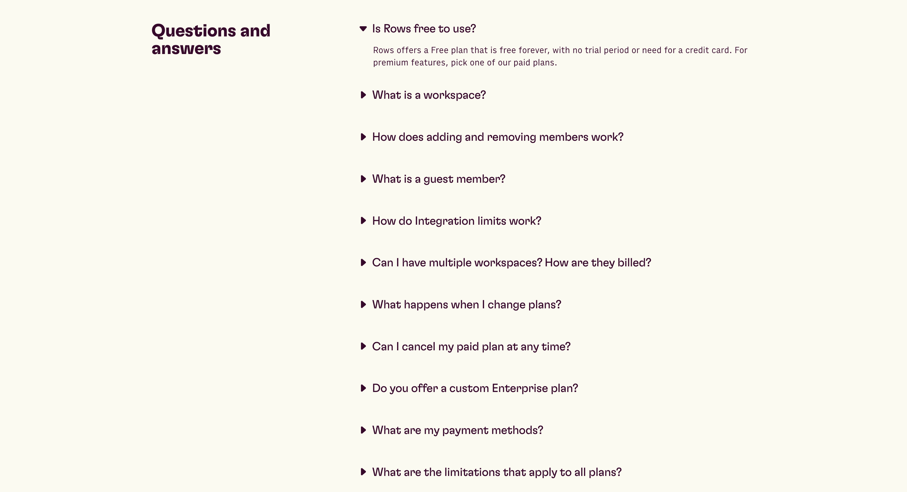
The final section of Rows' pricing page features a comprehensive FAQ (Frequently Asked Questions) section, which is a crucial element for several reasons:
Addresses common concerns: It proactively answers questions potential customers might have, reducing barriers to purchase.
Reduces support load: Many basic queries are answered here, potentially decreasing the volume of customer support inquiries.
Aids decision-making: By addressing concerns about topics like cancellation, plan changes, and limitations, it helps users make more informed decisions.
Improves user experience: Users can quickly find answers to their questions without leaving the pricing page, streamlining the decision-making process.
This FAQ section enhances the overall effectiveness of the pricing page by providing clarity and addressing potential objections, which can lead to higher conversion rates and more satisfied customers.
The next SaaS pricing page we will analyze is from enty.io Enty provides businesses with an all-in-one platform for managing back-office functions, such as accounting, payroll, and legal services. They focus on automating routine administrative tasks to help businesses streamline operations and ensure compliance.
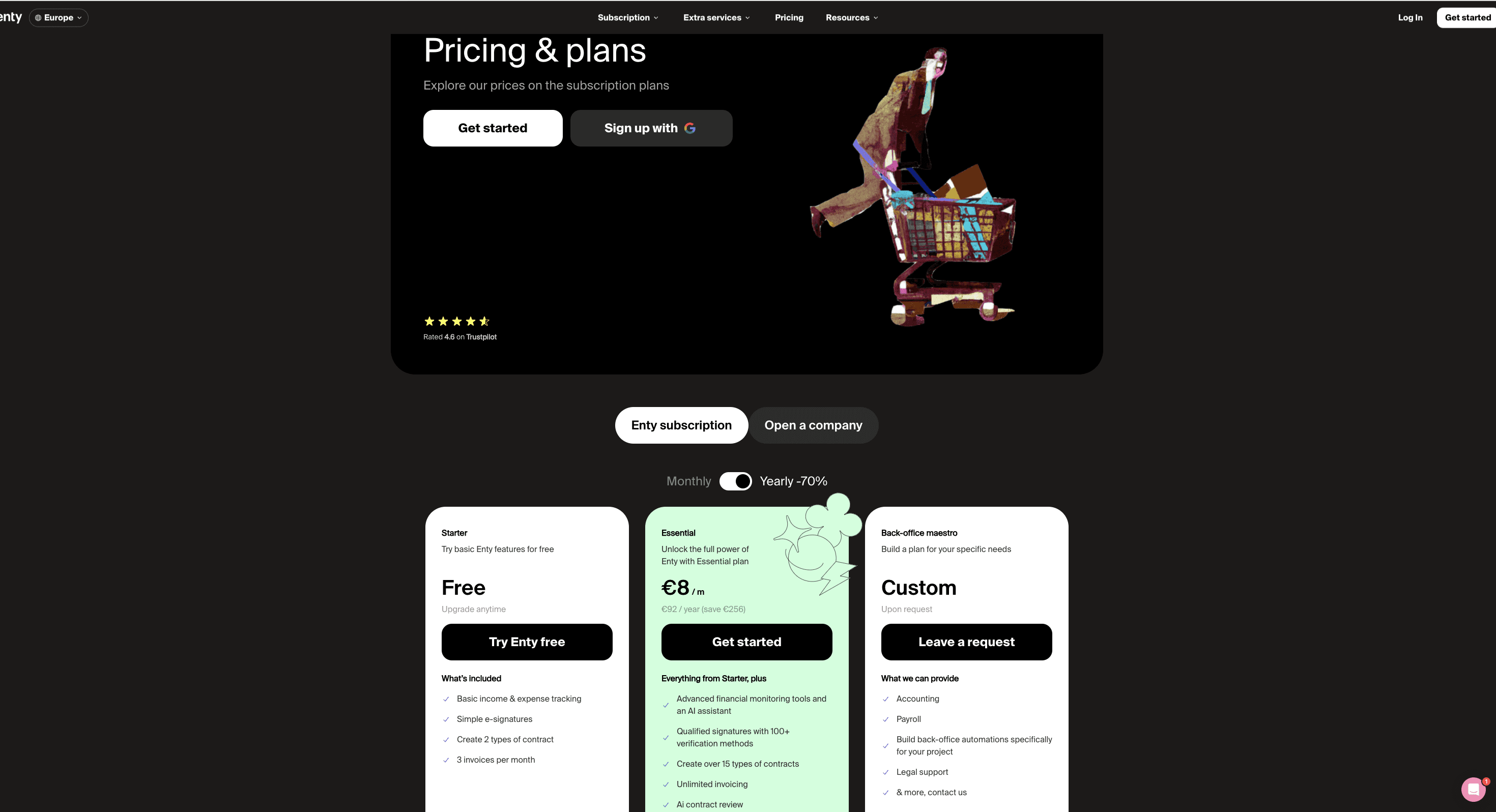
On the screenshot above, we can see some very important elements that enhance the overall effectiveness of the pricing page:
Sign-up Button for Quick Account Creation: The visible sign-up button allows users to quickly create an account, making the onboarding process seamless and minimizing friction in getting started.
Free Plan to Attract More Users: A free plan is offered, enabling users to try the platform without an upfront financial commitment, which helps in attracting a wider audience and can lead to more conversions once they experience the product.
Featured Plan Highlighted in Green: The Essential plan is featured with a green background, standing out visually and making it easier for users to choose, especially if they are unsure of which plan best fits their needs.
-70% Discount for Yearly Payments: A 70% discount for yearly payments is available, encouraging users to opt for long-term subscriptions, which improves retention and offers cost savings for the customer.
Social Proof with Trustpilot Rating: The Trustpilot rating is displayed prominently, providing social proof and reinforcing the credibility of the service through positive customer feedback.
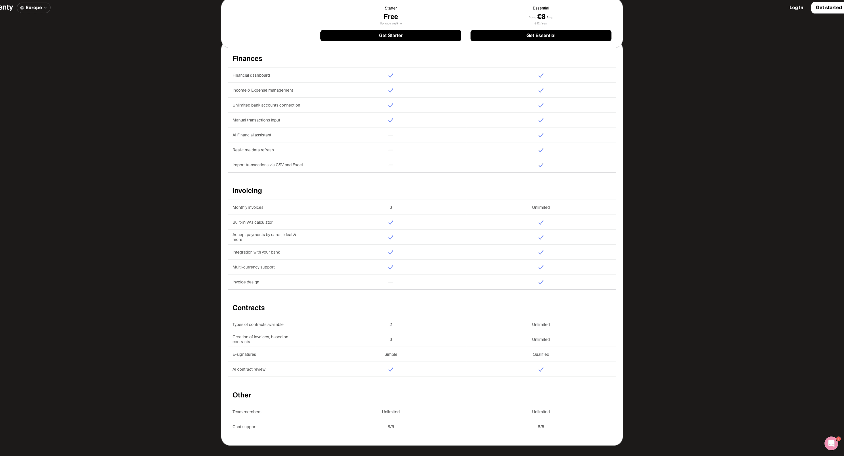
Scrolling down on their pricing page, we can notice a table that compares the features in each plan, making it easy for users to evaluate which option suits their needs. What's particularly important here are the sticky call-to-action (CTA) buttons that remain visible as users scroll.
This means they don't have to go back up to make a decision—they can review the feature table and select the plan they want directly from wherever they are on the page.
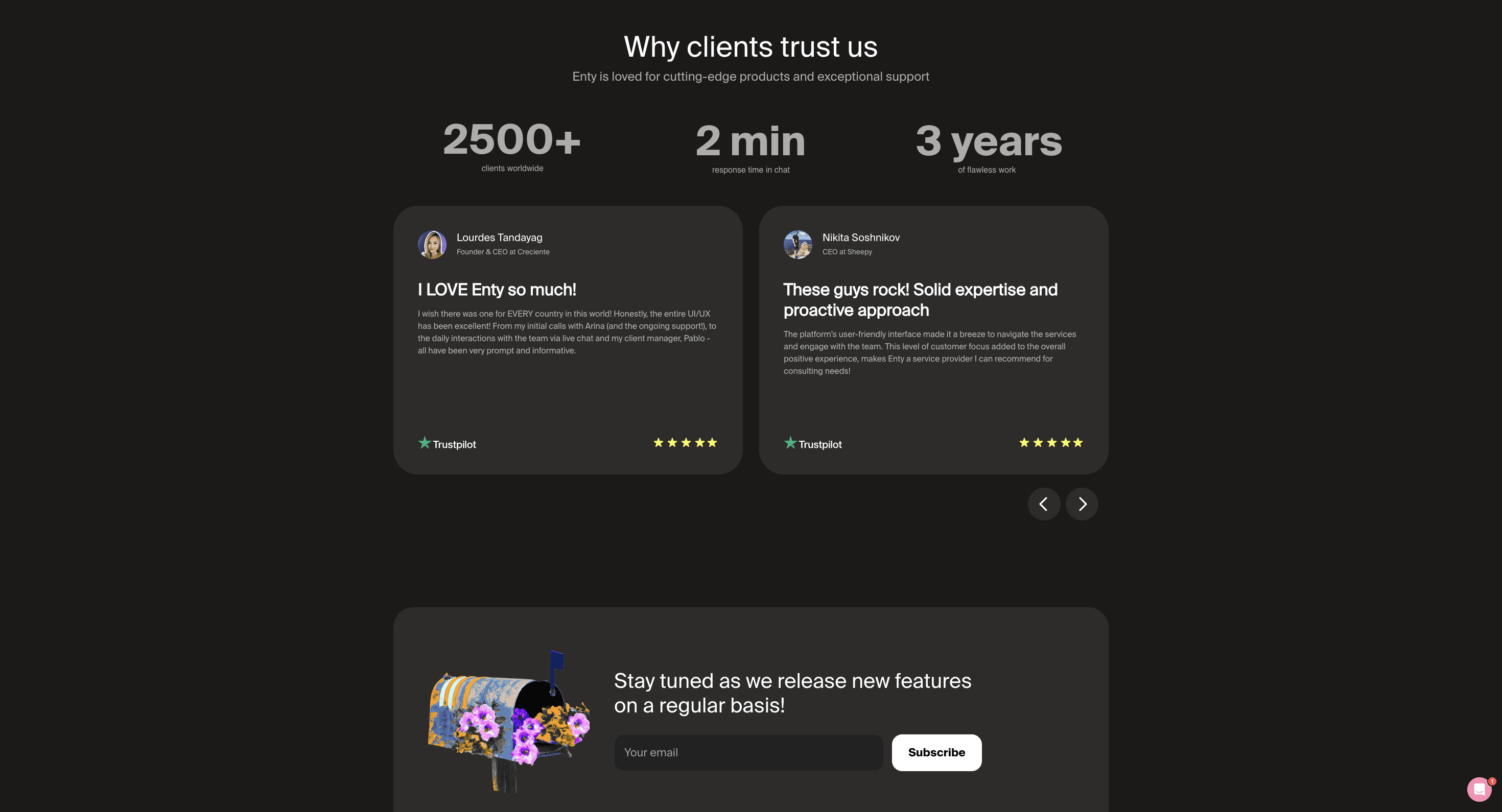
This section of the page prominently displays social proof by featuring real reviews from clients, showcasing the experiences of existing users and providing credibility to the product. Additionally, they highlight that they have over 2,500+ clients worldwide, a detail that speaks to their scale and trustworthiness, making potential users feel more confident in their decision to engage with the platform.
These reviews, paired with statistics like fast chat response times and years of flawless work, further build trust and reduce any concerns about service quality.
What's also smart here is the newsletter sign-up button. If visitors aren't fully convinced by the pricing page, this feature allows them to stay in the loop by giving their email. Regular updates about new features, product news, or even special offers might later convince users to subscribe or re-evaluate their decision, keeping the company at the top of their mind even after leaving the page.
Another interesting example of a very good page is Treblle. Treblle is a platform designed for API monitoring and management. It provides tools to help developers monitor API performance, track usage, and troubleshoot issues. Features often include real-time analytics, error tracking, and performance metrics.
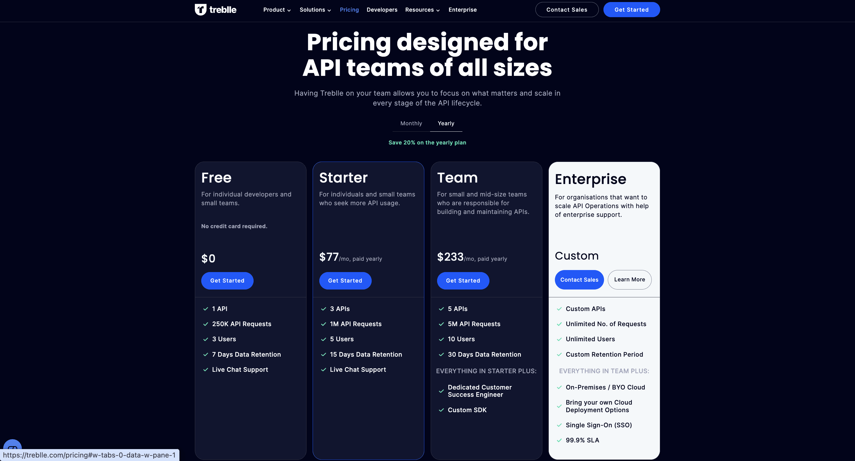
Why is this pricing page great:
The page prominently displays the title "Pricing designed for API teams of all sizes," which is highly effective due to its targeted messaging. It immediately informs visitors that this product is tailored specifically for API teams, regardless of their size.
Scalability: The plans cater to a wide range of users, from individual developers to large enterprises, showing that the service can grow with the customer's needs.
Highlighting Value: The page emphasizes "Save 20% on the yearly plan," encouraging longer-term commitments. The "20%" is displayed in a distinct green color, making it stand out from the surrounding text.
Call-to-Action Buttons: Each tier has a prominent "Get Started" button, making it easy for customers to take the next step.
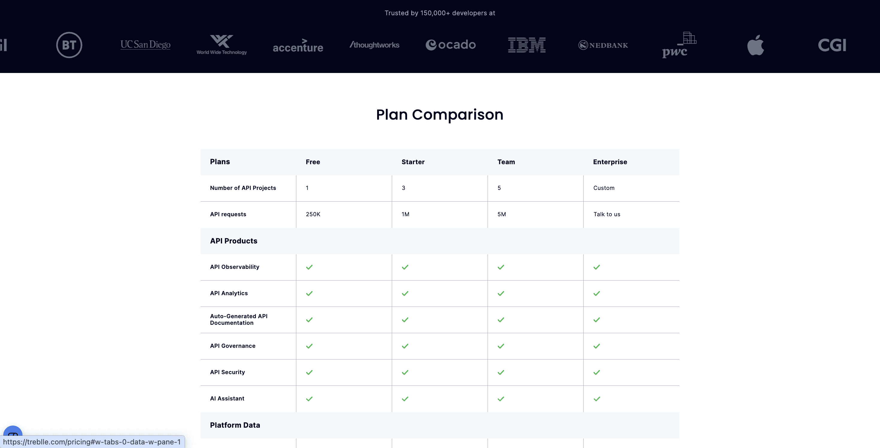
Scrolling down, we see two key features:
Social Proof: Logos of well-known companies and the text "Trusted by 150,000+ developers at" are displayed. This builds immediate credibility and trust, leveraging the reputation of established organizations to reassure potential customers.
Plan Comparison Table: A detailed table breaks down features across all pricing tiers. This allows easy side-by-side comparison, helping users make informed decisions by clearly showing what each plan offers. It also demonstrates transparency and highlights the value progression across tiers.
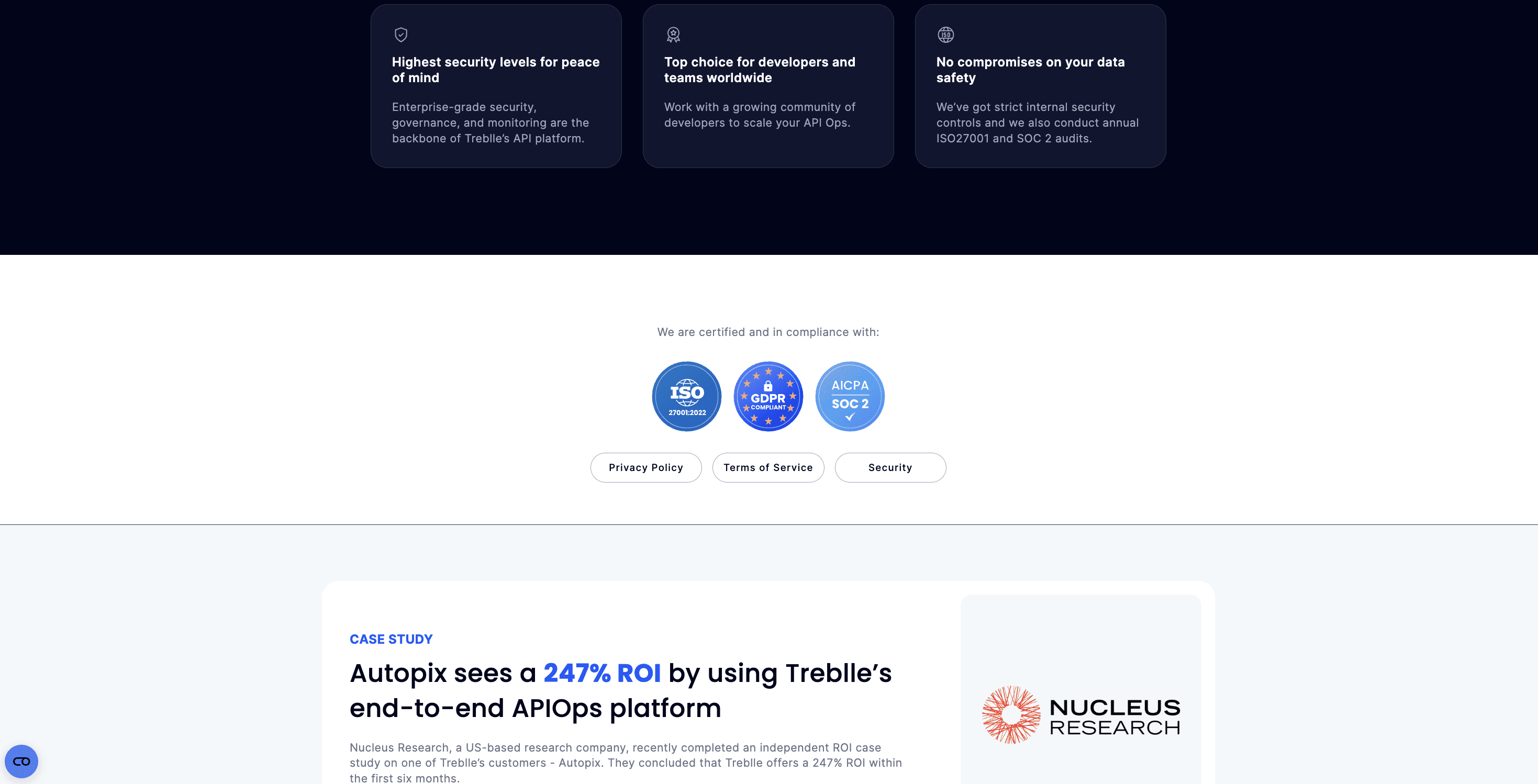
This section effectively builds trust and demonstrates value through:
Security emphasis: Three cards highlight key security features, global appeal, and data safety. Certification logos (ISO, GDPR, SOC 2) reinforce compliance with international standards.
Impactful case study: Showcases a customer (Autopix) achieving 247% ROI using Treblle, verified by an independent research company. The ROI figure is highlighted in blue for emphasis.
These elements address crucial concerns for API management tools: security, compliance, and tangible business value. By combining reassurances about data protection with a concrete success story, Treblle appeals to both emotional (trust) and rational (ROI) decision-making factors of potential customers.
The Bottom Line
Crafting an effective SaaS pricing page is both an art and a science. As we've seen through the examples of Rows, Enty.io, and Treblle, successful pricing pages share common elements:
Transparent pricing and clear value propositions
Multiple tiers catering to different user needs
Prominent social proof and trust indicators
Detailed feature comparisons
Strategic use of CTAs and visual highlights
Emphasis on security and compliance (especially for sensitive services)
These elements work together to build trust, facilitate decision-making, and ultimately drive conversions. Remember, your pricing page is more than just a list of features and costs—it's a crucial touchpoint in your customer's journey.
By implementing these best practices and continually optimizing based on user feedback and data, you can transform your pricing page into a powerful conversion tool that not only informs but persuades and guides potential customers towards becoming loyal users of your SaaS product.