Ultimate Guide to Implementing Effective CTAs in SaaS

by
Wiktoria Slowikowska
Nov 13, 2024
Identify and convert your most valuable users
Sign Up
When it comes to growing your SaaS business, implementing effective Calls-to-Action (CTAs) is one of the most important strategies for turning website visitors into paying customers.
Whether you want to convert trial users, guide potential customers, or retain existing clients, a well-crafted CTA can make all the difference. But creating an effective CTA is more than just slapping a button on your page. It's about understanding your audience, where they are in the user journey, and offering them a clear path forward.
In this guide, we’ll explore everything you need to know about creating powerful CTAs for your SaaS business. From understanding why CTAs are so crucial to mastering the art of writing, designing, and testing them, we’ll cover it all. So, whether you’re new to CTAs or looking for ways to improve your current strategy, this guide will help you increase conversions and grow your business.
What is a Call-to-Action (CTA)?
A Call-to-Action (CTA) is a prompt on your website, app, or email that encourages users to take a specific action. It can be as simple as a button that reads “Start Free Trial” or a hyperlink inviting users to “Download the eBook.” CTAs are used across different channels in your SaaS business, guiding your potential customers through the sales funnel by directing them towards actions that benefit both them and your business.
For example:
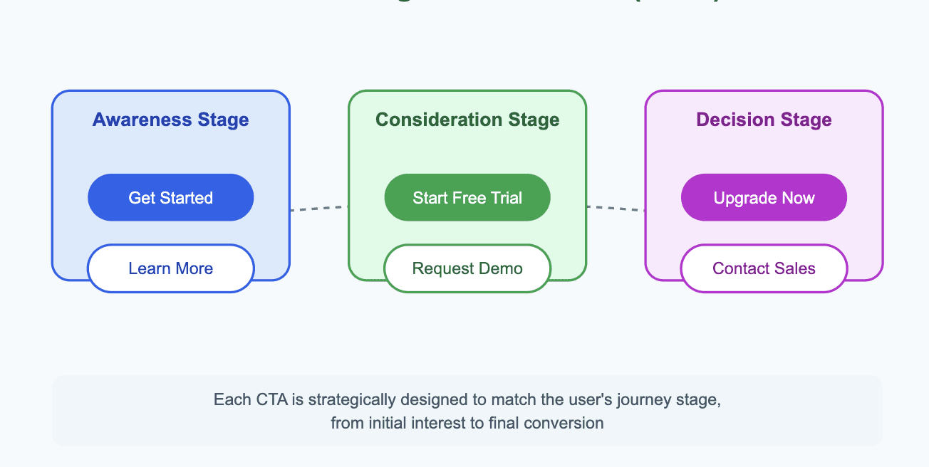
"Start Free Trial" – Encourages visitors to test the product before buying.
"Get Started" – An invitation to begin using the product or signing up.
"Request a Demo" – Ideal for visitors who want to see the product in action before committing.
"Upgrade Now" – For customers already using the service but ready to access more advanced features.
Each CTA is designed to serve a different stage in the customer journey, ultimately driving conversions and ensuring users get the most value from your product.
Why Are CTAs So Important in SaaS?
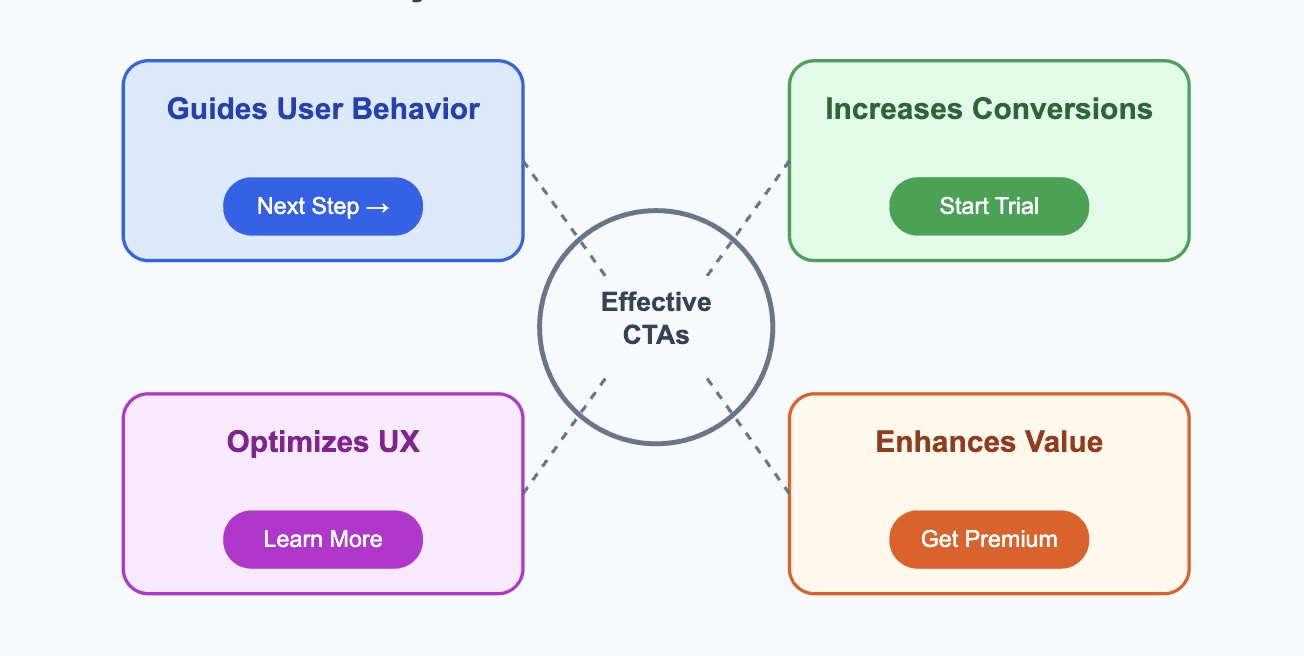
Your CTA plays a critical role in guiding users to take the next step. Here’s why CTAs are so essential:
1. Guides User Behavior
Without clear CTAs, your users might not know what to do next, causing them to exit your site without taking any action. A CTA acts as a signpost, guiding your visitors through their journey and ensuring they stay engaged with your content.
2. Increases Conversions
The whole purpose of a CTA is to convert visitors into customers. Whether it’s signing up for a free trial, downloading a resource, or upgrading their plan, a well-crafted CTA encourages users to take that crucial step towards becoming a paying customer.
3. Optimizes the User Experience
By strategically placing CTAs on your website or app, you create a smoother, more intuitive experience for users. When they can easily identify the next step they need to take, they are more likely to follow through.
4. Enhances the Value Proposition
CTAs make the benefits of your product or service clear. A good CTA highlights what’s in it for the user—whether it’s access to a free resource or an exclusive offer—therefore increasing the perceived value of your product.
Types of CTAs Every SaaS Business Needs
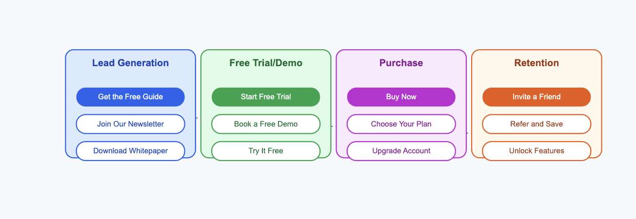
There are many types of CTAs, each designed for a specific purpose within the customer journey. Understanding these will help you create CTAs that are relevant and valuable at every touchpoint.
1. Lead Generation CTAs
Lead generation CTAs are used to collect information from visitors. These are typically placed in the early stages of the sales funnel and are designed to build awareness and trust.
Examples include:
“Get the Free Guide”
“Join Our Newsletter”
“Download Our Whitepaper”
These CTAs are great for users who are just starting to learn about your SaaS solution and need more information before making a decision.
2. Free Trial or Demo CTAs
Offering a free trial or a demo is a popular way for SaaS companies to entice potential customers. This CTA lets users experience your product firsthand, which can ultimately lead to conversions once they see its value.
Examples include:
“Start Free Trial”
“Book a Free Demo”
“Experience Our Software for Free”
By removing the initial barrier to entry (like the cost), you allow potential customers to see how your product solves their problems before asking them to commit.
3. Purchase CTAs
These are the CTAs designed to turn trial users or prospects into paying customers. They encourage users to make a purchasing decision or upgrade to a more advanced plan.
Examples include:
“Buy Now”
“Choose Your Plan”
“Upgrade Your Account”
These CTAs are most effective when users are already familiar with your product and ready to unlock its full potential.
4. Retention CTAs
Once customers are on board, you don’t want them to churn. Retention CTAs keep customers engaged by encouraging them to explore new features, refer friends, or upgrade their current plans.
Examples include:
“Invite a Friend”
“Refer a Friend and Save”
“Upgrade for More Features”
These CTAs can be used post-purchase to encourage long-term relationships and maximize customer lifetime value.
How to Craft an Irresistible CTA
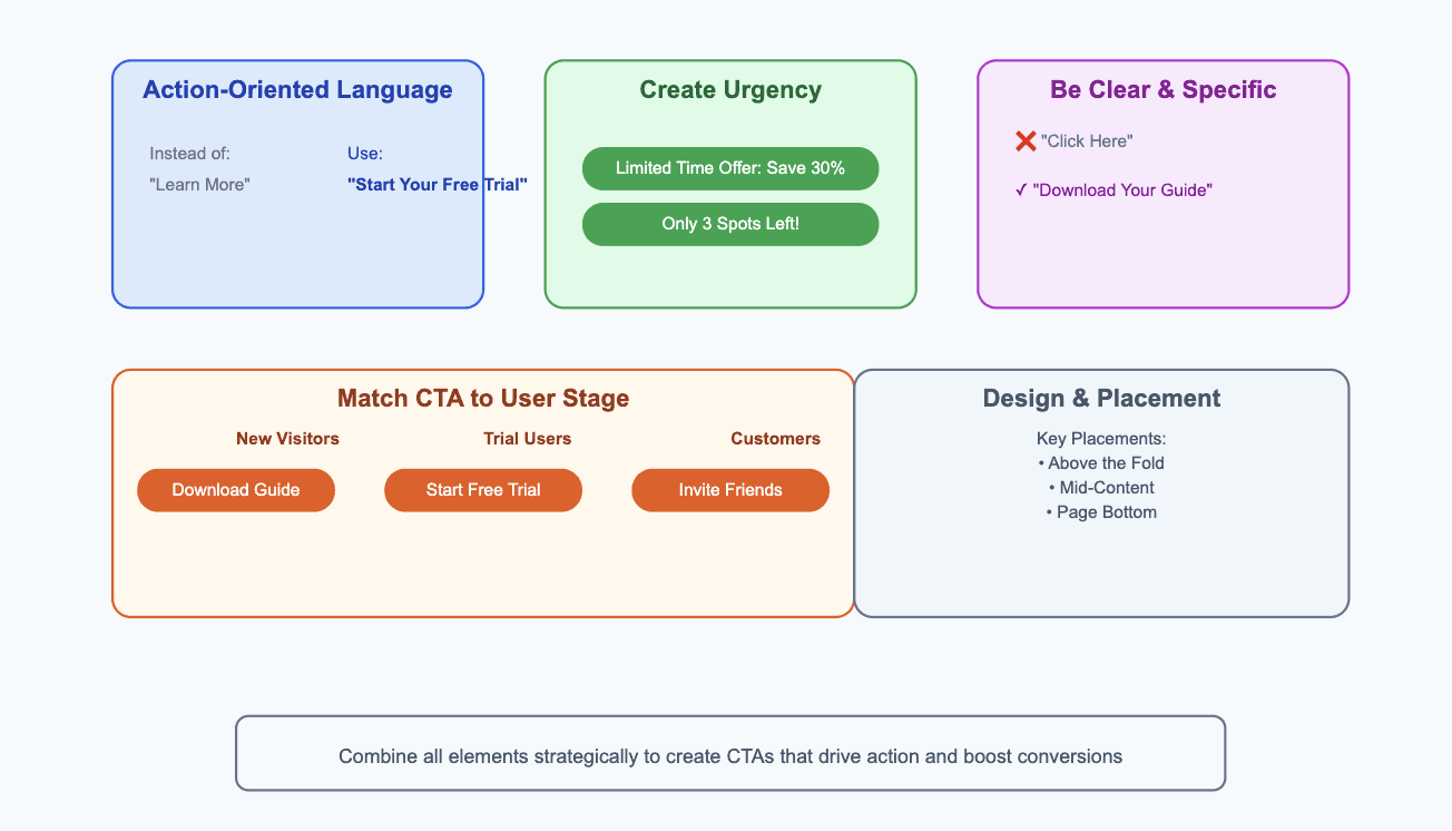
Creating a CTA that grabs attention and motivates action is an art. Let’s break down the key elements that make a CTA effective:
1. Use Action-Oriented Language
The most effective CTAs use strong, action-oriented verbs that compel users to act immediately. Words like “Get,” “Try,” “Start,” “Download,” and “Buy” all signal a sense of action.
For example:
Instead of “Learn More,” use “Start Your Free Trial.”
Instead of “Sign Up,” use “Get Started Today.”
Using actionable language helps push users past any hesitation and nudges them to take action.
2. Create a Sense of Urgency
Urgency is a powerful motivator. People tend to act faster when they feel they might miss out on an opportunity. By incorporating urgency into your CTA, you can boost conversions.
Examples:
“Start Your Free Trial Now”
“Limited Time Offer: Save 30% Today”
“Sign Up Before It’s Too Late”
Urgency doesn’t always have to be about time. You can create urgency by highlighting exclusivity or limited availability, such as “Only a Few Spots Left!”
3. Be Clear and Specific
Your CTA should leave no room for confusion. Users should immediately understand what they’ll get by clicking the button. Avoid jargon or vague language, and make sure your message is crystal clear.
Instead of “Click Here” (which could mean anything), try something more direct:
“Get Your Free Trial”
“Download Your Guide”
4. Match the CTA to the User’s Stage
A user’s intent will change depending on where they are in their journey. Your CTA should meet them where they are.
For Visitors Just Learning About You: Focus on informational CTAs, like “Learn More” or “Download Free Guide.”
For Trial Users: Focus on conversion-related CTAs, like “Start Free Trial” or “Upgrade Your Plan.”
For Returning Customers: Retention CTAs, such as “Invite a Friend” or “Refer and Save.”
5. Design and Placement Matter
Your CTA should be visually distinct and easy to find. A button with a contrasting color stands out better than a plain hyperlink. Also, be sure to place your CTA where users are most likely to see it.
Consider the following placements:
Above the Fold: Visitors should immediately see the CTA without needing to scroll.
In the Middle of the Page: As users scroll through content, a CTA in the middle of the page reminds them to take action.
At the Bottom of the Page: This works well when you want users to take action after reading the entire page.
Sticky or Floating Buttons: These stay visible as users scroll, ensuring the CTA is always within reach.
How to Test and Optimize Your CTAs
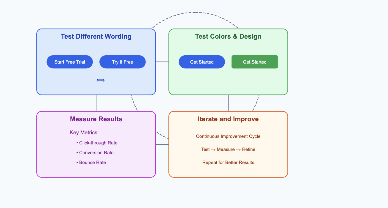
Even after crafting the perfect CTA, it’s important to keep testing and optimizing. A/B testing is an essential practice for finding the most effective CTA for your audience. Here’s how to get started:
1. Test Different Wording
One of the easiest ways to optimize CTAs is by experimenting with different phrases. Try testing variations of action verbs, tone, or even length.
Examples:
“Start Your Free Trial” vs. “Try It Free”
“Sign Up” vs. “Get Started Today”
2. Experiment with Colors and Design
The design of your CTA matters just as much as the copy. A CTA button’s color can have a huge impact on conversion rates. Test different colors, sizes, and placements to see what works best for your audience.
3. Measure Results
Use analytics tools to track how different CTAs perform. Metrics such as click-through rate (CTR), conversion rate, and bounce rate will help you understand which CTAs are driving the best results.
4. Iterate and Improve
A/B testing is an ongoing process. As you gain more insights into your audience’s behavior, continually test new ideas to refine your CTAs for even better performance.
Common CTA Mistakes to Avoid
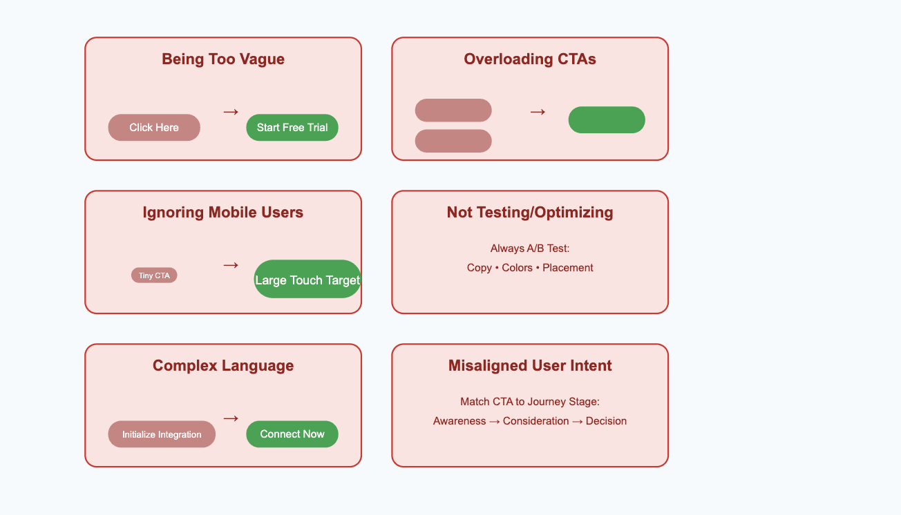
Even seasoned marketers can fall into common traps when creating CTAs. Here are some common mistakes to avoid when implementing CTAs on your SaaS website or app:
1. Being Too Vague
One of the biggest mistakes you can make is using CTAs that are too vague or don’t specify what the user will get. For instance, a generic “Click Here” doesn’t provide any incentive or clarity about the action you want the user to take.
Avoid this mistake: Use clear and direct language like “Start Free Trial” or “Download the Free Guide.”
2. Overloading with Too Many CTAs
While it may seem like having more CTAs would increase your chances of getting clicks, it can overwhelm users and dilute the effectiveness of your primary goal. Too many options can confuse potential customers and cause them to abandon your page.
Avoid this mistake: Stick to one primary CTA per page or section. You can have secondary CTAs, but they should be clearly secondary and not compete with the main action.
3. Ignoring Mobile Users
More and more people access websites on mobile devices, so if your CTAs aren’t optimized for mobile, you’re losing a significant portion of your potential customers. Mobile users may struggle with tiny buttons, hard-to-read text, or buttons that are too close together.
Avoid this mistake: Make sure your CTAs are large enough to tap easily on mobile devices. Also, ensure that your CTA text is legible, and the button is placed where users can easily access it on smaller screens.
4. Not Testing or Optimizing
Just because your CTA is performing well today doesn’t mean it will always be the best. Without testing and optimizing your CTAs, you risk missing out on opportunities to improve conversions over time.
Avoid this mistake: Always be A/B testing different versions of your CTAs to see what works best for your audience. Monitor your results, iterate, and keep refining your approach.
5. Using Complex Language or Jargon
Your users should never have to guess what a CTA means. Using industry jargon or overly complicated phrases can confuse your visitors and make them hesitant to click.
Avoid this mistake: Keep the language simple and easy to understand. Speak to your audience in a way that resonates with them, and always prioritize clarity over cleverness.
6. Failure to Align with User Intent
Each stage of the customer journey has different needs, and your CTAs should reflect that. If you’re asking a visitor to sign up for a trial too soon in their journey, they may not be ready yet. Similarly, if a visitor is on a pricing page, they may be ready to take action and might need a different type of CTA.
Avoid this mistake: Tailor your CTAs to the user’s stage in the funnel. Don’t push them too quickly toward a purchase before they’ve had the chance to learn about your product.
Final Thoughts
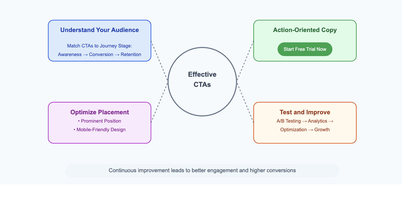
In conclusion, an effective Call-to-Action is one of the most powerful tools you have at your disposal to drive engagement and boost conversions for your SaaS business. When done right, CTAs guide users through their journey, turning them from passive visitors to active customers. But it’s not enough to just create a CTA and leave it there—testing, optimizing, and continually improving your CTAs will help you keep pace with changing user behavior and increase your SaaS business's growth.
Here’s a quick recap of what we covered:
Understand Your Audience: Make sure your CTAs match your user’s needs and motivations at every stage of their journey.
Craft Clear, Action-Oriented Copy: Use strong verbs and create urgency to compel users to act.
Optimize Placement and Design: Ensure your CTAs are prominent, easy to find, and mobile-friendly.
Test and Improve: Use A/B testing to fine-tune your CTAs and make data-driven decisions.
By following these strategies, you’ll create CTAs that not only grab attention but also push users to take meaningful actions that drive your SaaS business forward. Keep iterating, keep optimizing, and soon enough, you’ll see your conversions soar!
