
The Psychology of Sign-Up Friction in SaaS

by
Wiktoria Slowikowska
Oct 17, 2024
Identify and convert your most valuable users

Sign Up
Imagine this: You’ve finally found the perfect software solution for your business, and you’re ready to sign up. You navigate to the website, excitement buzzing in your veins, only to be greeted by a long, complicated sign-up form. Suddenly, that excitement turns to frustration. You close the tab and move on, leaving behind a world of potential benefits.
This scenario happens more often than you might think. In the fast-paced world of SaaS, the sign-up process serves as a critical gateway to your product. Understanding the psychology behind user behavior during this process is essential for reducing friction and boosting conversion rates. Let’s dive into the fascinating psychology of sign-up friction and explore how you can create a seamless experience that encourages users to hit that “Sign Up” button.

What Is Sign-Up Friction, Anyway?
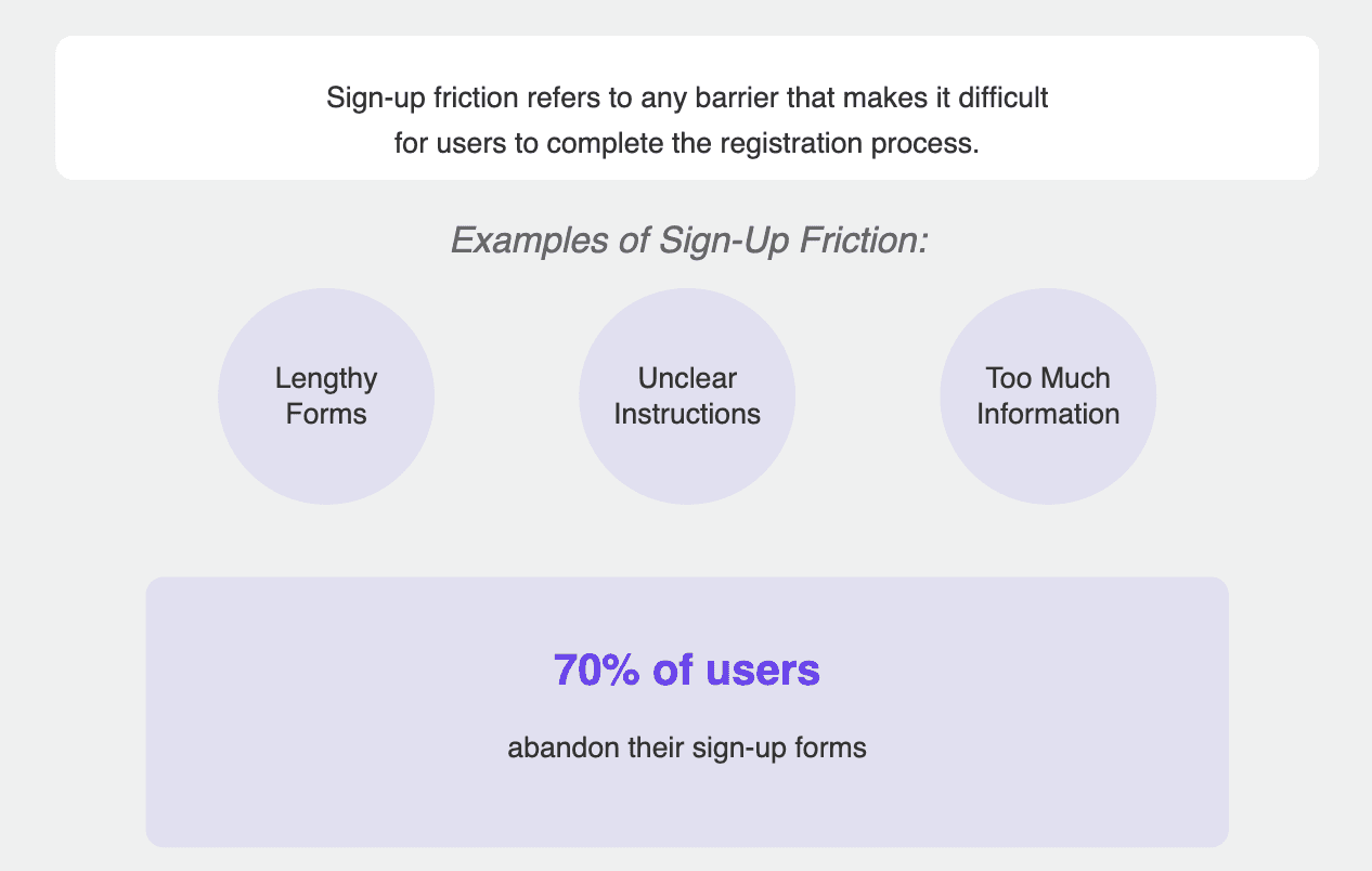
Sign-up friction refers to any barrier that makes it difficult for users to complete the registration process. These barriers can be blatant, like lengthy forms asking for too much information, or subtle, like unclear instructions that leave users feeling lost. Every friction point chips away at the overall user experience and affects how potential customers perceive your brand.
Studies show that nearly 70% of users abandon their sign-up forms. That’s a staggering statistic, and it highlights the critical need for businesses to refine their approach. So, how can you identify and reduce these friction points? It all starts with understanding the psychological factors at play.
The Power of Psychology in User Behavior
User behavior is not just a random collection of clicks and scrolls; it’s deeply influenced by psychological principles. By leveraging these principles, you can design an engaging sign-up process that resonates with users and encourages them to complete their registration.
1. Cognitive Load: Keep It Simple!
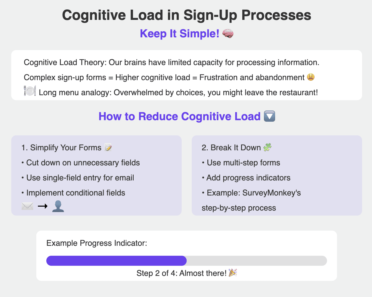
Picture this: you walk into a restaurant with a menu that’s a mile long. Overwhelmed by choices, you might just decide to leave. This is what happens when users encounter a complex sign-up form.
Cognitive Load Theory suggests that our brains have a limited capacity for processing information. The more complicated your sign-up form is, the higher the cognitive load, which often leads to frustration and abandonment. A classic study by Sweller (1988) shows that when tasks are simplified, individuals are more likely to succeed and complete them.
How to Reduce Cognitive Load:
Simplify Your Forms: Cut down on unnecessary fields. Only ask for essential information—if it’s not crucial, leave it out! Consider implementing a single-field entry for email addresses or using conditional fields that only appear based on prior responses. For example, instead of asking for a user's full name upfront, you can ask for just the email and follow up with a simple prompt for their name later.
Break It Down: Use a multi-step form to break the process into manageable chunks. A progress indicator can motivate users by showing how close they are to completion. An example of this can be seen in SurveyMonkey, which uses a step-by-step process to guide users through their survey creation.
2. Choice Paralysis: Too Many Options?
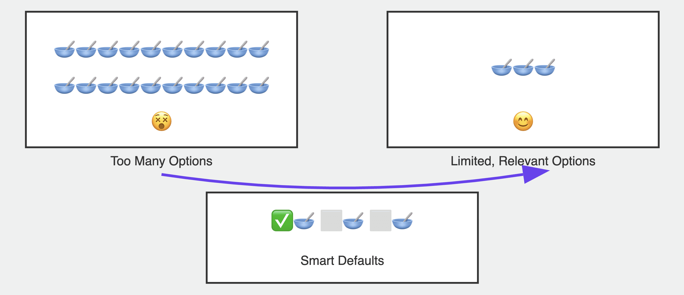
We’ve all been there—standing in front of a full wall of cereal boxes, paralyzed by the sheer number of choices. While options can empower users, having too many can lead to choice paralysis, making them second-guess their decisions.
How to Mitigate Choice Paralysis:
Limit Options: Offer only the most relevant choices. If your service has multiple plans, highlight a default or recommended option based on user behavior. For instance, Dropbox showcases its most popular plan prominently, making it easier for users to make a quick decision.
Use Smart Defaults: Pre-select the most common or recommended options to streamline the decision-making process. This strategy has proven effective for companies like Amazon, which often pre-selects shipping options based on user behavior, thus reducing friction.
3. Loss Aversion: Don’t Leave Users in the Dark
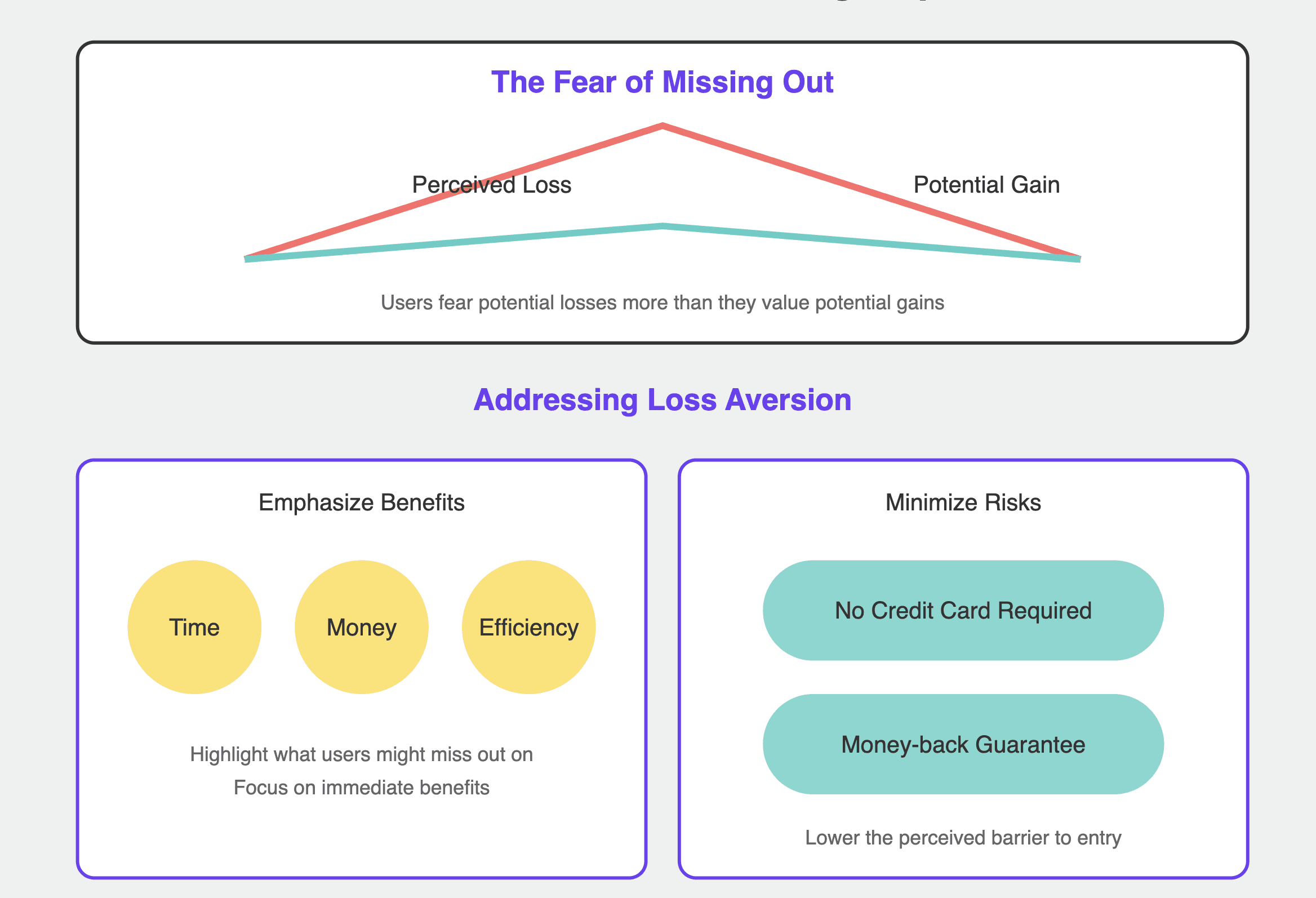
Human nature dictates that we’re more motivated by the fear of losing something than by the potential of gaining something new. This is known as loss aversion. If users perceive that signing up involves a risk, they might hesitate. A study by Kahneman and Tversky (1979) demonstrated that losses have a more significant emotional impact than gains, underscoring the importance of addressing this in your sign-up process.
How to Address Loss Aversion:
Emphasize Benefits: Frame your messaging around what users might miss out on if they don’t sign up. Focus on immediate benefits to capture their interest. For example, if your software can save users time, highlight this prominently during the sign-up process.
Minimize Risks: Offer a no credit card required free trial or a money-back guarantee. This alleviates fears and lowers the perceived barrier to entry. Canva uses this strategy effectively by allowing users to explore features without requiring credit card information upfront.
4. Social Proof: The Power of the Crowd
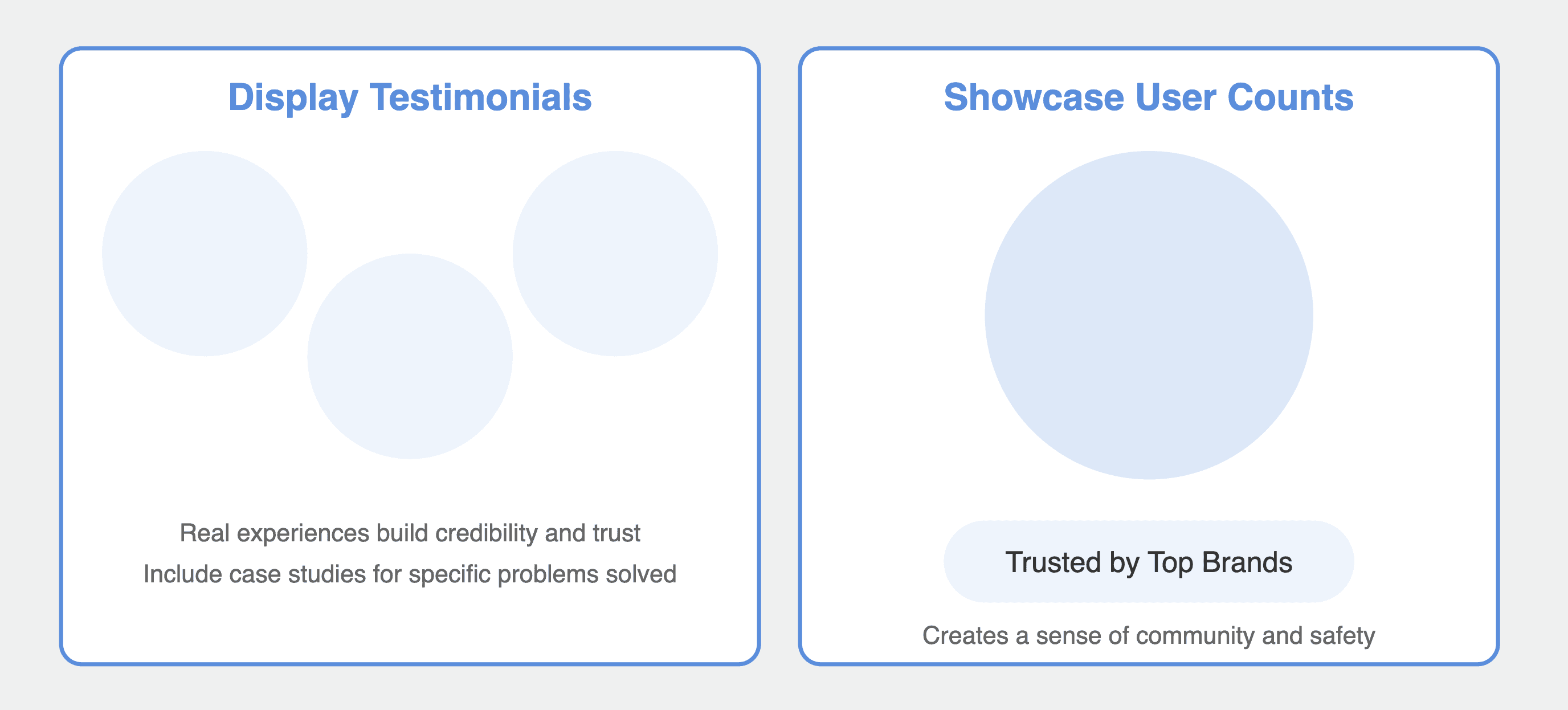
Ever notice how we often look to others when making decisions? That’s the essence of social proof—a powerful psychological principle that can drive sign-ups.
How to Leverage Social Proof:
Display Testimonials: Showcase positive feedback from existing users near the sign-up form. Real experiences build credibility and trust. Consider including a dedicated section for user testimonials or case studies that highlight how your product solved specific problems.
Showcase User Counts: Highlight the number of satisfied users or notable brands using your service. This creates a sense of community and safety. Mailchimp prominently displays its user base, which reassures potential users that they are joining a trusted platform.
5. Reciprocity: Give and Take
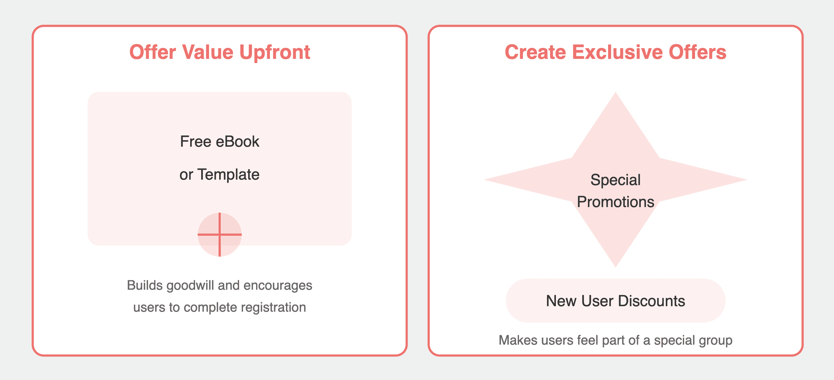
People are naturally inclined to return favors. This principle, known as reciprocity, can be a compelling motivator in the sign-up process.
How to Utilize Reciprocity:
Offer Value Upfront: Consider providing a free resource (like an eBook or template) in exchange for sign-up. This builds goodwill and encourages users to reciprocate by completing the registration. HubSpot, for instance, offers free marketing resources that require users to sign up, creating a sense of obligation to follow through.
Create Exclusive Offers: Highlight special promotions for new users, such as discounts or bonus features, to incentivize sign-ups. These exclusive deals make users feel like they are part of a special group, prompting them to act.
6. Commitment and Consistency: Small Steps Matter
Once a user commits to a small action, they are more likely to follow through with larger actions. This psychological principle, rooted in commitment and consistency, can work wonders in your sign-up process. Research shows that users who make small commitments are significantly more likely to complete larger commitments later.
How to Foster Commitment:
Use Micro-Commitments: Start with simple tasks, like entering an email, before gradually asking for more information. Each step builds a sense of commitment. For example, LinkedIn encourages users to create a profile by first asking them to sign up with just an email.
Utilize Progress Indicators: Show users how far they’ve come in the sign-up process. The more invested they feel, the less likely they are to abandon the process. Websites like Typeform use progress bars effectively to keep users informed about their journey.
Creating Engaging Sign-Up Experience
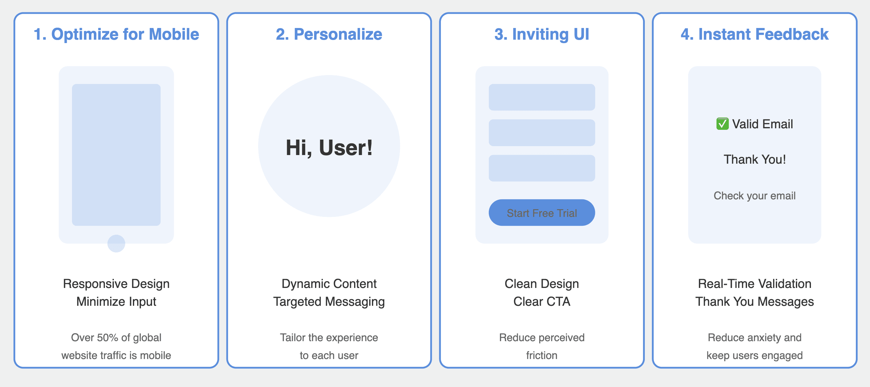
While understanding psychological principles is vital, creating an engaging sign-up experience requires more than just theory. It’s about the practical application of these insights in a way that resonates with your target audience. Let’s look at some best practices that can elevate your sign-up process.
1. Optimize for Mobile
With the rise of mobile usage, ensuring your sign-up process is mobile-friendly is non-negotiable. A study by Statista revealed that over 50% of global website traffic comes from mobile devices. If your sign-up form isn’t optimized for mobile, you risk losing a significant number of potential users.
How to Optimize for Mobile:
Responsive Design: Ensure your forms are fully responsive and easy to fill out on smaller screens. Use larger touch targets and clear fonts to enhance readability.
Minimize Input: Limit the amount of typing required. Use dropdown menus, toggles, or checkboxes instead of text fields where possible. For instance, using a toggle to select “Yes” or “No” can be quicker and more user-friendly than asking for a detailed answer.
2. Personalize the Experience
Personalization can significantly impact user engagement. When users feel that the experience is tailored to them, they are more likely to proceed with sign-ups.
How to Personalize the Experience:
Dynamic Content: Use dynamic fields in your forms to address users by name or tailor questions based on their previous interactions with your website.
Targeted Messaging: Segment your audience and create tailored messaging that speaks directly to their pain points. For example, a marketing software company could present different benefits to small businesses versus large enterprises.
3. Create an Inviting User Interface
A well-designed interface can reduce perceived friction. If a form looks overwhelming, users are less likely to engage with it.
How to Create an Inviting User Interface:
Clean Design: Use ample white space, legible fonts, and a cohesive color scheme. A clutter-free design helps users focus on completing the form.
Clear Call-to-Action (CTA): Your CTA should stand out and be actionable. Instead of a generic “Submit,” try something more engaging like “Start Your Free Trial” or “Join Our Community.”
4. Provide Instant Feedback
Users appreciate knowing that their actions are recognized. Providing instant feedback can enhance their experience and reduce anxiety during the sign-up process.
How to Provide Instant Feedback:
Real-Time Validation: If a user makes an error while filling out the form (like entering an invalid email address), provide real-time validation messages. This not only prevents frustration but also keeps users engaged.
Thank You Messages: After sign-up, a quick “Thank You!” message can reassure users that they’ve completed the process successfully. Consider including next steps, such as “Check your email for a confirmation link!” to guide them further.
Understanding User Behavior
While these psychological principles provide a solid foundation for reducing sign-up friction, it’s essential to support your strategies with data. Utilizing analytics tools can provide insights into user behavior during the sign-up process.
Funnel Analysis: Track where users drop off in the sign-up process. This data helps identify specific friction points that need attention. For example, if a high percentage of users abandon the process after entering their email, it could indicate an issue with what follows.
User Testing: Conduct user testing sessions to observe real users navigating your sign-up process. This qualitative data can reveal common frustrations and areas for improvement that analytics might miss.
A/B Testing: Regularly test variations of your sign-up form. Change one element at a time—such as the CTA text or the layout—and monitor which version performs better. This iterative process can lead to continuous improvement in your sign-up rates.
Conclusion
Creating a frictionless sign-up process is not just about reducing barriers; it’s about aligning with user behavior and psychology. By applying these principles—reducing cognitive load, mitigating choice paralysis, addressing loss aversion, leveraging social proof, utilizing reciprocity, and fostering commitment—you can enhance user experience and significantly boost conversion rates.
But remember, the journey doesn’t stop here. Continuously gather feedback from users and iterate on your sign-up process. Utilize A/B testing to see what resonates best with your audience. Over time, you’ll discover that even small tweaks can lead to substantial improvements in conversion rates.
So, the next time you find yourself optimizing your sign-up process, remember: it’s not just a form—it’s a critical touchpoint that sets the stage for user engagement and satisfaction. By embracing the psychological insights we’ve explored, you’ll not only attract more users but also create a positive first impression that paves the way for long-term loyalty.
Let’s turn those potential users into loyal customers, one frictionless sign-up at a time!
FAQ:
1. What is sign-up friction?
Sign-up friction refers to any obstacle or barrier that makes it difficult for users to complete the registration process. This could be in the form of long, complicated forms, unclear instructions, or unnecessary fields, all of which contribute to user frustration and abandonment.
2. Why do users abandon sign-up forms?
Nearly 70% of users abandon sign-up forms due to various factors such as high cognitive load, too many choices (choice paralysis), fear of losing something valuable (loss aversion), or poorly designed user interfaces. Streamlining the process can significantly reduce this abandonment rate.
3. How can social proof help increase sign-ups?
Social proof refers to the influence that other people’s behavior has on our own decisions. Displaying testimonials, showcasing user counts, or highlighting well-known brands that use your service can build trust and encourage potential users to sign up.
4. What design elements can reduce sign-up friction?
Clean, uncluttered design with ample white space, clear fonts, and cohesive color schemes help reduce perceived friction. A well-designed call-to-action (CTA), such as “Start Your Free Trial” instead of “Submit,” can also make a big difference in encouraging sign-ups.
5. What are micro-commitments, and why are they effective?
Micro-commitments are small actions that gradually build up a sense of commitment. For example, starting with a simple task like entering an email address and progressively asking for more information makes users feel invested in completing the process.