
SaaS Onboarding Sequence: 4 Best Examples Analyzed

by
Wiktoria Slowikowska
Sep 26, 2024
Identify and convert your most valuable users
Sign Up
Introduction
Onboarding is one of the most critical touchpoints in a customer's journey. The first few interactions with a product can shape a user's perception, influencing whether they'll stick around long enough to see its value.
That's why an effective onboarding email sequence can make or break user adoption. These emails provide a step-by-step guide to help users understand your product, get started smoothly, and realize its value as quickly as possible.
This blog will analyze five different onboarding email sequences over a defined period of time, highlighting the key elements that can lead to successful customer onboarding. We'll explore how different SaaS companies structure their email series, how they deliver value at each stage, and what lessons can be drawn to optimize user activation and long-term retention.
Why Onboarding Emails Are Crucial
Onboarding emails play a vital role in the success of SaaS products because they:
Build a relationship from day one: They create a connection with new users, welcoming them and reinforcing the value they'll gain from your product.
Guide users to activation: A clear and timely email sequence helps users achieve key milestones, such as completing their profile, setting up the product, or using core features, increasing the likelihood of product adoption.
Prevent user drop-off: Without proper guidance, new users may quickly feel overwhelmed or confused, leading to early churn. Onboarding emails keep users engaged and encourage ongoing product interaction.
Reinforce product benefits and features: Regular communication ensures users fully understand what the product offers and how it can solve their problems.
Increase trial-to-paid conversion rates: By nurturing users through education and engagement, onboarding emails help transform free trial users into loyal, paying customers.
In this analysis, we'll dive deep into the timing, content, and strategies used in these sequences, uncovering insights on how to craft the most effective onboarding emails to enhance user success and retention.
Let's take a closer look at how these five onboarding email strategies are paving the way for better customer experiences!
Calendly's Onboarding Sequence
Let's start with Calendly - a popular scheduling automation platform that simplifies the process of booking appointments and meetings. Their onboarding email sequence offers an excellent example of how to guide new users through product adoption while providing value at each step. Let's analyze their approach:
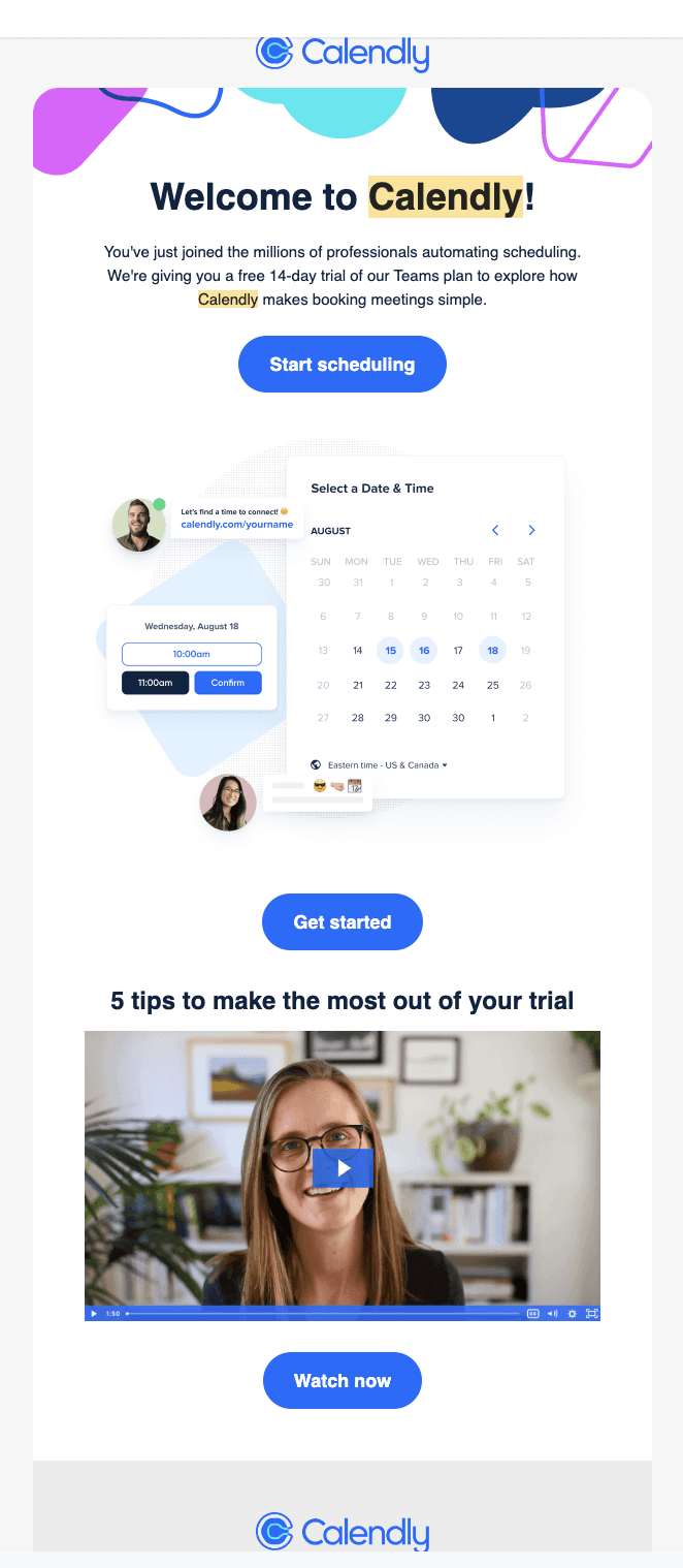
Email 1: "You're in — welcome to Calendly"
Timing: Sent immediately after sign-up, this email strikes while the iron is hot.
Content: The welcome email does several things right:
It confirms the user's successful registration and 14-day trial activation.
It immediately showcases the product's core functionality with an embedded scheduling widget.
It offers a clear call-to-action (CTA) to "Start scheduling" right away.
It provides a video with "5 tips to make the most out of your trial," encouraging immediate engagement.
Why they sent it: This email aims to capitalize on the user's initial interest and momentum, guiding them to take action right away and start using the product.
Email 2: "Let's set you up for scheduling success"
Timing: Sent two days after the welcome email, allowing time for the user to explore but not lose interest.
Content: This email focuses on deepening the user's engagement:
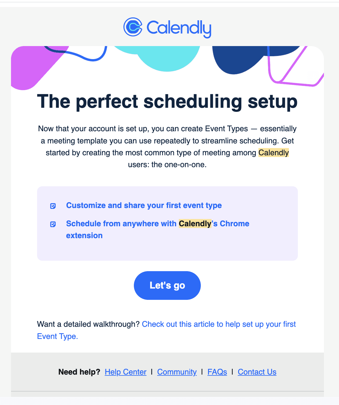
It introduces the concept of Event Types, a key feature for streamlining scheduling.
It provides clear, actionable steps to set up the first Event Type.
It offers a link to more detailed instructions, catering to users who might need extra help.
Why they sent it: This email aims to guide users deeper into the product's functionality, helping them set up essential features that will showcase the platform's value.
Email 3: "Need a little help?"
Timing: Sent about a week after sign-up, this email targets users who might be struggling or haven't fully engaged yet.
Content: This email is all about providing support:
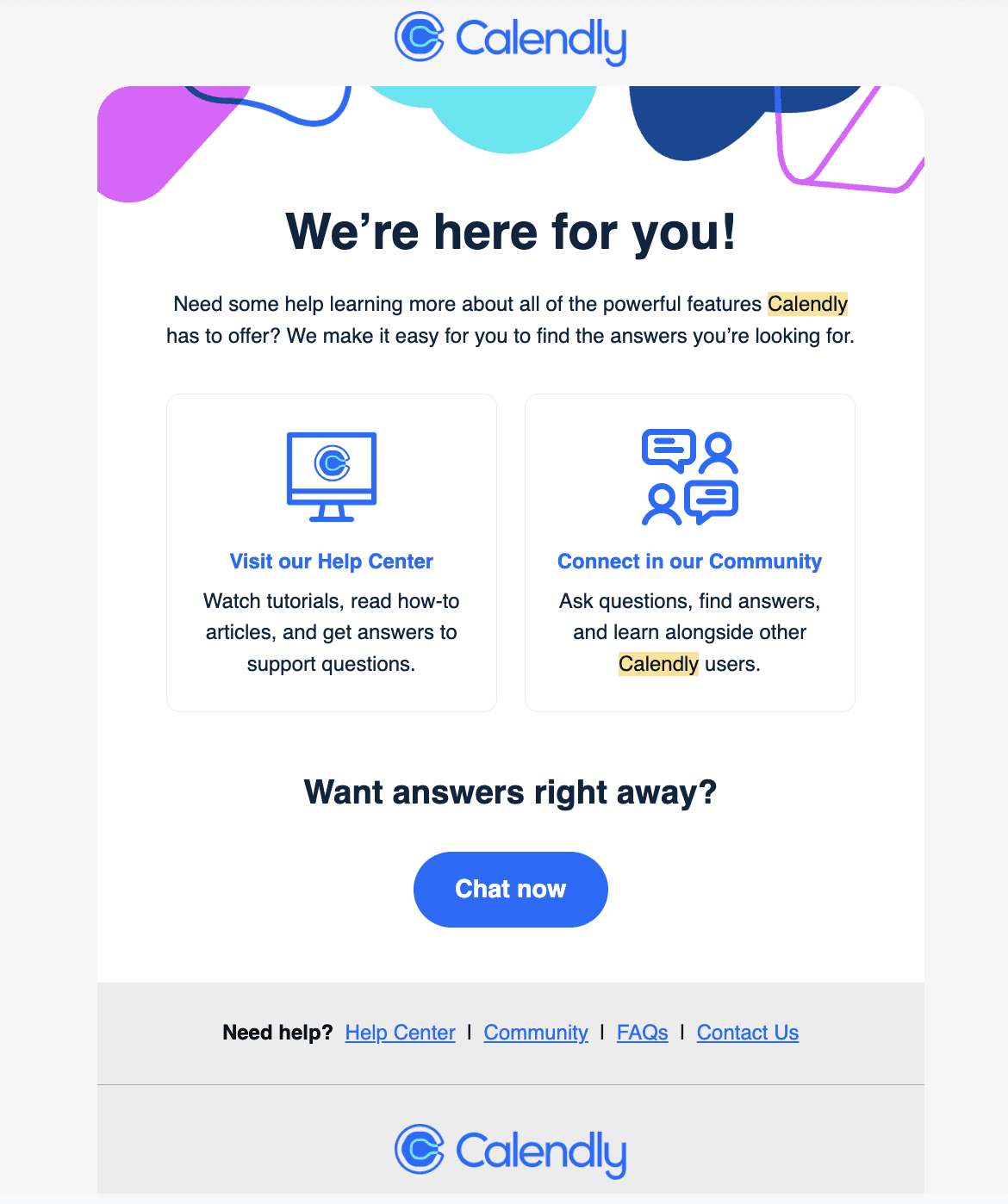
It acknowledges that users might need help learning about Calendly's features.
It offers two main avenues for support: the Help Center for self-service and the Community for peer assistance.
It provides a prominent CTA for instant help via chat.
Why they sent it: This email aims to prevent user drop-off by offering multiple support options, ensuring users don't get stuck or frustrated.
Email 4: "3 tips to politely share your scheduling link"
Timing: Sent 10 days into the trial, this email addresses a common user concern.
Content: This email tackles the etiquette of using the product:
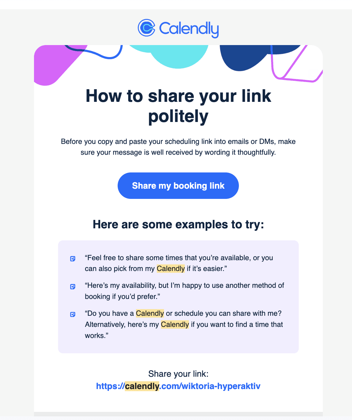
It acknowledges a potential user worry: how to share scheduling links politely.
It provides practical, ready-to-use examples of polite ways to share links.
It includes the user's personal Calendly link, making it easy to act on the advice.
Why they sent it: This email aims to overcome a potential barrier to use - concern about appearing impolite - while encouraging users to share their links and thus increase their engagement with the product.
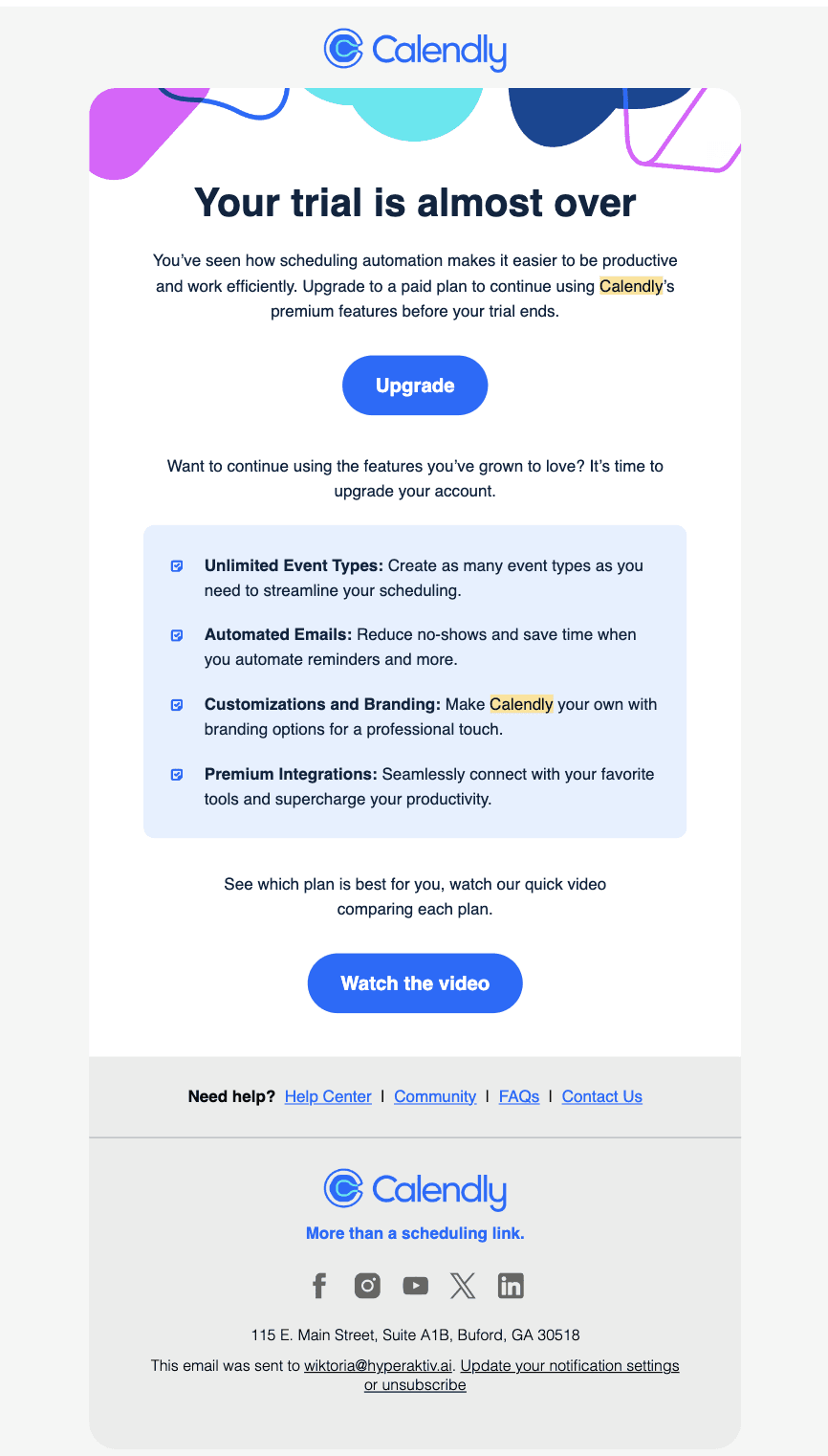
Email 5: "Your trial is almost over"
Timing: Sent 12 days into the 14-day trial, this email creates a sense of urgency.
Content: This email focuses on conversion:
It reminds users that their trial is ending soon.
It highlights key premium features to showcase the value of upgrading.
It provides clear CTAs to upgrade or learn more about pricing plans.
Why they sent it: This email aims to convert trial users into paying customers by reminding them of the product's value and the impending end of their free access.
Conclusion
Calendly's onboarding sequence demonstrates a well-thought-out strategy that guides users from initial sign-up to product adoption and, ultimately, paid conversion. Each email is timed to match the user's likely stage in their journey, addressing potential concerns and highlighting key features at appropriate moments. This sequence showcases how effective onboarding can drive user engagement and conversion in SaaS products.
Senja's Onboarding Sequence
Senja is a SaaS platform focused on collecting and managing customer testimonials. Let's analyze their onboarding email sequence to understand their strategy for user activation and engagement.
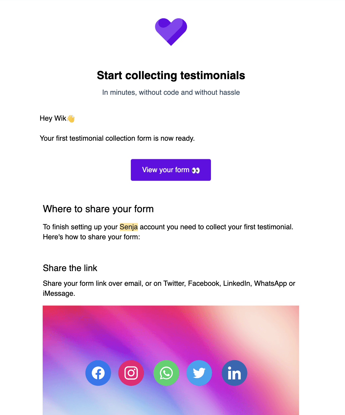
Email 1: "Let's get your first testimonial Wik"
Timing: Sent immediately after sign-up, capitalizing on the user's initial interest.
Content:
Welcomes the user to Senja
Informs that the first testimonial collection form is ready
Provides a clear CTA to view the form
Offers guidance on where to share the form
Includes social media sharing options
Why they sent it: This email aims to get users to take immediate action by creating and sharing their first testimonial form, demonstrating the core value of the product right away.
Email 2: "Finish setting up your Senja account Wik"
Timing: Sent on the same day as the welcome email, likely a few hours later to catch users who haven't completed the setup.
Content:
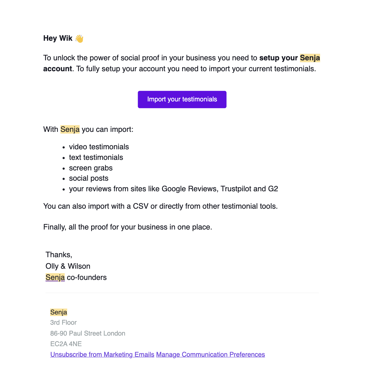
Emphasizes the importance of setting up the account to "unlock the power of social proof"
Provides a clear CTA to import existing testimonials
Lists various types of content that can be imported
Highlights the ability to import from multiple sources
Why they sent it: This email encourages users to fully set up their account by importing existing testimonials, increasing the likelihood of continued engagement with the platform.
Email 3: "Senja can transcribe your testimonial screen grabs"
Timing: Sent one day after the initial emails, introducing an advanced feature.
Content:
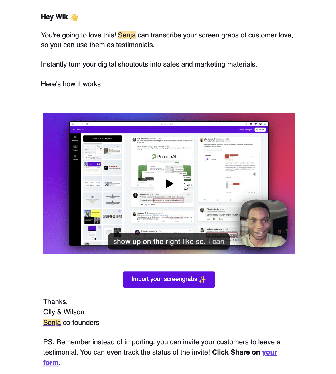
Introduces the screen grab transcription feature
Explains how this feature can turn digital shoutouts into marketing materials
Includes a visual demonstration of the feature
Provides a CTA to import screen grabs
Reminds users they can also invite customers to leave testimonials directly
Why they sent it: This email showcases a unique feature of Senja, aiming to increase perceived value and encourage deeper engagement with the platform.
Email 4: "It's not too late"
Timing: Sent three days after the previous email, targeting users who haven't taken action yet.
Content:
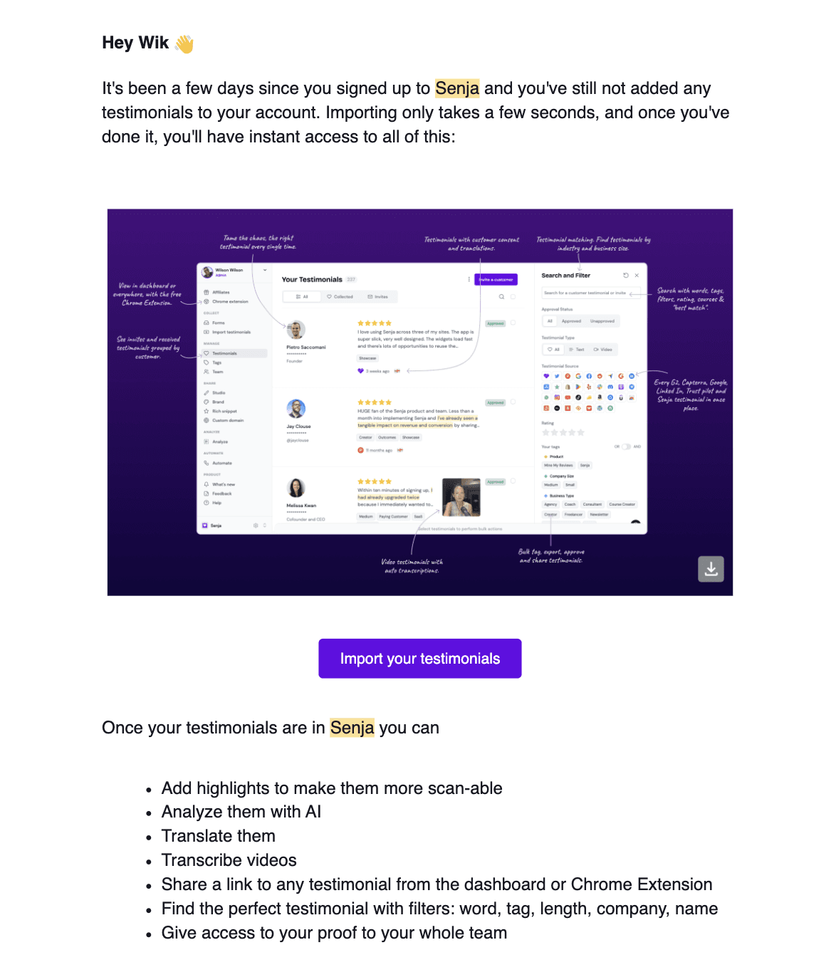
Reminds the user that they haven't added testimonials yet
Emphasizes the ease and speed of importing testimonials
Showcases the dashboard interface with a screenshot
Lists additional features available after importing testimonials
Includes a clear CTA to import testimonials
Why they sent it: This email serves as a gentle reminder and attempts to re-engage users who may have signed up but not taken any action, by highlighting the benefits and ease of use.
Email 5: "Video: how to import proof from 30 sources"
Timing: Sent about a week after the previous email, providing more detailed guidance.
Content:
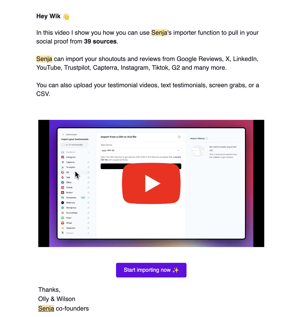
Introduces a video tutorial on using Senja's importer function
Mentions the ability to import from 39 different sources
Lists some of the major platforms Senja can import from
Reminds users of the various types of content they can import
Includes a video thumbnail and CTA to start importing
Why they sent it: This email aims to overcome any technical barriers users might have by providing a detailed tutorial, encouraging users who may have been hesitant to start importing their testimonials.
Overall Strategy and Effectiveness
Quick Start: Senja focuses on getting users to take action immediately by creating their first testimonial form on day one.
Feature Education: Each email introduces or reinforces key features of the platform, gradually building the user's understanding of Senja's capabilities.
Multiple Touchpoints: By sending five emails over a 10-day period, Senja maintains consistent communication without overwhelming the user.
Addressing Different User Behaviors: The sequence caters to both proactive users (with immediate setup instructions) and hesitant users (with reminders and additional guidance).
Clear CTAs: Each email has a distinct call-to-action, making it easy for users to take the next step.
Visual Aid: The use of screenshots and video tutorials helps users visualize the product and its benefits.
Personalization: Each email addresses the user by name, creating a more personalized experience.
Value Proposition: Throughout the sequence, Senja consistently reinforces the value of social proof and how their platform makes it easy to leverage this for business growth.
This onboarding sequence effectively guides users through the initial stages of using Senja, from creating their first form to importing existing testimonials and leveraging advanced features. The gradual introduction of features and consistent reminders help to keep users engaged and moving towards full adoption of the platform.
3. Todoist's Onboarding Sequences
Todoist is a popular task management and productivity app. Their onboarding email sequence showcases a unique approach to user engagement and activation. Let's analyze their strategy:
Overview of Todoist's Email Strategy
Before diving into specific emails, it's important to note that Todoist employs a high-frequency email strategy, sending daily emails to users. These often include a "daily digest" of tasks, creating a habit-forming interaction with the app. This approach is both a core feature and a key part of their onboarding and retention strategy.
Email 1: "What do you need to do today?"
Timing: Sent immediately after sign-up, encouraging immediate action.
Content:
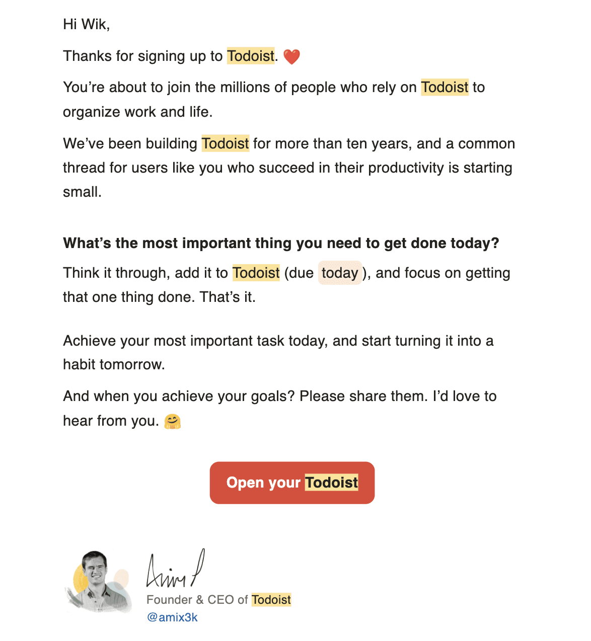
Welcomes the user to Todoist
Highlights the app's long-standing history and large user base
Encourages the user to add their most important task for the day
Provides clear instructions on how to add a task
Includes a personal touch from the founder
Why they sent it: This email aims to get users to take immediate action by adding their first task, demonstrating the core value of the product right away.
Email 2: "Wik's task(s) for Sep 13 2024 → 1 due, 1 overdue"
Timing: Sent the day after sign-up, continuing the daily engagement pattern.
Content:
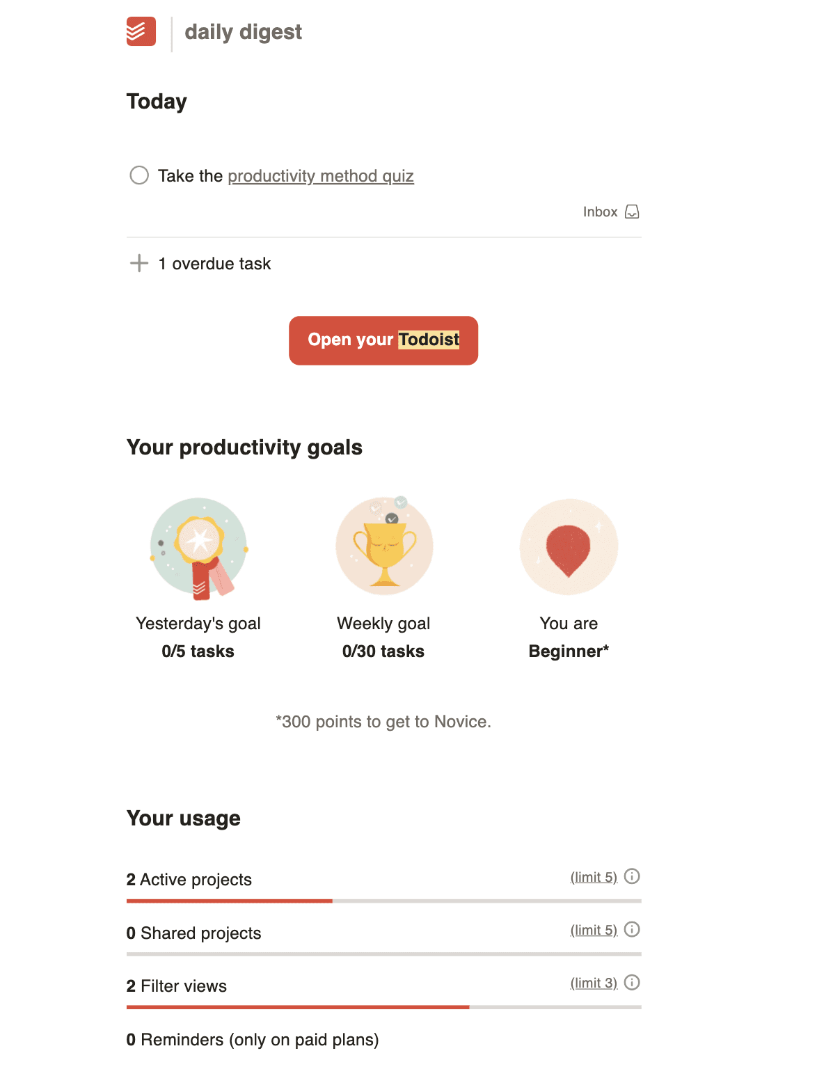
Provides a daily digest of tasks
Shows task status (due, overdue)
Includes a clear CTA to open Todoist
Why they sent it: This email establishes the daily check-in habit and reminds users of their pending tasks, encouraging regular app usage.
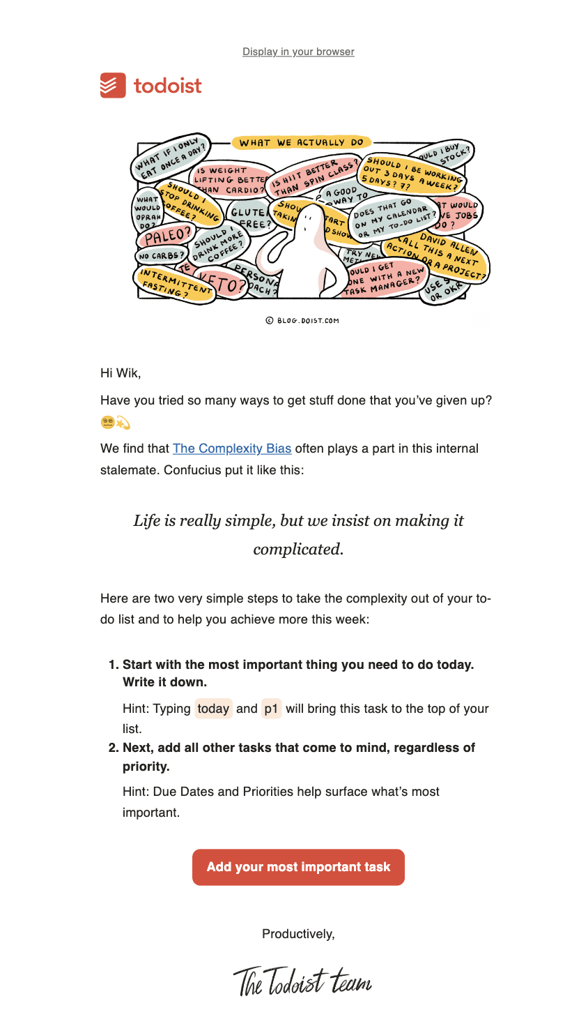
Email 3: "Solving the overwhelm"
Timing: Sent a few days after sign-up, addressing potential user challenges.
Content:
Acknowledges the common problem of feeling overwhelmed
Introduces the concept of "The Complexity Bias"
Provides simple, actionable steps to manage tasks effectively
Includes a motivational quote and a clear CTA
Why they sent it: This email aims to help users overcome common productivity hurdles, providing value beyond just task reminders and encouraging continued app usage.
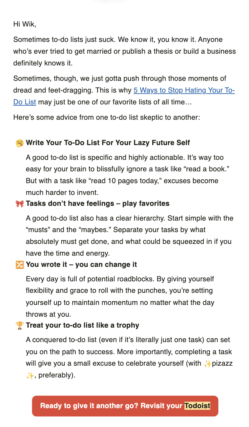
Email 4: "5 ways to stop hating your to-do list"
Timing: Sent about a week after sign-up, offering more advanced tips.
Content:
Acknowledges potential frustrations with to-do lists
Provides practical advice for effective list management
Includes multiple tips with explanations
Ends with a clear CTA to revisit Todoist
Why they sent it: This email aims to re-engage users who might be struggling with task management, offering solutions and encouraging them to give Todoist another try.
Overall Strategy and Effectiveness
High-Frequency Engagement: Todoist sends daily emails, often including task digests, which helps form a habit of checking tasks daily.
Humorous and Playful Tone: The emails use a conversational, often humorous tone, making productivity feel less daunting and more approachable.
Gamification Elements: The app incorporates gamification, such as productivity levels (e.g., "Beginner") and point systems, which are reflected in the emails.
Gradual Feature Introduction: While maintaining daily task reminders, they periodically introduce more advanced concepts and features.
Addressing Pain Points: Several emails focus on common productivity challenges, positioning Todoist as a solution.
Personalization: Emails are personalized with the user's name and their specific tasks.
Clear CTAs: Each email has a distinct call-to-action, usually to open Todoist and interact with tasks.
Founder Involvement: The initial email comes "from" the founder, adding a personal touch.
Todoist's onboarding sequence is notable for its high-touch, daily engagement approach. By sending frequent, varied content - from simple task reminders to productivity tips - they aim to quickly establish Todoist as an essential daily tool for users. The playful tone and gamification elements help to make task management feel more enjoyable, potentially increasing user engagement and retention.
This strategy may be particularly effective for users who benefit from frequent reminders and enjoy a more interactive relationship with their productivity tools. However, it's worth noting that this high-frequency approach might be overwhelming for some users, and Todoist likely offers options to adjust email frequency for those who prefer less frequent communication.
DocuSign's Onboarding Email Sequence Analysis
DocuSign is a leading e-signature and digital agreement cloud platform. Let's analyze their onboarding email sequence to understand their strategy for user activation and engagement.
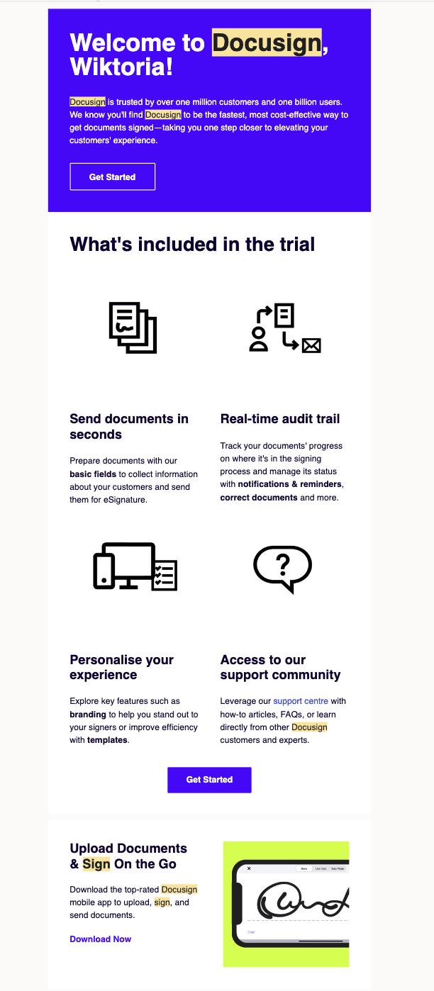
Email 1: "Get started with your DocuSign trial"
Timing: Sent immediately after sign-up, capitalizing on the user's initial interest.
Content:
Personalized welcome message
Social proof ("trusted by over one million customers and one billion users")
Value proposition highlighting speed and efficiency
Clear "Get Started" call-to-action (CTA)
Overview of trial features: Quick document sending, Personalization options
Why they sent it: This email aims to validate the user's decision to try DocuSign, highlight key features, and encourage immediate engagement with the platform.
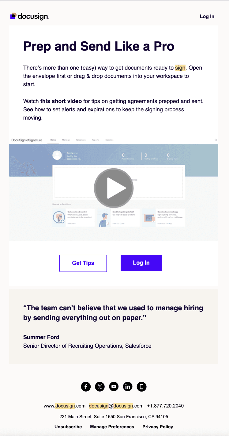
Email 2: "Tips for prepping documents"
Timing: Sent one day after the welcome email, providing guidance for new users.
Content:
Headline: "Prep and Send Like a Pro"
Multiple methods to prepare documents for signing
Short video tutorial offer
Tips on setting alerts and expirations
Clear CTAs: "Get Tips" and "Log In"
Customer testimonial
Why they sent it: This email aims to educate users on best practices, making it easier for them to start using the platform effectively and showcasing its versatility.
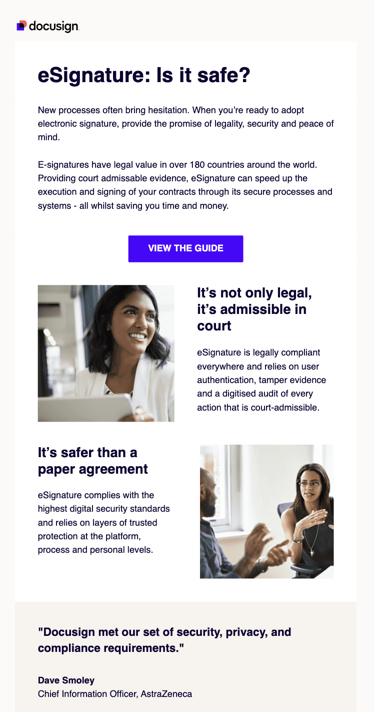
Email 3: "In case you were wondering.."
Timing: Sent three days after sign-up, addressing potential concerns about e-signatures.
Content:
Headline: "eSignature: Is it safe?"
Reassurance about the legality and security of e-signatures
Information on global legal validity
Emphasis on court-admissible evidence
Comparison to traditional paper agreements
Customer testimonial from a major company (AstraZeneca)
Why they sent it: This email aims to overcome potential hesitations about adopting e-signatures by addressing security and legal concerns, positioning DocuSign as a trusted, compliant solution.
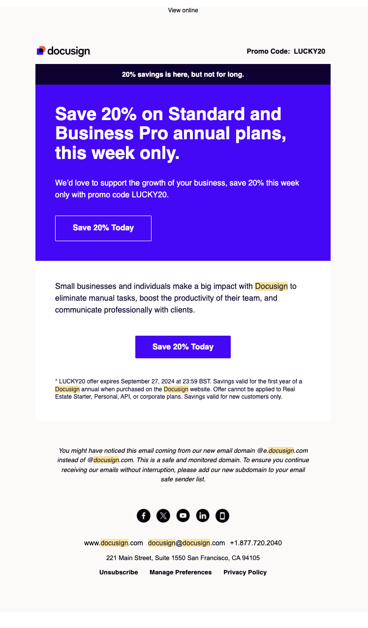
Email 4: "Our gift to you: Save on DocuSign"
Timing: Sent about 11 days after sign-up, likely near the end of a free trial period.
Content:
Limited-time discount offer (20% off)
Emphasis on urgency ("this week only")
Clear value proposition for small businesses and individuals
Multiple CTAs to "Save 20% Today"
Promo code and offer details
Information about a new email domain
Why they sent it: This email aims to convert trial users into paying customers by offering a time-limited discount, creating urgency, and reinforcing the value of DocuSign for businesses.
Overall Strategy and Effectiveness
Gradual Information Delivery: DocuSign starts with a broad overview, then moves to specific usage tips, addresses potential concerns, and finally presents a conversion offer.
Educational Focus: The sequence emphasizes learning and best practices, helping users become proficient with the platform.
Trust Building: DocuSign heavily emphasizes the safety, legality, and widespread acceptance of their e-signature solution.
Social Proof: The use of statistics and customer testimonials from well-known companies reinforces DocuSign's credibility.
Clear Value Proposition: Each email reinforces the benefits of using DocuSign, particularly for businesses.
Conversion-Oriented: The sequence culminates in a direct sales offer, aiming to convert trial users into paying customers.
Multi-Channel Approach: The emails promote both web and mobile app usage, catering to different user preferences.
Visual Elements: The use of images, videos, and well-designed email layouts enhances the overall user experience.
DocuSign's onboarding sequence effectively guides users from initial interest to potential conversion. It addresses key aspects of the user journey, including initial activation, education, trust-building, and ultimately, sales conversion. The sequence is well-timed, with emails spaced out to maintain engagement without overwhelming the user.
The strategy seems particularly effective for businesses and professionals who may be new to e-signatures and need reassurance about their validity and security. By addressing these concerns head-on and providing educational content, DocuSign positions itself as a knowledgeable, trustworthy partner in digital document management.
Conclusion
As we've seen through the analysis of Calendly, Senja, Todoist and Docusign, effective onboarding email sequences are tailored to each product's unique value proposition and target audience.
While their approaches differ in frequency, tone and specific content, all four companies focus quickly demonstrating their product's value, educating users on key features, and guiding them towards full adoption.
By studying these successful strategies, SaaS companies can craft their own onboarding sequences that engage users, drive product adoption and ultimately convert free trials into loyal paying customers.


