
Reducing Signup Friction in SaaS: A Comprehensive Guide

by
Wiktoria Slowikowska
Sep 26, 2024
Identify and convert your most valuable users
Sign Up
Reducing signup friction is crucial for SaaS companies aiming to enhance user experience and improve conversion rates. A smooth signup process not only attracts new users but also keeps them engaged.
This article explores various strategies and best practices to create an easy and effective signup flow, ensuring that potential customers can start using the product without unnecessary hurdles.
Key Takeaways
A seamless signup process boosts user satisfaction and retention.
Minimizing data requests at the start can prevent user drop-off.
Using social media accounts for signup can save time and reduce friction.
Clearly explaining the benefits of signing up encourages users to complete the process.
Regularly gathering user feedback helps refine and improve the signup experience.
Importance of Reducing Signup Friction in SaaS
Why Signup Friction Matters
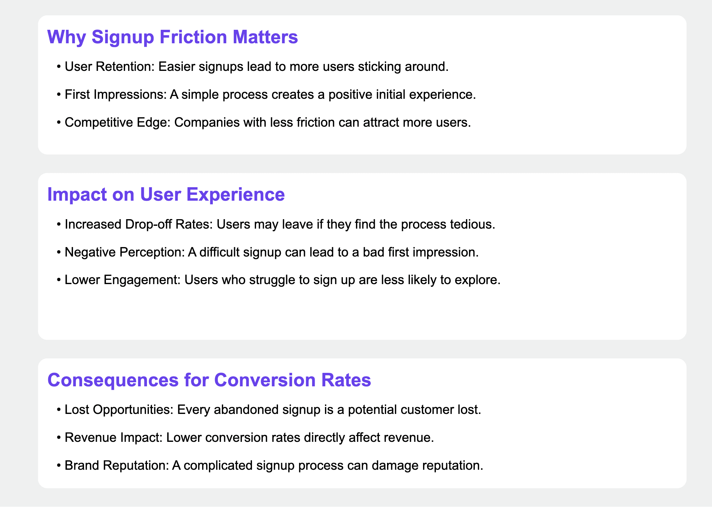
Reducing signup friction is crucial for SaaS companies. A smooth signup process can lead to higher user engagement and satisfaction. When users face too many hurdles, they may abandon the signup altogether. Here are some reasons why minimizing friction is essential:
User Retention: Easier signups lead to more users sticking around.
First Impressions: A simple process creates a positive initial experience.
Competitive Edge: Companies with less friction can attract more users than those with complicated processes.
Impact on User Experience
The user experience is directly affected by how easy or hard it is to sign up. A complicated signup can frustrate potential customers. Here's how it impacts users:
Increased Drop-off Rates: Users may leave if they find the process tedious. A complex or lengthy signup form can cause immediate abandonment, with users closing the tab or navigating away from the site. Even those who start the process might quit halfway through if they encounter too many fields or confusing questions.
Negative Perception: A difficult signup can lead to a bad first impression of the product. Users often assume that if the signup process is challenging, the product itself might be equally difficult to use. This perception can significantly impact the brand image and deter users from even trying the product.
Lower Engagement: Users who struggle to sign up are less likely to explore the product further. The initial enthusiasm that brought them to the product can quickly dissipate if they face obstacles during signup. This diminished excitement often carries over into their product usage, resulting in limited feature exploration and potentially shorter trial periods for those offering free trials.
Consequences for Conversion Rates
High signup friction can significantly hurt conversion rates. If users find it hard to sign up, they are less likely to become paying customers. Consider these points:
Lost Opportunities: Every abandoned signup is a potential customer lost.
Revenue Impact: Lower conversion rates directly affect revenue.
Brand Reputation: A complicated signup process can damage a brand's reputation.
In summary, reducing signup friction is not just about making things easier; it's about creating a better experience that leads to higher conversion rates and satisfied users.
Simplifying your SaaS onboarding process and reducing friction is critical to ensuring users can easily complete the necessary steps. By focusing on these aspects, SaaS companies can improve their overall performance and user satisfaction.
Best Practices for Creating a Frictionless Signup Flow
Minimizing Data Collection
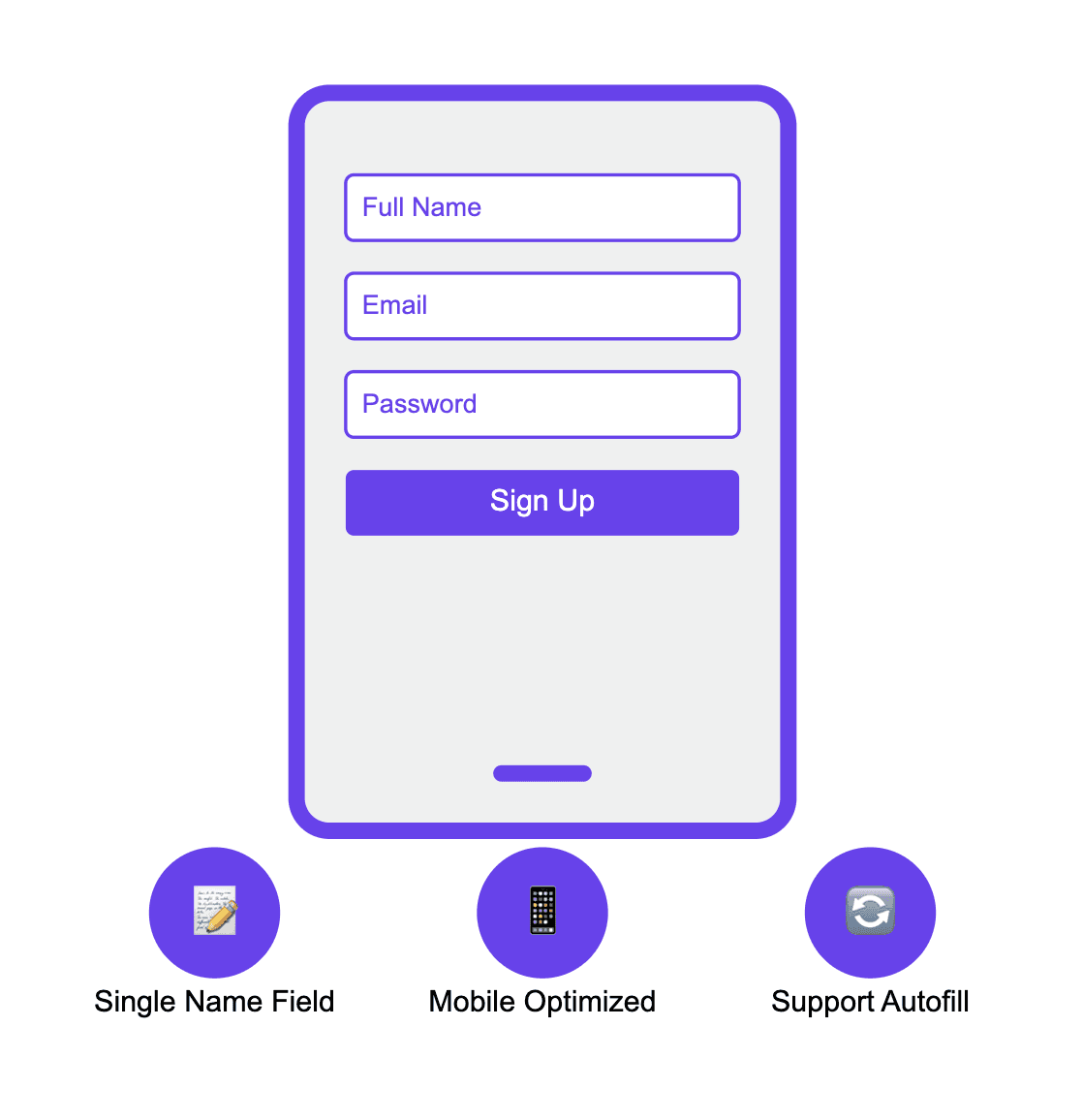
To create a smooth signup experience, it's essential to minimize the amount of data you ask for. Here are some tips:
Use a single field for names instead of separate first and last names.
Optimize forms for mobile devices to ensure they fit well on screens.
Support autofill to save users time when entering common information.
Using Single Sign-On Options
Offering multiple signup options can significantly reduce friction. Consider these methods:
Allow users to sign up using social media accounts like Facebook or Google.
Provide an option for Apple sign-in to enhance privacy.
Make sure to explain the benefits of using these options clearly.
Avoiding Unnecessary Fields
Every extra field can lead to user drop-off. To keep your signup flow effective:
Limit the number of fields to only what is necessary.
Avoid asking for work emails unless absolutely required.
Clearly differentiate between signup and sign-in to avoid confusion.
A smooth signup process can lead to higher conversion rates and better user satisfaction. By focusing on reducing friction, you can create a more engaging experience for your users.
Signup Methods to Reduce Friction
Lazy Registration
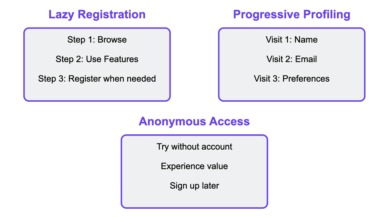
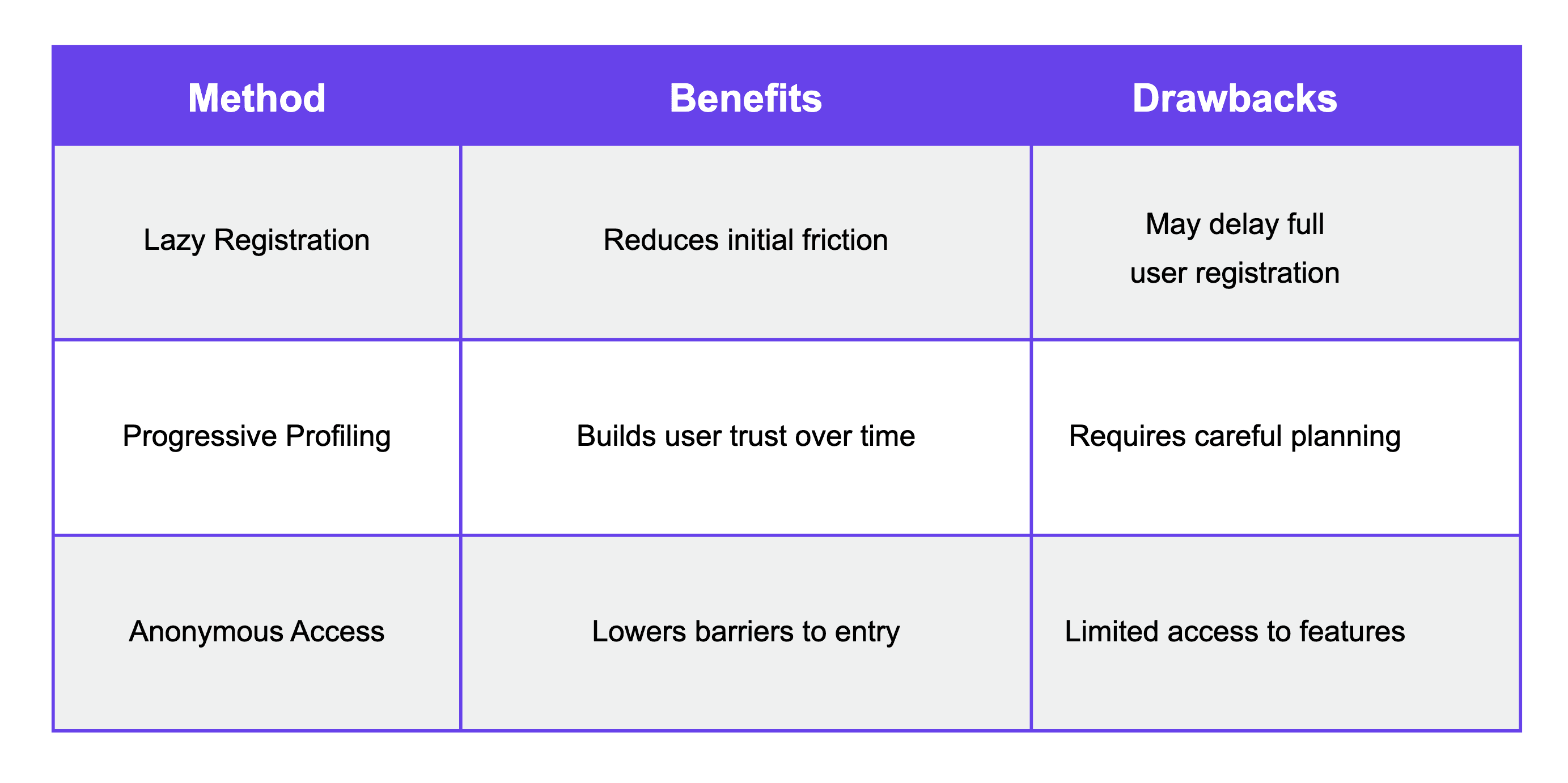
Lazy registration allows users to sign up gradually as they explore your product. Instead of asking for all information upfront, you collect data only when it's needed. This method makes the process feel less overwhelming and more natural. Users appreciate this seamless experience.
Progressive Profiling
With progressive profiling, you gather user information over time rather than all at once. For example, you might ask for a name during the first visit and then request more details later as users engage with your service. This approach helps in building a relationship without causing frustration.
Anonymous Access
Offering anonymous access lets potential users try your service without creating an account. This way, they can experience the benefits of your product first-hand. Once they see the value, they may be more willing to sign up later.
Implementing these innovative methods can significantly enhance user experience and reduce signup friction. Frictionless sign-up processes lead to higher conversion rates.
Designing an Effective Signup Page
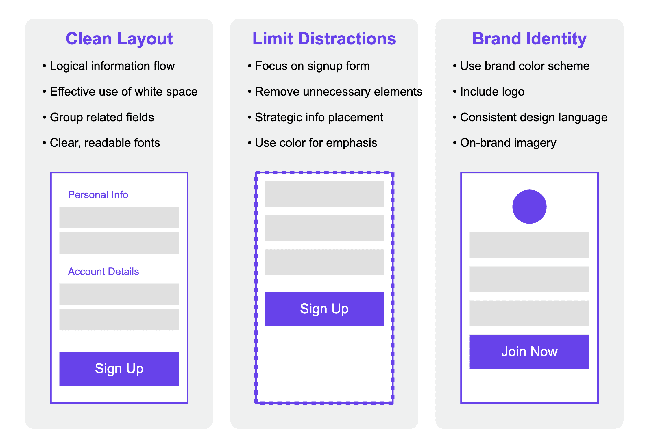
Creating a smooth signup page is crucial for attracting users. A well-designed page can significantly boost conversions. Here are some key elements to consider:
Compelling and Concise Design
Use a clean layout that is easy to navigate.
Employ a logical flow of information, guiding the user's eye from top to bottom or left to right.
Utilize white space effectively to prevent the page from feeling cluttered or overwhelming.
Group related fields together (e.g., name and email in one section, password creation in another) to create visual hierarchy.
Use clear, readable fonts and appropriate font sizes to ensure all text is easily legible across devices.
Limit distractions by keeping the focus on the signup form.
Remove unnecessary elements such as complex navigation menus or unrelated content.
If including additional information (like benefits or testimonials), position it strategically so it doesn't compete with the form for attention.
Use color and contrast to make the signup form stand out from the rest of the page.
Implement a single-column layout for the form fields to maintain a clear, linear progression.
Ensure that the design aligns with your brand identity.
Incorporate your brand's color scheme, but use it judiciously to highlight important elements rather than overwhelm the user.
Include your logo in a prominent but not distracting position to reinforce brand recognition.
Maintain consistency with your website's overall design language, including button styles, form field appearance, and typography.
Use imagery or illustrations that resonate with your brand's personality and appeal to your target audience.
By focusing on these design elements, you create a signup page that not only looks professional and trustworthy but also guides users smoothly through the registration process. This thoughtful design approach can significantly improve user experience and increase the likelihood of successful signups.
Highlighting Benefits
Clearly state what users will gain by signing up. Use bullet points to outline key features or advantages:
Quick access to tools.
Personalized experience.
Ongoing support and resources.
Using Informative Microcopy
Provide helpful hints next to form fields to guide users.
Use friendly language to make the process feel welcoming.
Include real-time feedback to inform users about their input, such as green checkmarks for valid or clear error messages for corrections entries.
A simple and engaging signup page can turn visitors into loyal users.
By focusing on these aspects, you can create a signup page that not only attracts users but also encourages them to complete the registration process. Remember, the goal is to make the experience as frictionless as possible, ensuring that potential customers feel confident and excited to join your platform.
Common Pitfalls and How to Avoid Them
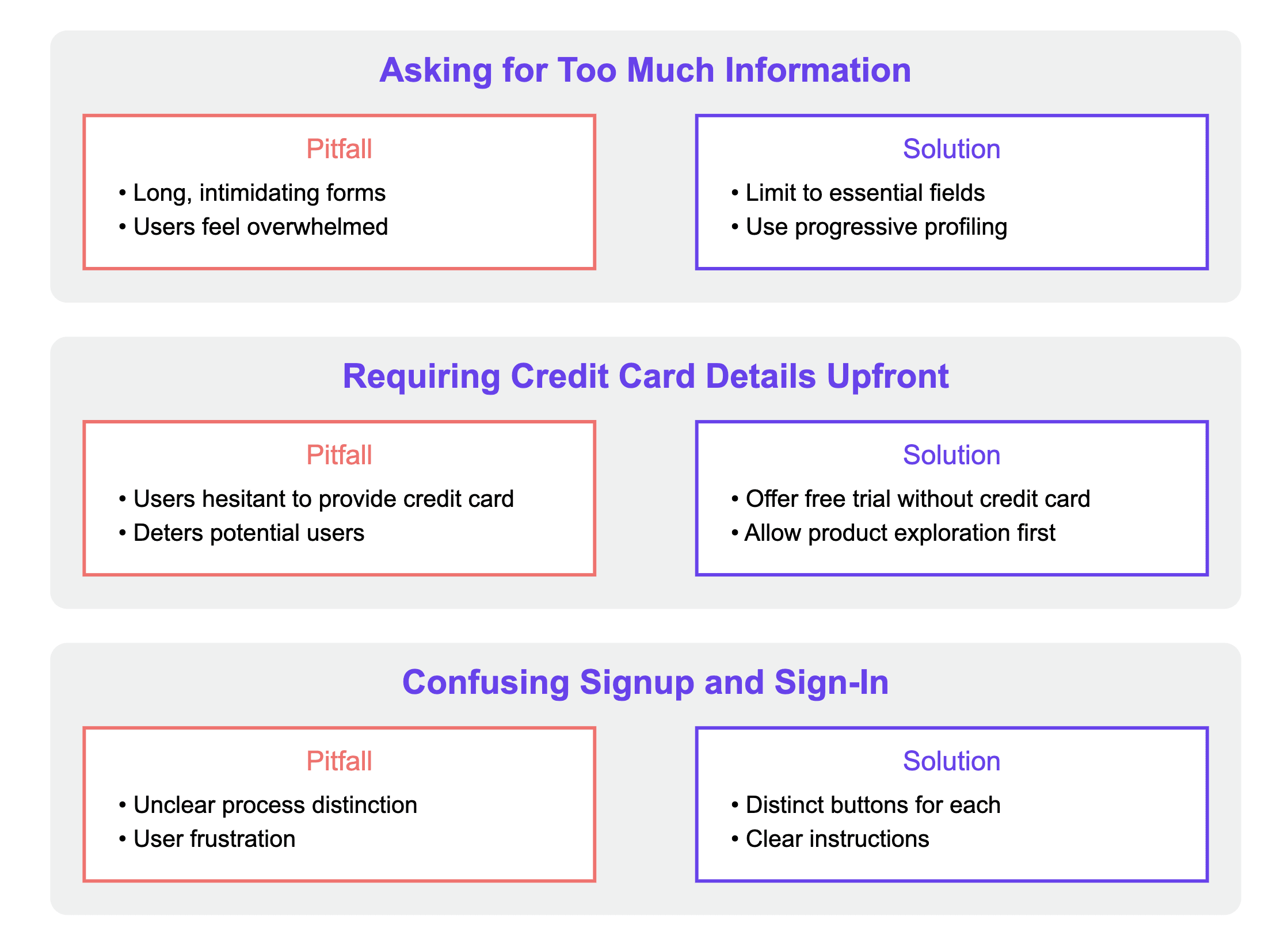
Asking for Too Much Information
When users are asked to provide too much information during signup, they may feel overwhelmed and abandon the process. To avoid this:
Limit the number of fields to only essential information.
Use progressive profiling to gather more data over time.
Clearly explain why each piece of information is needed.
Requiring Credit Card Details Upfront
Asking for credit card information right away can deter potential users. Instead:
Offer a free trial without requiring payment details.
Allow users to explore the product before asking for payment.
Clearly communicate the value they will receive before asking for payment information.
Confusing Signup and Sign-In
Mixing up the signup and sign-in processes can lead to frustration. To clarify:
Use distinct buttons for signing up and signing in.
Provide clear instructions for each process.
Ensure that users can easily navigate back to the signup page if they mistakenly land on the sign-in page.
Reducing friction in the signup process is crucial for improving user experience and increasing conversion rates. By addressing these common pitfalls, you can create a smoother onboarding experience for your users.
User Feedback to Improve Signup Flows
Collecting User Feedback
Gathering user feedback is essential for understanding how your signup process is performing. Here are some effective methods to collect insights:
Surveys: Ask users about their experience after they complete or abandon the signup process.
Interviews: Conduct one-on-one interviews to dive deeper into user frustrations and suggestions.
Analytics: Use tools to track where users drop off in the signup flow.
Implementing Changes Based on Feedback
Once you have collected feedback, it's time to make improvements. Consider these steps:
Analyze the data: Look for common themes in user feedback.
Prioritize changes: Focus on the most impactful changes first.
Test new features: Implement changes and monitor their effects on user behavior.
Continuous Testing and Optimization
Improving your signup flow is an ongoing process. Here's how to keep refining it:
A/B Testing: Regularly test different versions of your signup page to see which performs better.
User Sessions: Observe real users as they navigate your signup process to identify pain points.
Feedback Loops: Create a system for ongoing feedback collection to stay updated on user needs.
User feedback is a powerful tool for enhancing your signup flow. By listening to your users, you can create a smoother experience that encourages more signups and reduces drop-offs.
By leveraging user feedback effectively, you can create a signup process that not only meets user expectations but also drives higher conversion rates. Understanding user needs is key to reducing friction in your SaaS signup flow.
Successful SaaS Signup Flows
Dropbox employs a minimalist design in their signup flow, focusing on simplicity and ease of use. They offer social login options, allowing users to sign up quickly using their existing accounts from platforms like Google or Apple. This approach simplifies the process and reduces the effort required from the user.
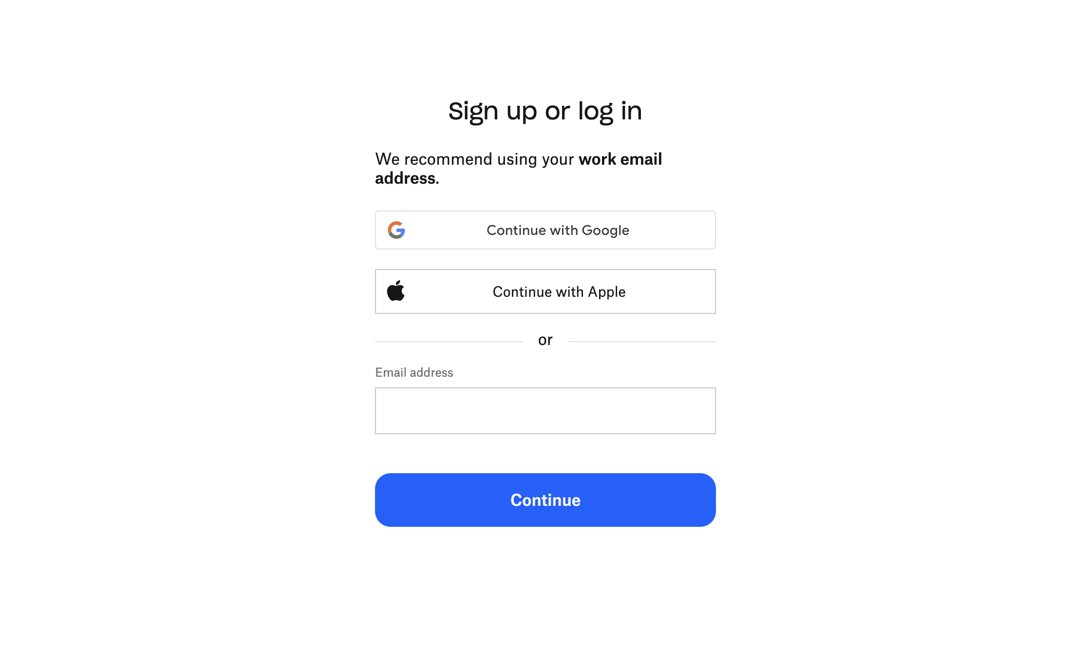
Key Features:
Minimalist design
Social login options
Trello takes a unique approach by using a single-field signup form. Initially, they only ask for an email address, allowing users to start using the product almost immediately. This low-barrier entry point significantly reduces friction and encourages users to explore the platform before committing to a full account setup.
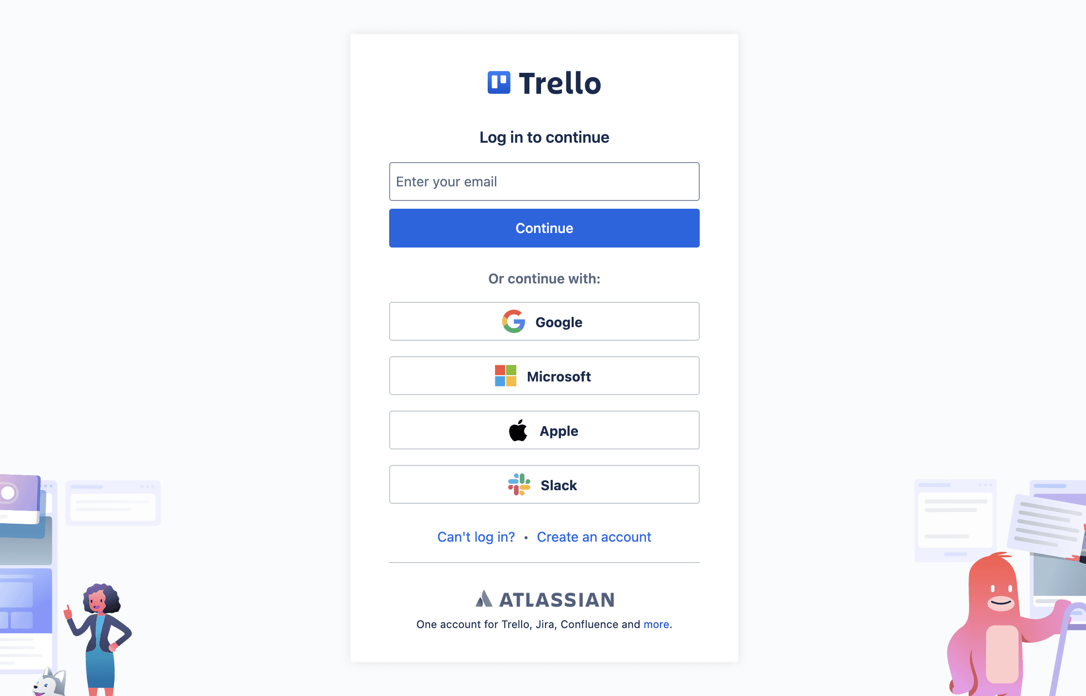
Key Features:
Single-field signup form
Immediate product access
Conclusion
In summary, making the sign-up process easier for users is crucial for any SaaS business. By using methods like lazy registration, companies can collect information gradually as users explore the product. This way, users feel less pressure and can enjoy the experience more
Asking for too much data upfront can scare potential customers away. By following best practices like simplifying forms, avoiding unnecessary email requests, and providing clear benefits, businesses can create a welcoming environment.
Ultimately, a frictionless sign-up process not only helps attract users but also keeps them engaged and satisfied.
Frequently Asked Questions
What is signup friction in SaaS? Signup friction refers to the obstacles that make it harder for users to create an account in a Software as a Service (SaaS) application. This can include too many required fields or confusing instructions.
Why is it important to reduce signup friction? Reducing signup friction is crucial because it helps to improve user experience and increases the chances that visitors will complete the signup process.
What are some best practices for a smooth signup process? Best practices include minimizing the amount of information needed upfront, offering social media sign-in options, and keeping the signup form simple.
What is lazy registration? Lazy registration allows users to sign up gradually as they use the product, rather than requiring all information upfront. This can make the process feel less overwhelming.
How can user feedback help improve signup flows? Collecting user feedback can highlight areas where users struggle during signup, allowing you to make changes that enhance their experience.


