Landing Page Conversion in SaaS: Proven Strategies+ Examples

by
Wiktoria Slowikowska
Oct 2, 2024
Identify and convert your most valuable users

Sign Up
Your landing page is often the first point of contact for potential customers. A well-optimized landing page can significantly improve your conversion rates, leading to more sign-ups, free trials, and ultimately, paying customers. But what makes a SaaS landing page convert effectively?
In this blog post, we’ll explore essential strategies and best practices for creating high-converting SaaS landing pages.
The Difference Between Home Page and Landing Page

Home Page: The home page acts as the main entry point for a SaaS website, providing an overview of the brand and its offerings. It features multiple sections highlighting product features, benefits, testimonials, and pricing plans, engaging a diverse audience, including potential customers and existing users. The layout emphasizes branding and includes various calls-to-action (CTAs) to guide visitors to different areas of the site, such as blogs, support resources, or product demos.
Landing Page: In contrast, a landing page is designed with a singular goal—prompting the visitor to take a specific action, like signing up for a free trial or downloading a resource. It features a focused message with a concise title and clear value proposition, minimizing distractions by often removing navigation options. A well-crafted landing page includes persuasive copy, social proof, and a compelling call-to-action (CTA), optimizing conversion rates by targeting visitors interested in a specific offer.
1. The Power of a Clear Value Proposition
Your SaaS landing page should immediately communicate its value proposition — what your software offers and why it matters. This message should be clear, concise, and compelling. Ideally, the value proposition is above the fold, meaning it's visible without the user needing to scroll.
Tips for a Strong Value Proposition:
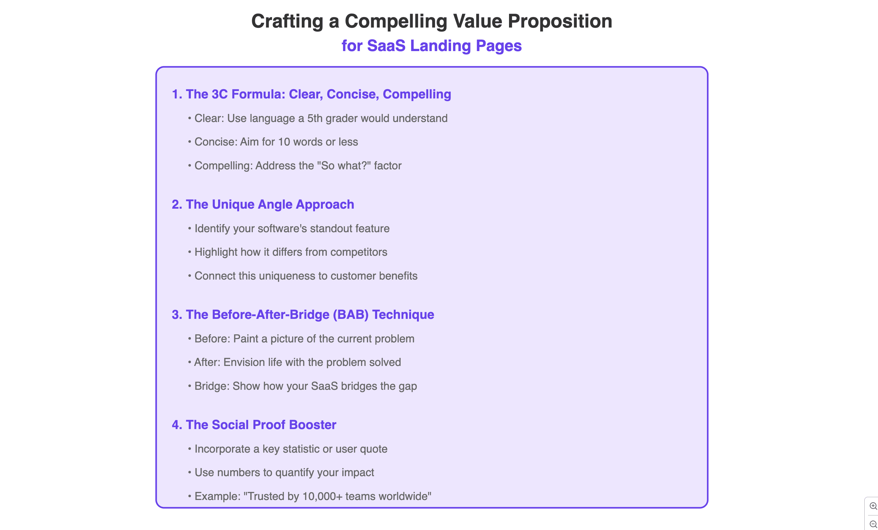
Use simple, direct language that highlights the key benefits.
Clear and straightforward language helps ensure your value proposition is easily understood by your target audience. Avoid jargon and complex terminology to make the benefits of your software accessible to all potential users, allowing them to quickly grasp the advantages of your solution.
Focus on how your software solves a problem or meets a need.
Identify the specific challenges your target customers face and demonstrate how your software effectively addresses those issues. This approach not only resonates with potential users but also positions your product as a necessary tool for overcoming their obstacles, making it more appealing.
Include specific outcomes (e.g., “Increase productivity by 50% in 30 days”).
Providing concrete, quantifiable results gives potential customers a clear expectation of what they can achieve with your software. This kind of specificity builds credibility and motivates prospects to take action, as they can envision the tangible benefits your solution offers.
Example: “Unlock smarter team collaboration with our all-in-one project management software.”
2. Minimalistic Design and Focused Layout
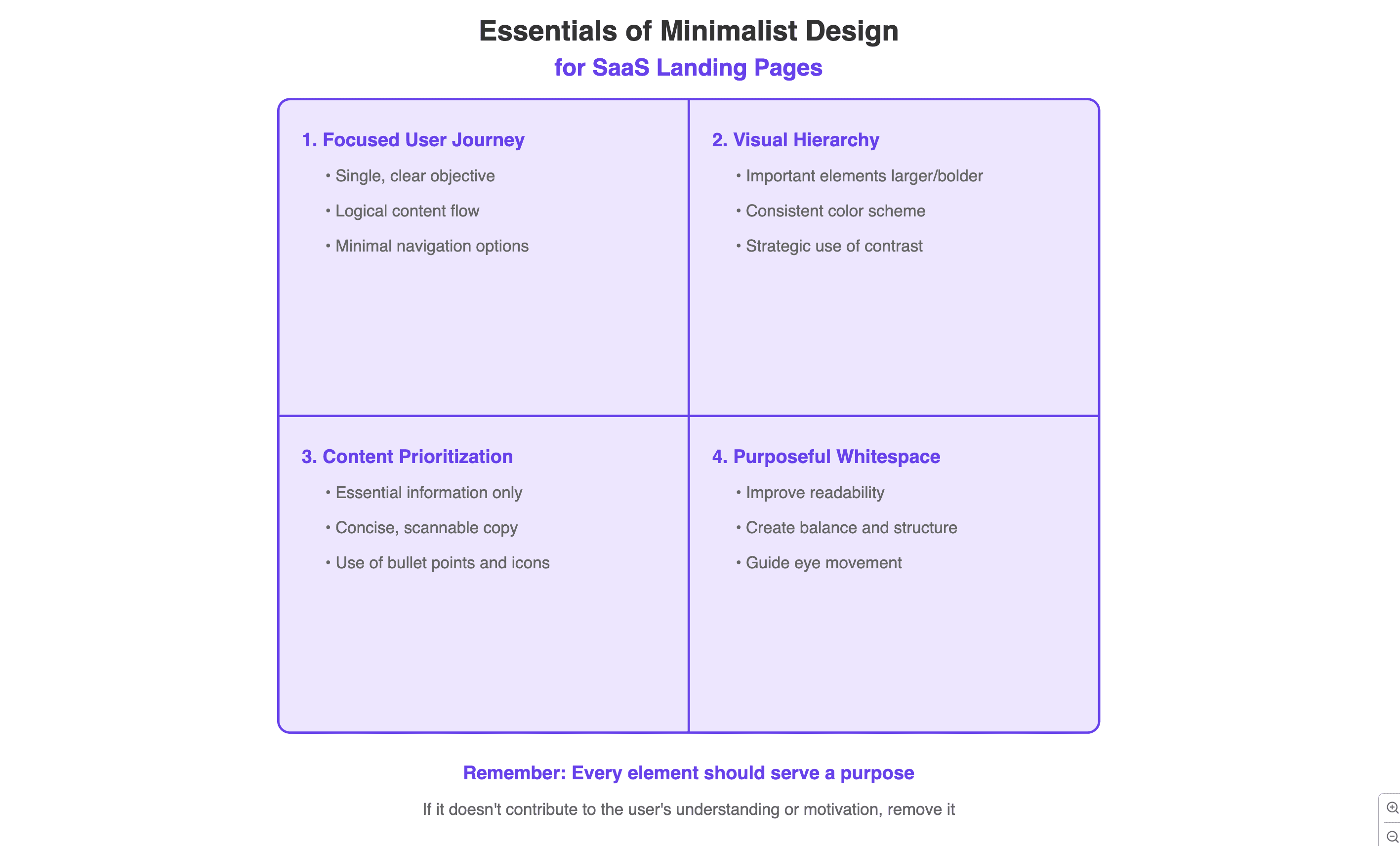
SaaS landing pages need to be clean and distraction-free. Your design should guide users' attention to the conversion goal, whether it’s signing up for a free trial or requesting a demo.
Key Elements:
Limit the number of visual distractions like unnecessary images or multiple CTAs (Calls to Action).
A cluttered landing page can overwhelm visitors and dilute your core message, making it difficult for them to focus on what truly matters. By minimizing distractions and limiting the number of calls to action, you create a more streamlined experience that guides users toward your desired outcome.
Use whitespace effectively to highlight important content, such as your headline, features, and CTA.
Whitespace, or negative space, plays a crucial role in creating a visually appealing layout that enhances readability and comprehension. By strategically using whitespace, you can draw attention to key elements of your landing page, ensuring that essential information stands out and is easily digestible for your audience.
Ensure that your CTA is the most prominent element on the page.
Your call to action should stand out visually through size, color, or placement, making it the focal point of your landing page. By ensuring your CTA is prominent, you increase the likelihood that visitors will notice it and take the desired action, whether that’s signing up for a trial, downloading a resource, or making a purchase.
3. Social Proof: Building Trust with Testimonials and Reviews
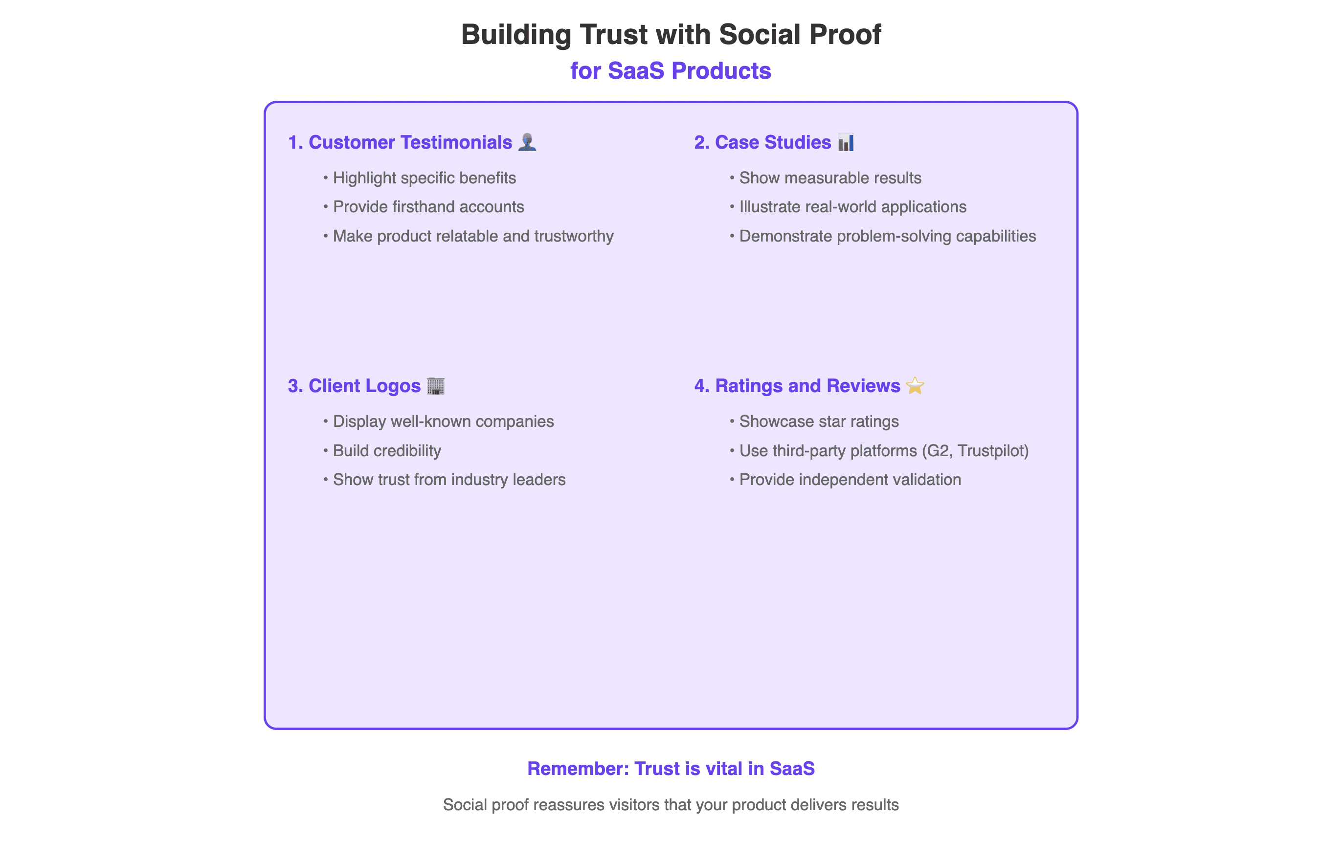
Trust is vital in SaaS, especially since customers often invest long-term in software solutions. Social proof, such as customer reviews, case studies, and testimonials, can reassure visitors that your product delivers results.
Effective Social Proof Examples:
Customer testimonials that highlight specific benefits.
Authentic testimonials from satisfied customers provide firsthand accounts of how your software has positively impacted their experience, making it relatable and trustworthy for potential users.
Case studies showing measurable results.
Detailed case studies illustrate real-world applications of your software, showcasing quantifiable results that demonstrate its effectiveness in solving specific problems for your customers.
Logos of well-known companies that use your software.
Displaying logos of reputable brands that endorse your product not only builds credibility but also assures potential customers that your software is trusted by industry leaders.
Star ratings or reviews from platforms like G2 or Trustpilot.
Ratings and reviews from third-party review sites serve as independent validation of your software's quality, providing potential users with confidence in their decision to engage with your product based on collective feedback from peers.
Example: “Trusted by over 10,000 teams at companies like Google, Microsoft, and Spotify.”
4. Clear and Compelling Call to Action (CTA)
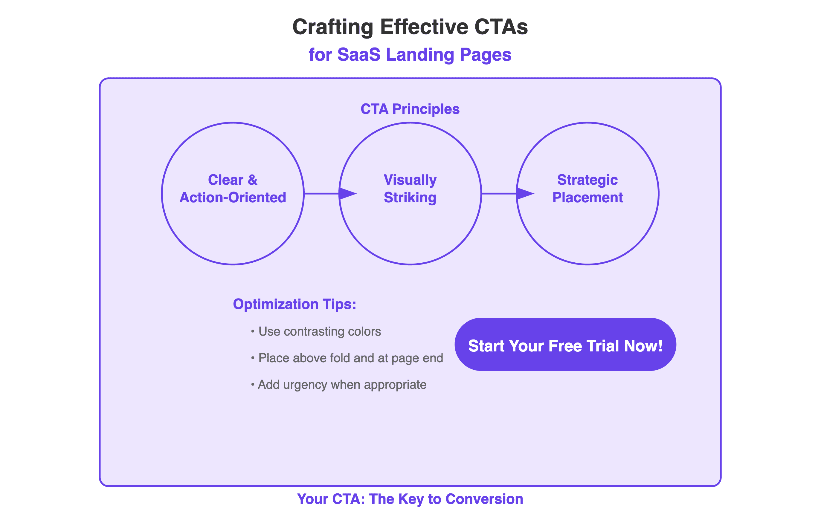
Your CTA should be straightforward and action-oriented. Avoid vague CTAs like “Learn More” and instead, opt for action-driven language like “Start Free Trial” or “Get Started.” The CTA button should stand out visually and be placed strategically throughout the page.
CTA Optimization Tips:
Use bright, contrasting colors that draw attention.
Place the CTA above the fold and at the end of the page.
Add urgency where appropriate (e.g., “Start Your Free 14-Day Trial Today”).
5. Offer a Free Trial or Demo
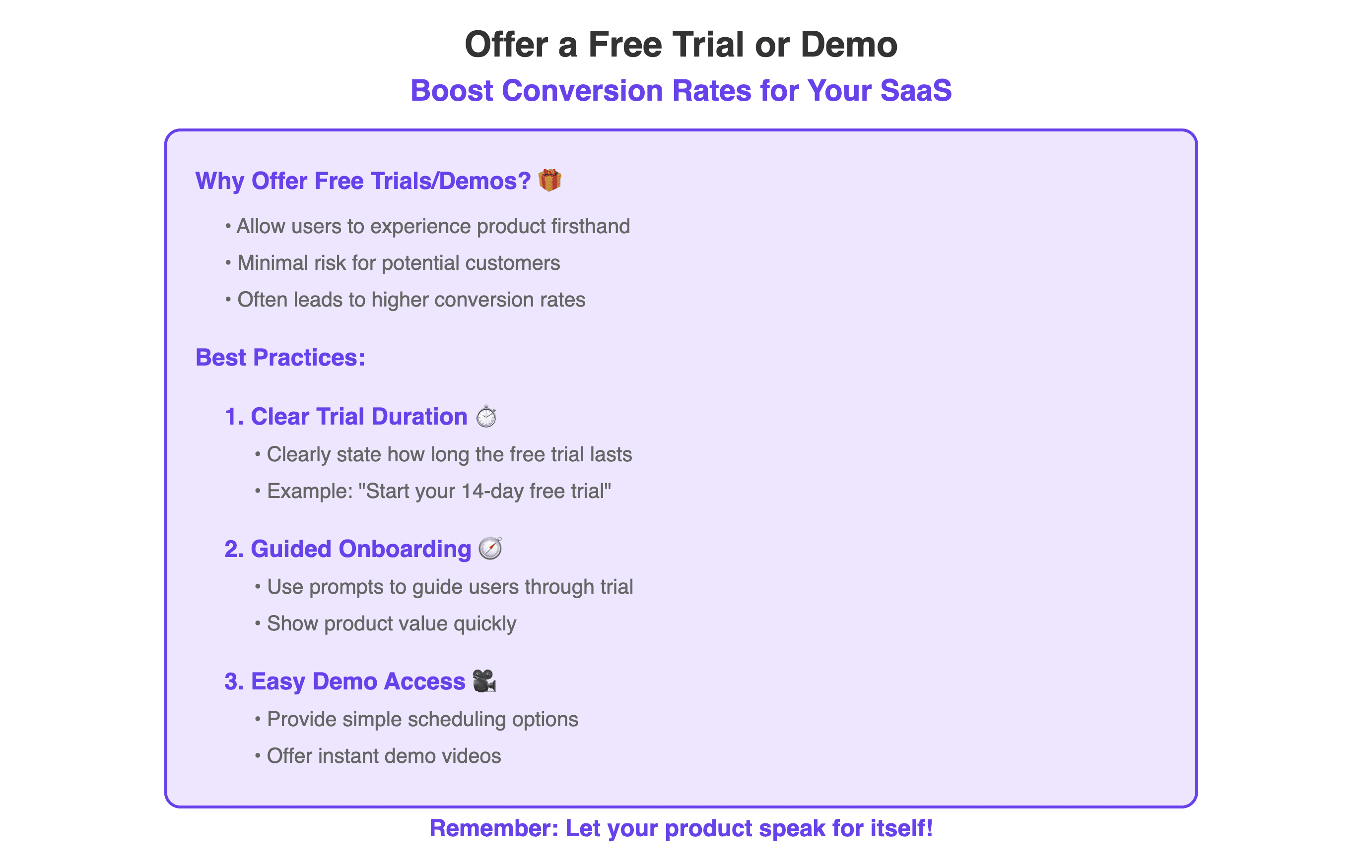
In SaaS, giving users a chance to experience the product firsthand often leads to higher conversion rates. Offering a free trial or a live demo allows potential customers to test your software’s value with minimal risk.
Best Practices for Free Trials/Demos:
Clearly state how long the free trial lasts.
Use onboarding prompts to guide users through the trial and show value quickly.
For demos, provide easy scheduling options or instant demo videos.
6. Highlight Key Features and Benefits
List out the features of your SaaS product that directly address your target audience's pain points. Focus on the benefits these features provide and how they can improve the user’s workflow.
Feature Section Tips:
Use short descriptions, icons, or images to make the section visually engaging.
Highlight 3-5 core features that solve the primary challenges of your audience.
Example: “Automated reporting saves you hours each week.”
7. Mobile Optimization: Don't Neglect Mobile Users
A significant portion of users will access your SaaS landing page from mobile devices. Ensure your landing page is fully responsive and delivers a smooth experience on all devices.
Mobile-Friendly Features:
Fast-loading pages (optimize for speed by compressing images and minimizing code).
Large, tappable CTA buttons that are easy to click on mobile.
Responsive layout and text that adapt to smaller screens.
8. A/B Testing and Continuous Optimization
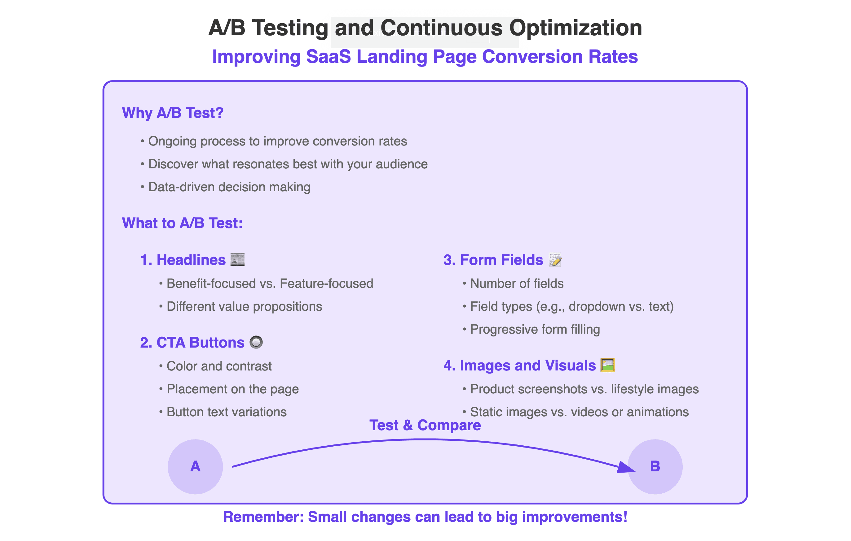
Improving landing page conversion rates is an ongoing process. Regularly test different elements of your page — from headlines and images to CTAs and form lengths — to see what resonates best with your audience.
What to A/B Test:
Headline variations (e.g., benefit-focused vs. feature-focused).
CTA button color, placement, and wording.
Length of form fields (shorter forms generally have higher conversions).
Different images or hero shots of your product in action.
9. Speed and Performance: Ensure Fast Load Times
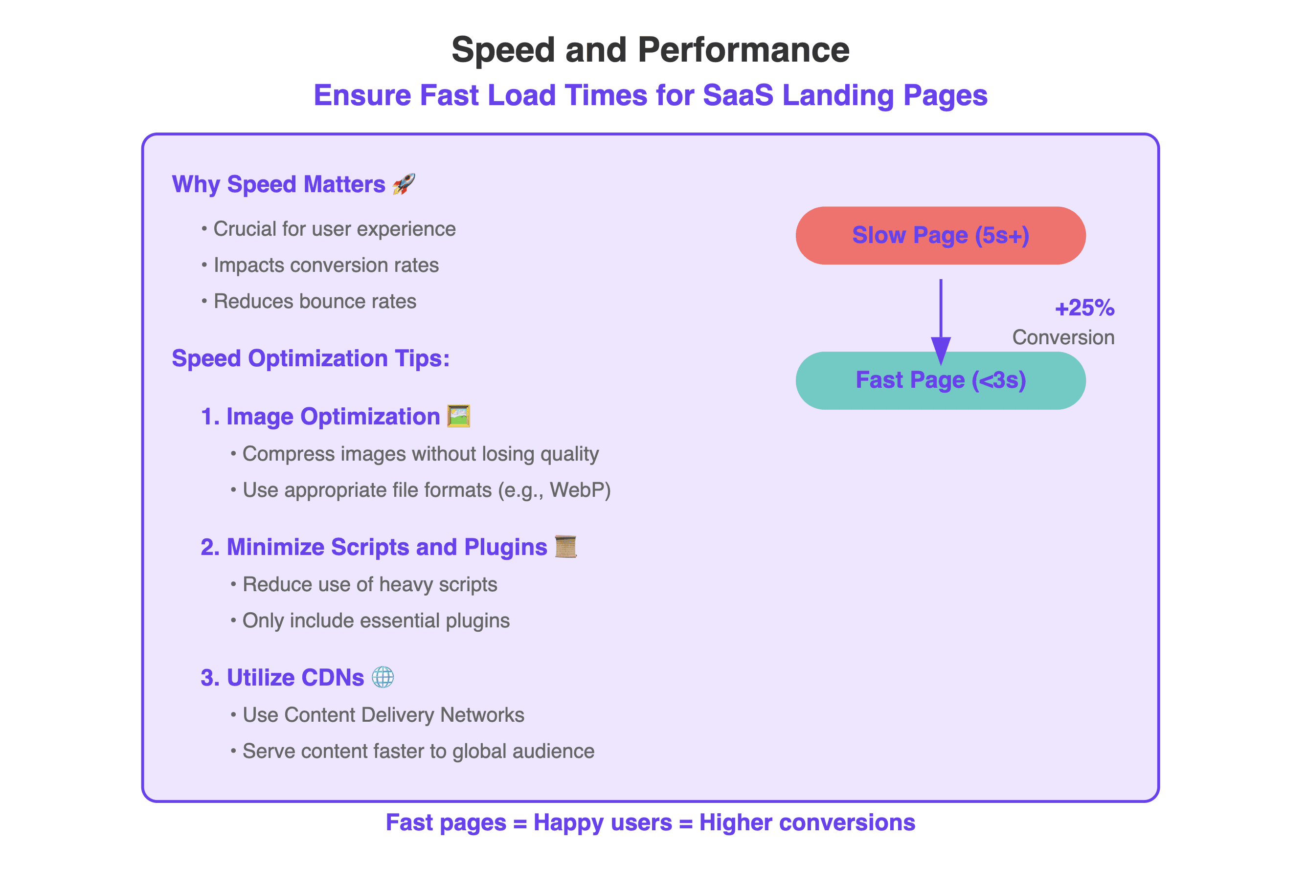
Page speed plays a crucial role in both user experience and conversion rates. If your landing page is slow to load, visitors are more likely to bounce before engaging with the content.
Speed Optimization Tips:
Compress images without losing quality.
Minimize the use of heavy scripts and plugins.
Utilize Content Delivery Networks (CDNs) to serve content faster.
10. Use Exit-Intent Popups Wisely
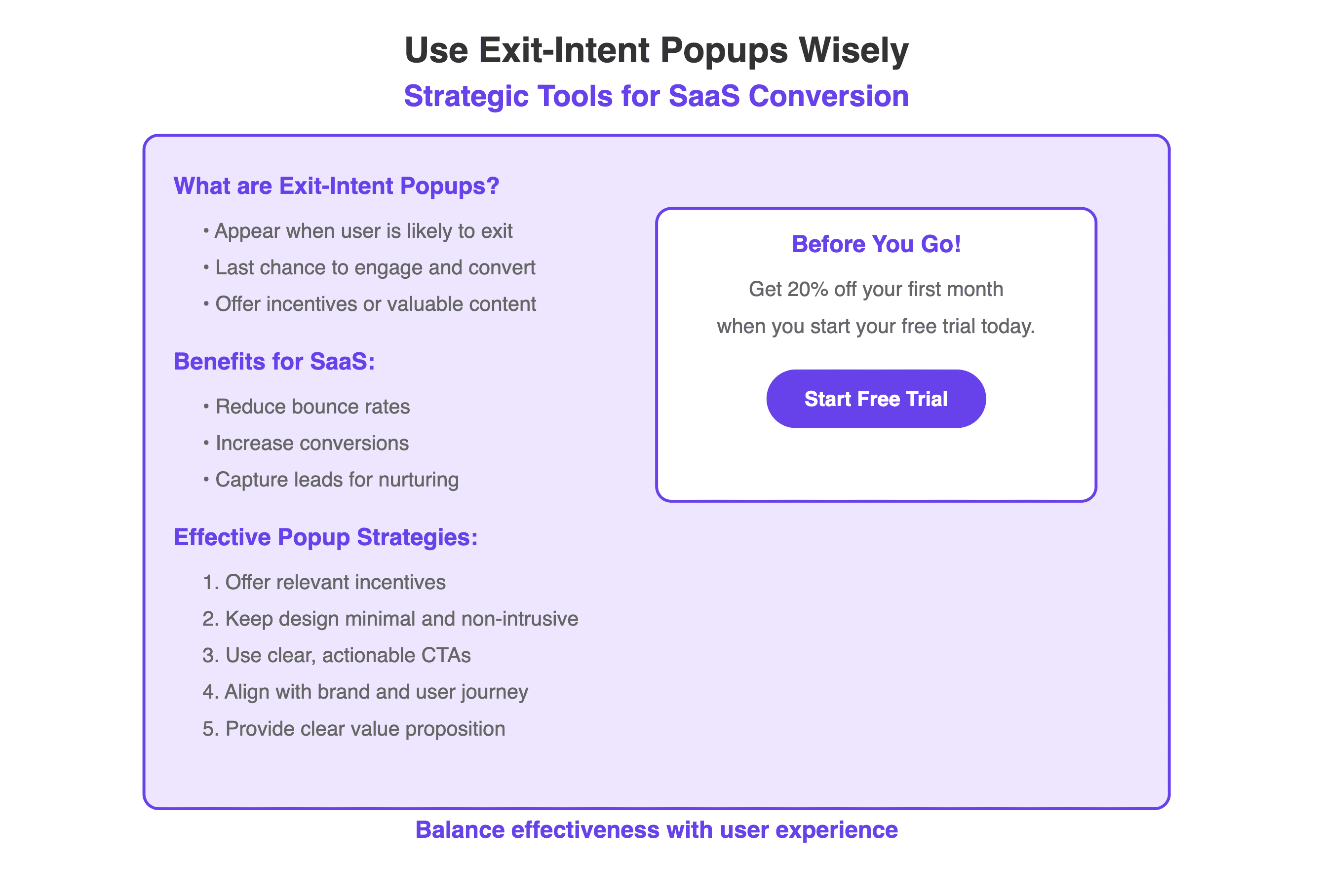
Exit-intent popups are strategic tools used by SaaS companies to engage users who are about to leave their website. These popups appear when the system detects a user is likely to exit, offering a final opportunity to convert. Common offers include free trials, demo signups, or downloadable resources like whitepapers or case studies.
The goal is to reduce bounce rates and increase conversion by providing a timely, relevant incentive. For SaaS businesses, this often means capturing email addresses for lead nurturing or encouraging immediate sign-ups. While potentially effective, it's crucial to balance their use with overall user experience.
The most successful exit-intent popups for SaaS are those with clear value propositions, compelling offers, and designs that align with the brand and don't disrupt the user's journey.
Effective Popup Strategies:
Offer a discount or incentive relevant to the visitor’s interests.
Keep the design minimal and non-intrusive.
Ensure the popup’s CTA is clear and actionable.
Examples of Great Landing Pages
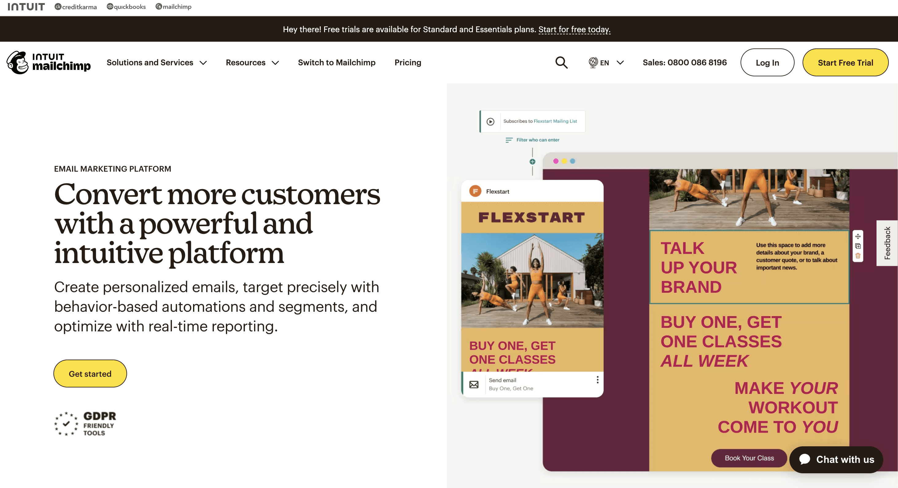
Let's examine why Mailchimp's landing page is effective:
The headline "Convert more customers with a powerful and intuitive platform" immediately communicates the core value proposition. It focuses on the outcome users desire - increased conversions - while highlighting the platform's strength and ease of use.
The call-to-action buttons are strategically placed and visually prominent. The yellow "Start Free Trial" button in the top right and the "Get started" button below the main text stand out against the white background, guiding visitors towards taking action.
The page design is clean and minimalist, preventing information overload. It presents a clear message alongside a visual preview of the platform interface, giving potential users a glimpse of what they'll be working with.
Mailchimp also builds trust through association by displaying the Intuit logo, signaling that it's part of a larger, reputable company.
The availability of live chat support, indicated by the "Chat with us" button, provides immediate assistance for visitors with questions, potentially reducing hesitation in sign-ups.
Overall, Mailchimp's landing page effectively balances information delivery with a strong focus on conversion, employing clear messaging and strategic design elements to guide visitors towards trying their service.
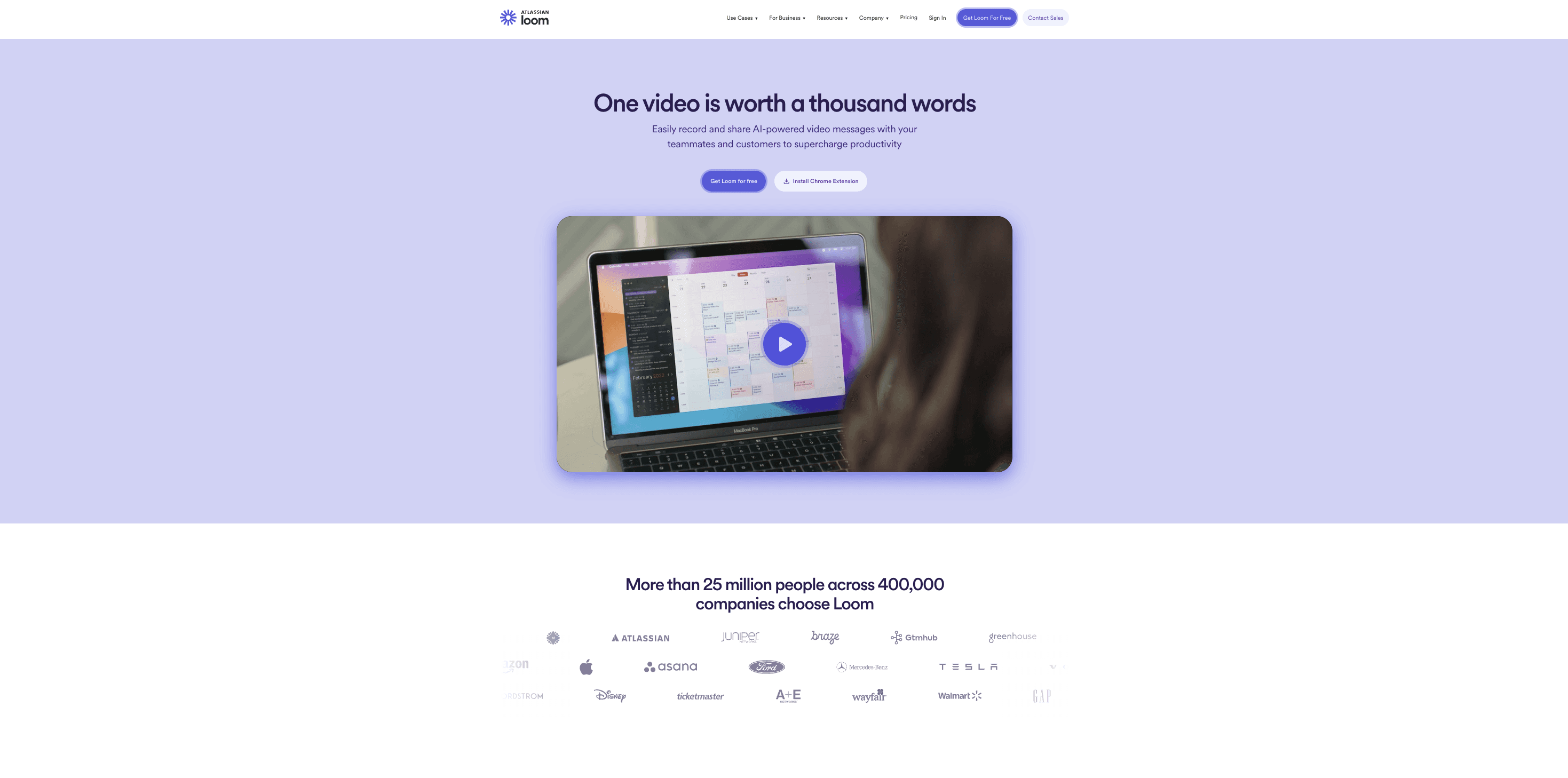
Loom, a platform for easy video messaging and screen recording, presents a compelling landing page that effectively communicates its value proposition. The headline "One video is worth a thousand words" immediately captures the essence of the product, emphasizing the power of video communication.
The page's design is clean and focused, with a soft purple background that's easy on the eyes. The central image showcases the product in action, giving visitors a clear idea of what to expect. This visual representation is crucial for a video-based tool.
Two clear call-to-action buttons, "Get Loom for Free" and "Install Chrome Extension," provide users with immediate options to engage with the product. The prominence and clarity of these CTAs align well with best practices for conversion optimization.
The subheadline succinctly explains the product's key benefit: "Easily record and share AI-powered video messages with your teammates and customers to supercharge productivity." This clearly outlines who the product is for and what problem it solves.
Below the fold, Loom leverages strong social proof by stating "More than 25 million people across 400,000 companies choose Loom." This is further reinforced by displaying logos of well-known companies using their product, building trust and credibility.
Overall, Loom's landing page effectively combines a clear value proposition, strong visual elements, prominent CTAs, and compelling social proof to create a persuasive introduction to their product.
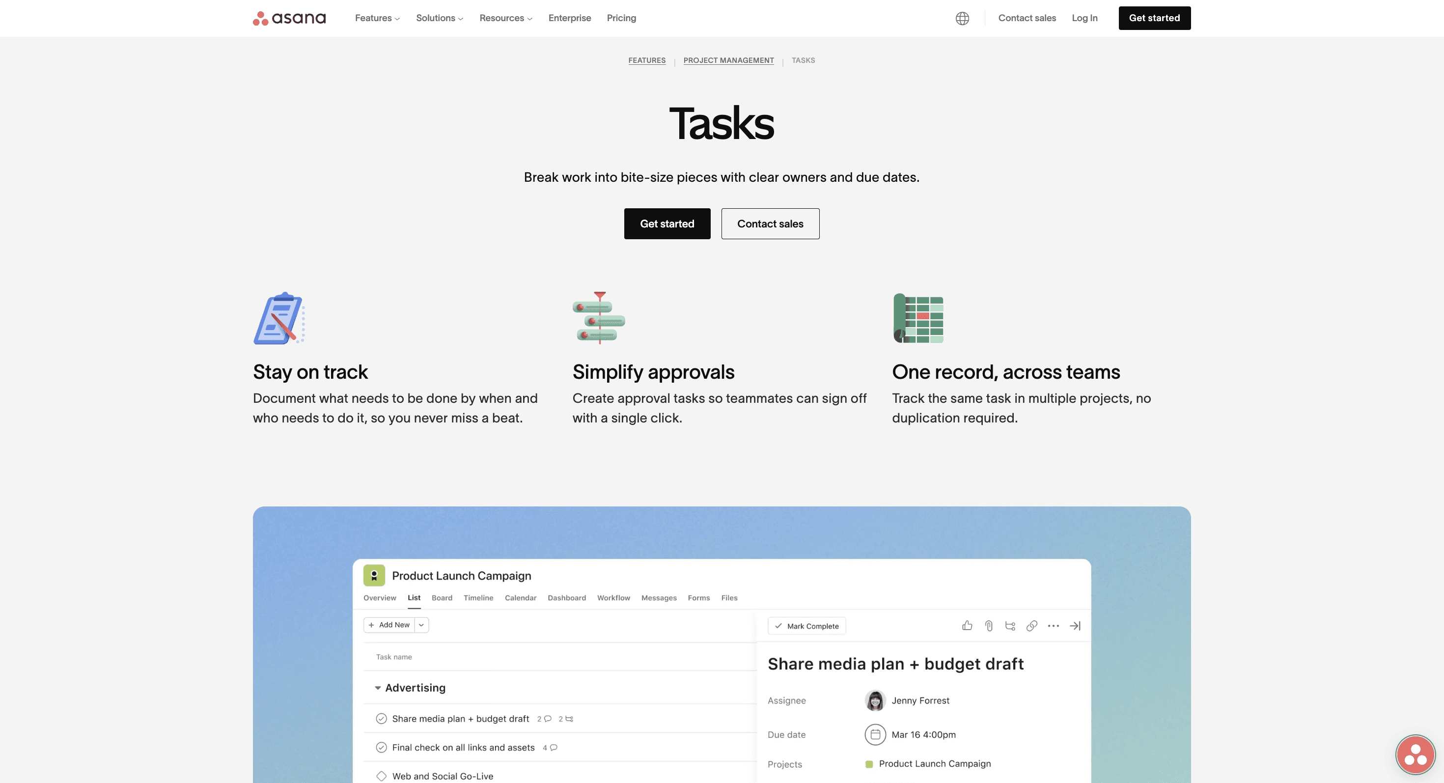
Let's examine why Asana's landing page for their Tasks feature is effective:
Asana, a project management and collaboration tool, presents a focused and clear landing page for its Tasks feature. The page effectively communicates the value of this specific functionality within their broader platform.
The headline "Tasks" is simple yet prominent, immediately drawing attention to the feature being showcased. The subheadline, "Break work into bite-size pieces with clear owners and due dates," succinctly explains the core benefit of using Asana for task management.
The page employs a clean, minimalist design with plenty of white space, making it easy for visitors to digest the information. This aligns well with best practices for reducing cognitive load and maintaining user focus.
Two clear call-to-action buttons, "Get started" and "Contact sales," are prominently displayed, giving users options based on their level of interest or stage in the buying process. The contrasting colors of these buttons make them stand out effectively.
The page highlights three key features with simple icons and brief explanations: "Stay on track," "Simplify approvals," and "One record, across teams." This approach effectively communicates the main benefits of using Asana for task management without overwhelming the visitor.
A screenshot of the product interface provides a visual representation of how tasks are managed in Asana, giving potential users a clear idea of what to expect. This helps to set expectations and can reduce hesitation in trying the product.
Overall, Asana's Tasks landing page effectively combines a clear value proposition, key feature highlights, and a visual product demonstration to create a compelling case for their task management capabilities. The design is clean and focused, guiding visitors towards taking action without overwhelming them with information.
Conclusion
Implementing these strategies - from clear value propositions to mobile optimization - can significantly boost your conversion rates. Remember to focus on user needs, communicate value clearly, and make action easy. As shown by Mailchimp, Loom, and Asana, successful pages share clear messaging, strong CTAs, and effective social proof. Start applying these tactics today, but remember: continuous testing is key to finding what works best for your audience. Keep refining your approach to attract more sign-ups and loyal customers.