
Implementing Interactive Product Tours in SaaS: Best Guide

by
Wiktoria Slowikowska
Oct 17, 2024
Identify and convert your most valuable users
Sign Up
The first few minutes can make or break a customer’s experience. Imagine signing up for a promising new tool only to find yourself lost in a sea of features, unsure of how to get started. This scenario is all too common; many potential users abandon products simply because they can’t see their value quickly enough.
This is where interactive product tours and demos come into play, transforming the onboarding process into an engaging and intuitive experience.
Why Interactive Product Tours Matter for SaaS Success
Picture this: Sarah, a marketing manager, eagerly signs up for a new analytics tool that promises to streamline her reporting process. However, upon logging in, she’s met with a cluttered dashboard and a myriad of unfamiliar options. Frustrated and overwhelmed, she decides to leave the platform without ever unlocking its potential. This is not just a hypothetical situation; it’s a reality faced by countless SaaS providers.
User onboarding is crucial in ensuring that new customers experience immediate value. A well-crafted product tour can bridge the gap between initial interest and user engagement, helping users like Sarah feel confident and informed. In fact, studies have shown that effective onboarding can lead to a 30% increase in user retention, highlighting the importance of getting it right from the start.
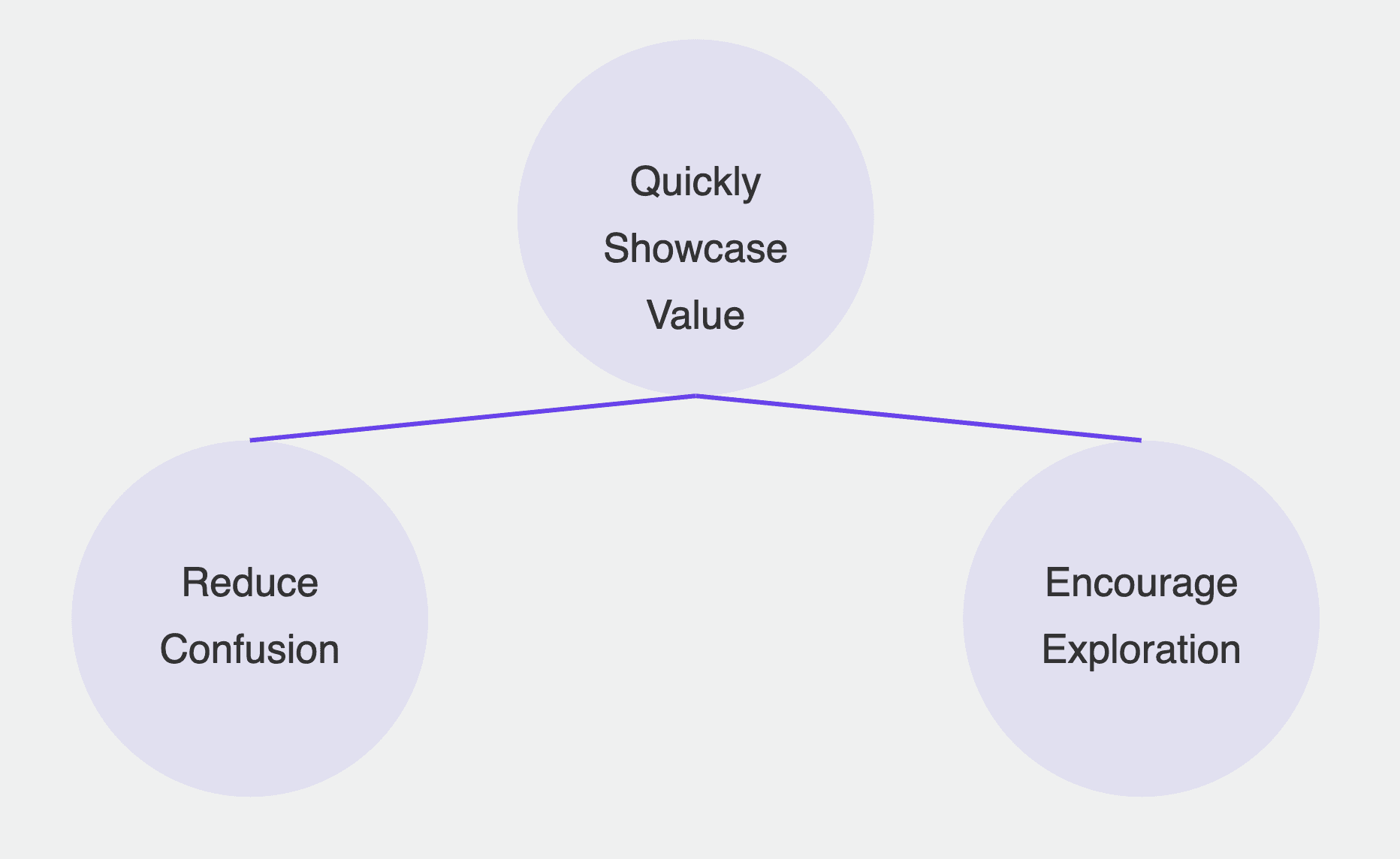
Interactive product tours serve several purposes:
Quickly showcase value: They help users recognize the product's value right from the start.
Reduce confusion: By guiding users through complex workflows, they alleviate the overwhelming feeling often associated with new software.
Encourage exploration: Interactive demos invite users to engage with the software actively, making learning a more enjoyable experience.
Companies like Slack and HubSpot have mastered this approach, using engaging product tours to ensure users understand how to leverage their tools effectively. For instance, when a new user logs into Slack, they're greeted with a friendly, interactive walkthrough that introduces them to essential features, ensuring they start on the right foot.
Key Elements
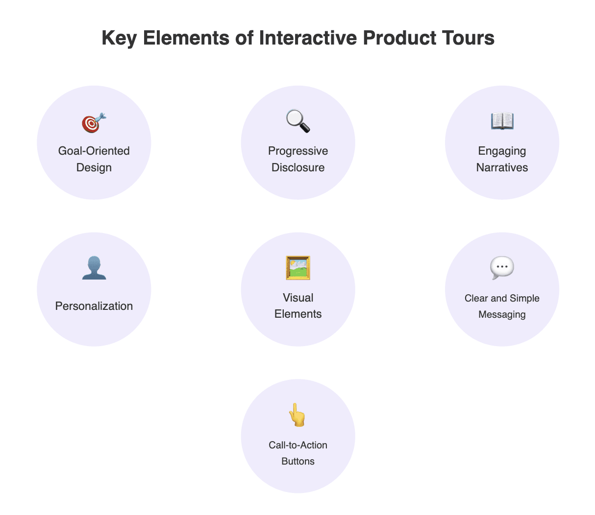
So, how do you create an interactive product tour that resonates with users? Think of your product tour as a friendly guide—someone who walks you through the essentials without overwhelming you with information.
Goal-Oriented Design
Start by defining the primary goals of your tour. What key actions do you want users to complete? This could range from setting up their profile to creating their first project or sending their first message. By focusing on these critical actions, you can ensure users experience quick wins that demonstrate the product's value.
For instance, consider a product tour for a project management tool. Instead of detailing every feature available, it could prioritize tasks like adding team members, setting deadlines, and creating a project board. Users who see immediate value are more likely to continue using the product.
Progressive Disclosure
Overloading users with too much information can be counterproductive. Instead, employ progressive disclosure—introduce features incrementally as users navigate through the tour. This method helps users absorb information without feeling overwhelmed.
For example, if your software includes a complex reporting feature, you might first introduce basic reporting capabilities before diving into advanced functionalities. This approach ensures users grasp fundamental concepts before tackling more complex tasks.
Engaging Narratives
Engage users by telling a story. Rather than a bland walkthrough, create a narrative that resonates with your audience. This could involve fictional characters or relatable scenarios. For instance, your product tour could follow Sarah, who is learning how to use the analytics tool for her upcoming campaign. As users navigate through the tour, they can relate to Sarah’s challenges and victories, making the experience more engaging and memorable.
Make the tour feel personal! Tailoring the experience based on user personas or their specific needs can significantly enhance engagement. Whether they’re marketing managers or developers, ensuring the content speaks directly to them can create a stronger connection and keep them interested.
Visual Elements
Don’t make the tour boring! Incorporate eye-catching images, gifs, and videos to break up text and illustrate key points. Visual aids can enhance understanding and keep users engaged. For example, a short video demonstrating a feature in action can be much more effective than a long text description.
Clear and Simple Messaging
Keep your messages clear and straightforward. Avoid jargon and complex language; instead, use simple terms that anyone can understand. Remember, the goal is to guide users smoothly through their onboarding experience, not to confuse them further.
Encourage users to take action with strategically placed CTA buttons. Whether it’s prompting them to “Try This Feature” or “Set Up Your Profile,” these buttons guide users to the next steps in their journey. Make them stand out, and ensure they lead to valuable actions that reinforce the product’s benefits.
Tailoring Product Demos to Different User Personas
One size does not fit all when it comes to product demos. Each user brings unique needs, preferences, and backgrounds. Tailoring your product tour to different user personas can significantly enhance engagement and satisfaction.
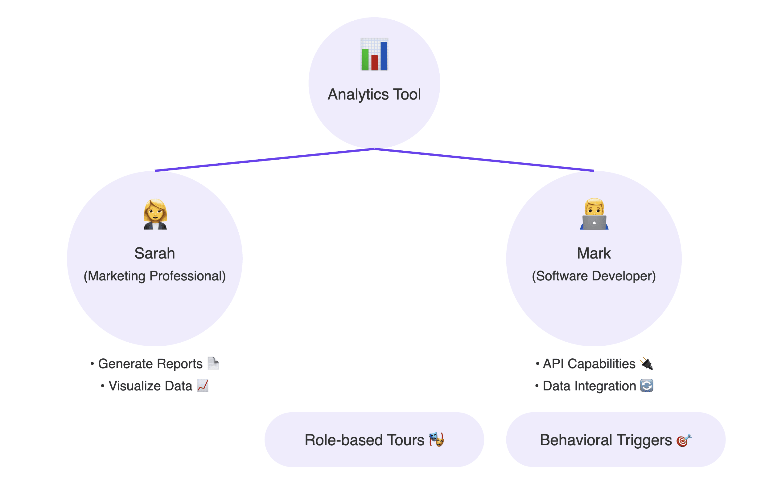
Imagine a scenario where Sarah and Mark, a software developer, both sign up for the same analytics tool. While Sarah wants to understand how to generate reports and visualize data, Mark is more interested in the tool’s API capabilities and data integration features.
By personalizing the product tour experience, you can cater to these distinct needs:
Role-based Tours: Offer different tours based on user roles. For example, marketing professionals could receive tours that emphasize data visualization and reporting, while developers might focus on technical integrations.
Behavioral Triggers: Use user behavior to guide the tour. If a user frequently accesses certain features, tailor the tour to highlight advanced functionalities that enhance their experience.
This level of personalization makes users feel valued and understood, leading to increased satisfaction and a higher likelihood of product adoption.
Keeping Users Engaged
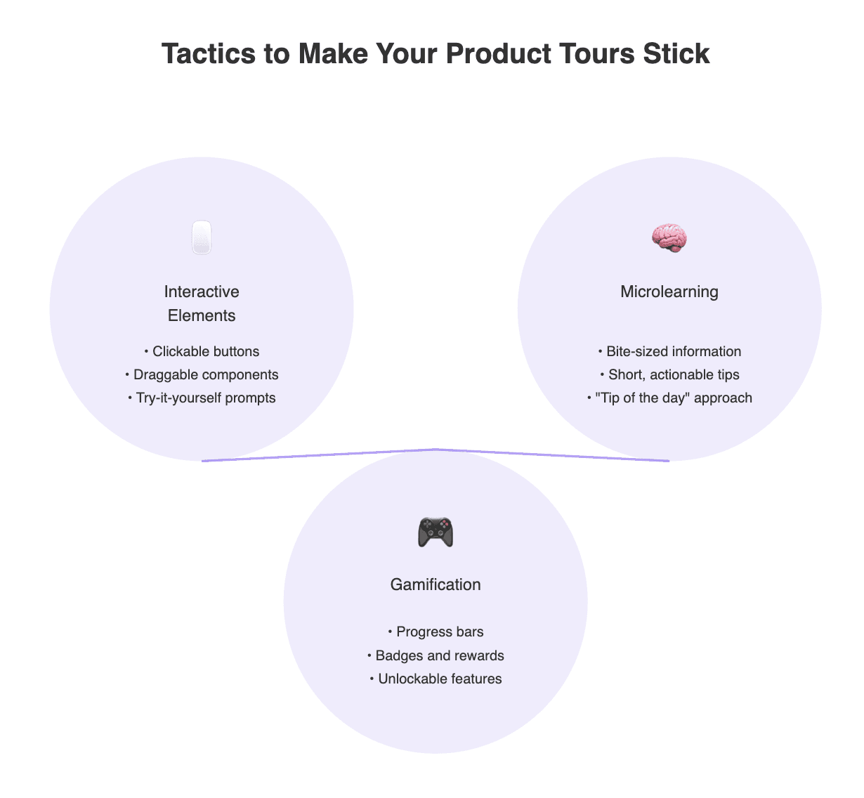
Creating an engaging product tour goes beyond simply presenting information. It’s about making the experience interactive and enjoyable. Here are some effective tactics to keep users engaged:
Interactive Elements
Incorporate interactive elements that invite users to participate. This could include clickable buttons, draggable components, or prompts encouraging users to try out features themselves. By making the tour interactive, you encourage users to explore rather than passively consume information.
For example, a tour for a graphic design tool might prompt users to drag and drop elements to create their first design. This hands-on approach not only keeps users engaged but also allows them to learn through practice.Microlearning
Break down complex information into bite-sized pieces. Microlearning focuses on delivering small, focused learning segments that are easier for users to digest. Instead of overwhelming users with lengthy explanations, provide short, actionable tips throughout the tour.
Think of the classic “tip of the day” approach, where users receive quick suggestions or best practices during the tour. This keeps the information flowing without making users feel bogged down.Gamification
Gamification can add an exciting layer to your product tours. Consider incorporating elements such as progress bars, badges, or rewards for completing specific tasks. Users are often motivated by achievement and recognition, making gamified tours more appealing.
For instance, if users complete their onboarding tasks, they might receive a badge or unlock special features. This not only enhances engagement but also reinforces a sense of accomplishment.
Common Mistakes to Avoid in Interactive Product Tours
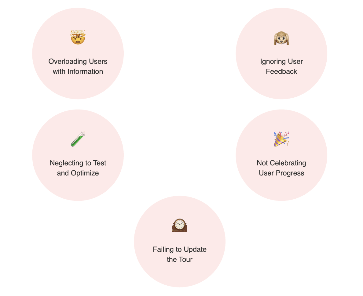
While crafting interactive product tours, it’s essential to avoid common pitfalls that can lead to user frustration. Here are some mistakes to steer clear of:
Overloading Users with Information
One of the biggest mistakes is trying to cover every feature in the product tour. Users can easily become overwhelmed by too much information, leading to disengagement. Instead, focus on the most critical features that deliver immediate value.Ignoring User Feedback
Failing to gather user feedback after the tour can be detrimental. Listening to your users allows you to identify areas for improvement and make necessary adjustments. Consider implementing surveys or feedback forms to gauge users’ experiences and gather insights for enhancements.Neglecting to Test and Optimize
Launching a product tour is just the beginning. Continuous testing and optimization are crucial to ensuring its effectiveness. Utilize A/B testing to experiment with different tour formats, messaging, and pacing to determine what resonates best with your audience.Not Celebrating User Progress
Ignoring to acknowledge users’ progress throughout the tour can make the experience feel monotonous. Consider adding milestones or badges that celebrate when users complete certain steps. This recognition can create a sense of achievement and encourage users to continue through the entire tour. A little positive reinforcement can go a long way in maintaining user engagement.Failing to Update the Tour
Your product is likely to evolve over time, with new features and updates being introduced regularly. If your product tour isn’t kept up-to-date, it can become irrelevant or misleading. Regularly review and refresh your tour to reflect the latest changes and enhancements in your product. This not only ensures accuracy but also demonstrates to users that your company is committed to providing them with the best experience possible.
How Do I Create a Product Tour?
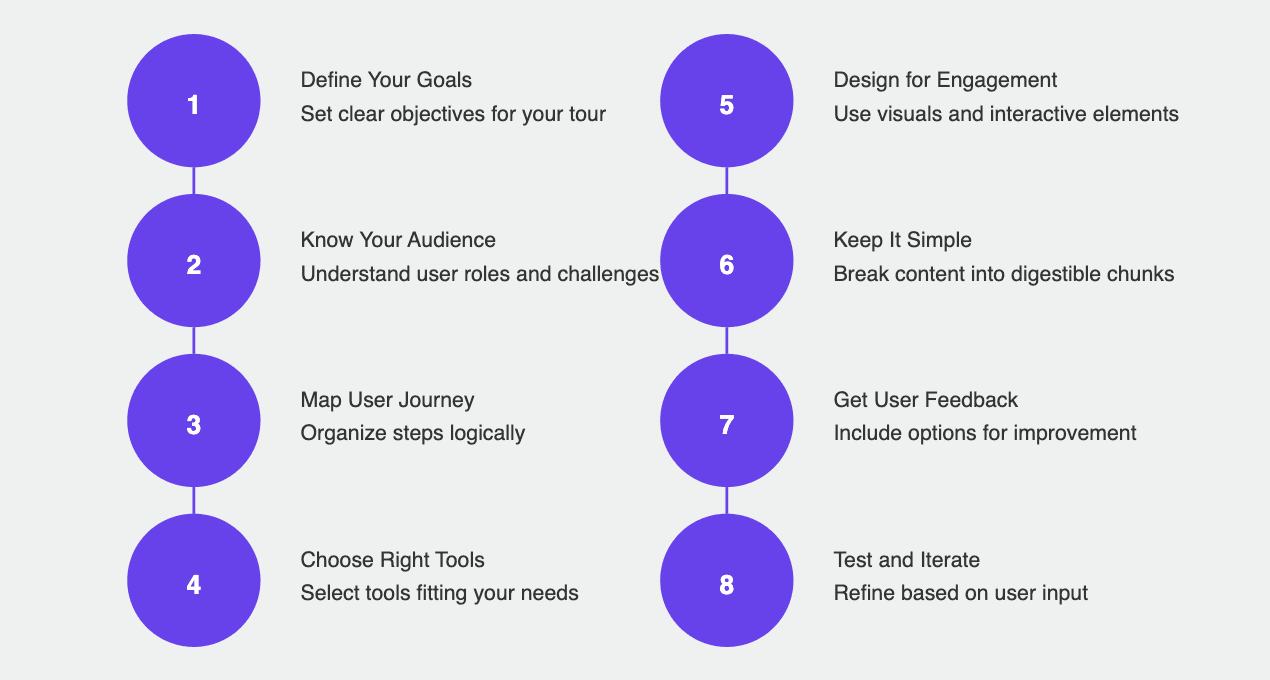
Creating an effective product tour can be a game-changer for onboarding new users and ensuring they get the most out of your SaaS offering. So, where do you start? Here’s a step-by-step guide to help you craft an engaging and informative product tour that users will love.
1. Define Your Goals
Before diving into the design process, take a moment to define what you want to achieve with your product tour. Are you aiming to help users complete specific tasks, highlight key features, or provide an overall understanding of your product? Having clear goals will guide your decisions throughout the creation process.
2. Know Your Audience
Understanding your users is key to creating a relevant product tour. What are their roles? What challenges do they face? By knowing your audience, you can tailor the tour to meet their specific needs, making the experience more personal and effective.
3. Map Out the User Journey
Once you know your goals and audience, outline the steps you want users to take during the tour. Think about the most important actions they need to complete, and organize them in a logical sequence. This will help ensure users stay engaged and don’t feel lost as they navigate through your product.
4. Choose the Right Tools
There are various tools available for creating interactive product tours, such as WalkMe, Userlane, and Intro.js. Choose one that fits your needs and offers features like step-by-step guidance, tooltips, and user analytics. The right tool can make the creation process easier and help you measure the tour's effectiveness.
5. Design for Engagement
When designing your tour, focus on creating an engaging experience. Use vibrant visuals, such as images, gifs, or videos, to illustrate key points. Incorporate storytelling elements, so users can relate to the content. Don’t forget to include interactive elements that allow users to click, drag, or try features as they go.
6. Keep It Simple
Simplicity is key! Make sure your messaging is clear and straightforward. Avoid overwhelming users with too much information at once. Instead, break the content into digestible chunks that guide users step by step through the tour.
7. Incorporate Feedback Mechanisms
To continually improve your product tour, include options for users to provide feedback. This could be as simple as a quick survey at the end of the tour or prompts asking if they found the information helpful. Gathering feedback will help you refine the tour and make it even more effective over time.
8. Test and Iterate
Before launching your product tour, conduct thorough testing. Get a group of users to try it out and observe their reactions. Are they engaging with the content? Do they understand the features? Use their feedback to make adjustments. After launching, keep monitoring user engagement and make necessary changes based on analytics and user input.
9. Promote Your Tour
Once your product tour is live, promote it! Make sure new users know it exists and encourage them to take it when they sign up. You can also highlight the tour in your marketing materials or onboarding emails to drive participation.
Conclusion: Making Your First Impression Count
Onboarding users effectively is paramount to ensuring long-term success. Interactive product tours and demos have emerged as essential tools for transforming the onboarding experience, guiding users toward understanding the value of your product.
As we’ve explored, a well-designed product tour goes beyond merely showcasing features; it’s about creating a journey that resonates with users. By focusing on goal-oriented design, tailoring experiences to different user personas, and keeping users engaged through interactivity and gamification, you can enhance user satisfaction and retention.
Ultimately, interactive product tours are more than just an onboarding tool—they’re a critical component of the overall user experience. So, as you embark on this journey, remember: the first impression counts. By investing time and effort into crafting a compelling product tour, you can empower users to explore, engage, and ultimately succeed with your SaaS solution.


