
Extensive Guide to SaaS Frictionless Signup: 10 Strategies

by
Wiktoria Slowikowska
Oct 9, 2024
Identify and convert your most valuable users

Sign Up
The signup process serves as the critical gateway between potential customers and your product. A frictionless, intuitive signup experience can dramatically impact your conversion rates, user satisfaction, and ultimately, your bottom line.
This comprehensive guide delves deep into the strategies, tactics, and best practices for reducing friction in your SaaS signup process, providing actionable insights for implementation and continuous improvement.

Understanding Signup Friction
Signup friction encompasses any element in the registration process that may deter potential users from completing it. These friction points can be obvious or subtle, but all contribute to lost conversions and missed opportunities. Common sources of friction include:
Lengthy, complex forms requiring excessive information
Stringent password requirements that frustrate users
Mandatory credit card information for free trials, creating trust issues
Unclear value propositions that fail to motivate completion
Technical glitches or slow load times that test user patience
Confusing navigation or unclear next steps in the process
Lack of mobile optimization, alienating on-the-go users
Absence of social proof, leaving users uncertain about your product's value
To identify friction points in your current signup flow, consider the following methods:
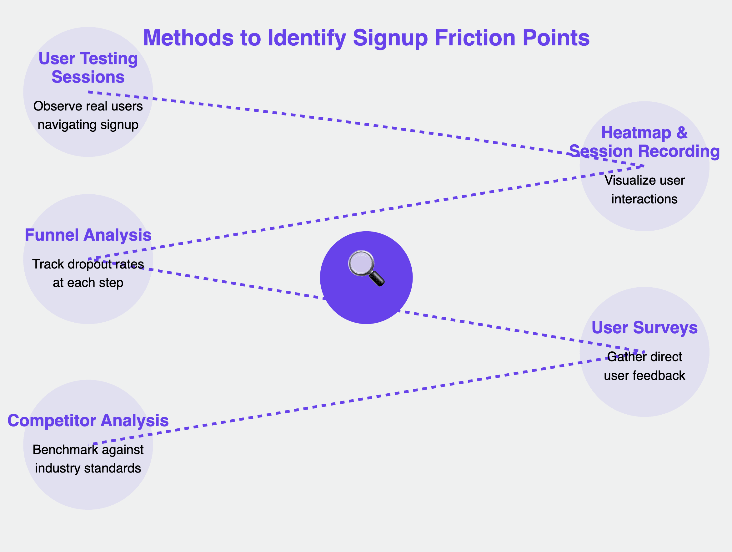
User Testing Sessions: Observe real users as they navigate your signup process, noting where they hesitate or express frustration.
Heatmap and Session Recording Analysis: Use tools like Hotjar or Crazy Egg to visualize how users interact with your signup page.
Funnel Analysis: Track dropout rates at each step of the process to pinpoint where users are most likely to abandon the signup.
User Surveys: Gather direct feedback from users who have recently completed (or abandoned) your signup process.
Competitor Analysis: Sign up for your competitors' services to benchmark your process against industry standards.
The Psychology Behind User Signups
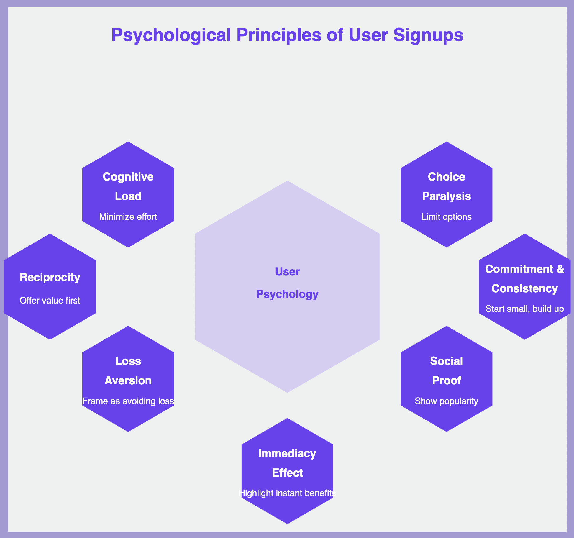
Understanding the psychological factors that influence user behavior during the signup process can help you design a more effective, friction-free experience. Key psychological principles to consider include:
Cognitive Load Theory: Minimize the mental effort required to complete your signup process. Break complex tasks into smaller, manageable steps.
Choice Paralysis: While options are good, too many can overwhelm users. Limit choices where possible and use smart defaults to ease decision-making.
Loss Aversion: Humans are more motivated to avoid losses than to acquire gains. Frame your signup benefits in terms of what users might miss out on if they don't sign up.
Social Proof: We tend to follow the actions of others. Incorporate elements like user counts or testimonials to leverage this principle.
Reciprocity: Offer something of value upfront (like a free resource) to increase the likelihood of users completing the signup process.
Commitment and Consistency: Once users take a small action, they're more likely to follow through with larger ones. Use this by breaking the signup into smaller commitments.
Immediacy Effect: People value immediate rewards more than future ones. Highlight instant benefits of signing up, not just long-term advantages.
By incorporating these psychological principles into your signup design, you can create a more compelling and frictionless user experience.
Proven Strategies to Reduce Signup Friction
1. Simplify Your Forms: Less is More
Complex, lengthy forms are one of the biggest sources of signup friction. Simplifying your forms can significantly improve completion rates.
How to implement:
Audit your current form fields: Critically assess each field and ask, "Is this information essential at signup?" Be ruthless in eliminating unnecessary fields.
Use conditional logic: Show additional fields only when necessary based on previous responses. For example, only ask for company size if the user selects "Business" account type.
Implement a progress indicator: For longer forms, break them into steps and show users their progress. This provides a sense of advancement and reduces perceived complexity.
Utilize inline validation: Provide real-time feedback as users fill out the form to catch errors early. Use clear, friendly messaging for error states.
Optimize field order: Place easier fields (like name or email) first to build momentum, and leave more complex fields for later in the process.
Improvement tip: Regularly review signup analytics to identify fields with high error rates or abandonment. Consider removing or simplifying these fields, or providing additional context to help users complete them accurately.
Example: Dropbox's signup form is a masterclass in simplicity. It asks for just three pieces of information: full name, email, and password. This minimalist approach reduces friction and gets users into the product quickly.
2. Offer Social Sign-up Options
Social sign-up options can significantly reduce friction by allowing users to create an account using existing credentials from platforms they already trust.
How to implement:
Choose relevant platforms: Select social login options that align with your target audience. For B2B SaaS, LinkedIn might be more appropriate than Facebook.
Clearly communicate data usage: Transparently inform users about what data you'll access and how you'll use it. This builds trust and reduces abandonment due to privacy concerns.
Offer multiple options: While social signup can reduce friction, some users prefer traditional email signup. Always provide both options.
Design for clarity: Use recognizable logos and clear, action-oriented text for social signup buttons.
Improvement tip: Monitor the usage rates of different social login options and A/B test their placement on your signup page to optimize adoption. Regularly review and update your social login options as platform popularity shifts.
Example: Spotify offers a seamless social signup process, allowing users to create accounts using their Facebook, Apple, or Google credentials. They clearly state what information will be shared, building trust with potential users.
3. Provide a Clear Value Proposition
Users are more likely to complete a signup process when they clearly understand the value they'll receive. A compelling value proposition can significantly reduce friction by motivating users to push through any complexity.
How to implement:
Craft compelling microcopy: Use action-oriented language to highlight key benefits succinctly. Focus on how your product solves user problems or improves their lives.
Incorporate social proof: Display user testimonials, usage statistics, or logos of well-known clients near the signup form. This builds credibility and reassures potential users.
Use visual aids: Create infographics or short videos to quickly convey your product's value. Visual content can often communicate complex value propositions more effectively than text alone.
Personalize the value proposition: If possible, tailor the benefits you highlight based on what you know about the user (e.g., their industry or role).
Address common objections: Anticipate and proactively address reasons why users might hesitate to sign up. For example, highlight your money-back guarantee or no-credit-card-required trial.
Improvement tip: Regularly update your value proposition based on user feedback and product updates. A/B test different versions to find the most effective messaging. Consider using dynamic content to show different value propositions to different user segments.
Example: Slack's homepage clearly communicates its value proposition: "Slack is your digital HQ". They follow this with concrete benefits like "Move faster", "Collaborate better", and "Feel more connected", each accompanied by a brief explanation and relevant imagery.
4. Implement a Frictionless Free Trial
Offering a free trial can be a powerful way to acquire users, but requiring credit card information upfront can create significant friction. A truly frictionless free trial removes this barrier and others.
How to implement:
Offer "no credit card required" trials: Use this as a prominent selling point in your messaging. It reduces risk for potential users and can significantly increase trial signups.
Set appropriate trial lengths: Balance giving users enough time to experience value with creating urgency. Analyze user behavior to determine the optimal trial length for your product.
Implement a smooth trial-to-paid transition: Design an easy upgrade process when the trial ends. Provide clear notifications about trial expiration and make the upgrade process as simple as possible.
Provide a guided trial experience: Don't just turn users loose in your product. Offer a structured onboarding experience that guides users to key features and helps them achieve early wins.
Use smart limitations: If you need to limit functionality in your free trial, do so strategically. Ensure users can still experience your core value proposition.
Improvement tip: Analyze user behavior during the trial period to identify key actions that lead to conversions. Use this data to guide users towards these actions during onboarding. Continuously refine your trial experience based on user feedback and conversion data.
5. Optimize for Mobile: Ensure Cross-Device Compatibility
With an increasing number of users accessing services via mobile devices, ensuring a smooth mobile signup experience is crucial for reducing friction.
How to implement:
Use responsive design: Ensure your signup form adapts to different screen sizes. Test on a variety of devices to ensure a consistent experience.
Simplify input methods: Utilize dropdown menus, toggles, and auto-complete to ease data entry on mobile devices. Consider using numeric keypads for number fields and email keypads for email fields.
Optimize button sizes and spacing: Ensure all interactive elements are large enough to be easily tapped on a mobile screen. Follow platform-specific design guidelines for optimal user experience.
Minimize keyboard toggles: Try to design your form so users don't need to switch between different keyboard layouts (e.g., numeric, alphabetic) frequently.
Improvement tip: Regularly test your signup process on various devices and browsers. Use tools like BrowserStack to ensure consistent performance across platforms. Pay special attention to load times on mobile devices, as slow-loading pages can significantly increase abandonment rates.
6. Use Microcopy Effectively: Guide Users with Clear Instructions
Effective microcopy can significantly reduce friction by providing clear guidance, setting expectations, and addressing potential concerns throughout the signup process.
How to implement:
Audit your current copy: Review all text in your signup process for clarity and concision. Eliminate any jargon or unnecessarily complex language.
Use tooltips strategically: Provide additional context for complex fields without cluttering the interface. Ensure tooltips are easily accessible on both desktop and mobile interfaces.
A/B test different copy variations: Experiment with tone, length, and messaging to find what resonates best with your audience. Even small changes in wording can have significant impacts on conversion rates.
Address common concerns: Use microcopy to proactively address issues that might cause users to hesitate. For example, include a note about your privacy policy near email field.
Provide clear next steps: At each stage of the signup process, make it clear what the user needs to do next. Use action-oriented language to guide users forward.
Improvement tip: Collect and analyze user feedback on your microcopy. Pay attention to common questions or points of confusion and adjust your copy accordingly. Consider implementing a system for continuous copy testing and improvement.
Example: Mailchimp uses clear, friendly microcopy throughout their signup process. They provide helpful tooltips for potentially confusing fields and use conversational language to guide users through each step.
7. Leverage User Onboarding: Seamlessly Transition from Signup to Activation
A smooth onboarding process can reduce friction by helping users quickly find value in your product after signing up. This increases the likelihood of long-term retention and reduces post-signup abandonment.
How to implement:
Design a welcome series: Create a sequence of emails or in-app messages to guide new users through key features. Tailor this series based on user actions and characteristics.
Implement an interactive product tour: Use tools like Appcues or Intercom to create guided walkthroughs of your product. Focus on helping users achieve their first "win" with your product as quickly as possible.
Set up milestone tracking: Identify key actions that indicate successful activation and guide users towards these milestones. Celebrate user achievements to build engagement.
Personalize the onboarding experience: If possible, tailor the onboarding process based on information gathered during signup (e.g., user role, company size, primary goals).
Offer multi-format learning resources: Provide a variety of resources (e.g., video tutorials, knowledge base articles, webinars) to cater to different learning preferences.
Improvement tip: Continuously refine your onboarding process based on user behavior data. Identify where users commonly drop off and adjust your onboarding to address these pain points. Regularly survey new users to gather feedback on the onboarding process.
Example: Canva offers an excellent onboarding experience, guiding new users through creating their first design with interactive tooltips and celebrating their achievements along the way.
8. Implement Smart Defaults: Reduce Cognitive Load
Smart defaults can significantly reduce friction by minimizing the number of decisions a user needs to make during the signup process.
How to implement:
Analyze user data: Use data from existing users to determine the most common selections for various options. Set these as your defaults.
Use geolocation: Auto-fill country or language fields based on the user's location.
Implement progressive profiling: Start with minimal required information and gather additional data over time as users engage with your product.
Pre-select recommended options: If your product has different tiers or packages, pre-select the most popular option. Always make it clear that users can change this selection.
Remember user preferences: If a user has previously abandoned the signup process, remember their inputs if they return (with appropriate privacy considerations).
Improvement tip: Regularly review your default selections to ensure they remain optimal as your user base grows and evolves. A/B test different default options to maximize conversion rates.
Example: When signing up for a new Google account, the form intelligently suggests a username based on the name you provide, reducing the cognitive load on the user.
9. Offer Live Chat Support: Provide Real-Time Assistance
Implementing live chat support during the signup process can significantly reduce friction by providing immediate assistance to users who encounter difficulties or have questions.
How to implement:
Choose the right live chat software: Select a tool that integrates well with your platform and offers features like canned responses and chatbots for initial triage.
Train your support team: Ensure your team is well-versed in the signup process and common issues users face.
Use proactive chat: Set up triggers to offer chat support when users spend too long on a particular step or show signs of hesitation.
Provide 24/7 support if possible: If round-the-clock human support isn't feasible, use AI chatbots to handle basic queries outside business hours.
Collect feedback: Use chat interactions to gather insights on common pain points in your signup process.
Improvement tip: Regularly analyze chat logs to identify recurring issues. Use these insights to improve your signup process, FAQs, and chatbot responses.
Example: Intercom offers a chat widget that allows potential customers to get immediate answers during the signup process, reducing abandonment rates.
10. Use Gamification Elements: Make Signup Engaging
Gamification can transform the signup process from a chore into an engaging experience, reducing perceived friction.
How to implement:
Use progress bars: Show users how close they are to completing the signup process.
Offer rewards: Provide small incentives for completing each step of the signup process.
Implement a point system: Award points for providing additional (optional) information or completing profile steps.
Create challenges: Set up simple challenges that users can complete during or immediately after signup.
Use playful microcopy: Incorporate fun, encouraging messages throughout the process.
Improvement tip: Be cautious not to overdo gamification. It should enhance the experience, not distract from the primary goal of completing signup.
Conclusion
Implementing a frictionless signup process is crucial for SaaS success. By focusing on simplification, clear value communication, and user-centric design, you can significantly improve conversion rates and user satisfaction. Key strategies include:
Simplifying forms
Offering social sign-up options
Providing clear value propositions
Implementing frictionless free trials
Optimizing for mobile devices
Using effective microcopy
Leveraging user onboarding
Implementing smart defaults
Offering live chat support
Using gamification elements
Remember, creating a frictionless signup is an ongoing process. Continuously gather user feedback, analyze data, and refine your approach. By reducing friction, you're not just improving signups – you're setting the stage for long-term user engagement and success.
Ultimately, a smooth signup process is your first opportunity to demonstrate your commitment to user experience. Make it count, and watch your conversion rates soar.