
Best SaaS Onboarding Emails: 10 Amazing Examples

by
Wiktoria Slowikowska
Sep 14, 2024
Identify and convert your most valuable users
Sign Up
You've just signed up for a new software tool, excited about its potential to revolutionize your workflow. But as soon as you log in, you're hit with a confusing interface and no clear direction on where to start.
Frustrating, right? This scenario is precisely why SaaS onboarding emails are very important.
Average person receives 121 emails per day, your onboarding sequence needs to cut through the noise and deliver real value.
The stakes are high: according to industry research, 40-60% of free trial users will use your software once and never come back. A well-crafted onboarding email sequence can dramatically improve these odds.
What is a SaaS Onboarding Email?
A SaaS onboarding email is a strategic communication sent to new users after they sign up for your software service. But it's so much more than a simple "thank you for joining" message. These emails are carefully crafted guides, designed to:
Introduce users to your product's key features
Provide step-by-step instructions for getting started
Highlight the unique value proposition of your service
Address common pain points and questions
Encourage active engagement with the platform
But what sets great SaaS onboarding emails apart from the mediocre ones? It's all about understanding your user's journey. The best onboarding emails anticipate the user's needs at each stage of their experience.
For example, your first email might focus on the quick wins – the features that provide immediate value and can be set up in minutes. Subsequent emails could introduce more advanced features, always tying them back to the user's goals and pain points.
Moreover, effective SaaS onboarding emails are highly personalized. They take into account the user's role, industry, and specific use case for your software. A marketing professional using your analytics tool will need a different onboarding experience than a data scientist using the same product.
Why Send Welcome Emails During the Onboarding Process?
You might wonder, "Why bother with emails when users can just explore the product themselves?" Here's why welcome emails are a non-negotiable part of your onboarding strategy:
First Impressions Matter: Your welcome email is often the first post-signup interaction a user has with your brand. Make it count by setting the tone for a positive, helpful relationship. Studies show that welcome emails have an average open rate of 82% - significantly higher than standard marketing emails
Combat Information Overload: New users can feel overwhelmed when first accessing your software. Well-timed emails break down the learning process into manageable steps, preventing cognitive overload. This is crucial because 55% of people say they've returned a product because they didn't fully understand how to use it
Boost Activation Rates: Guide users to take specific actions that lead to their "aha moment"—the point where they realize the true value of your product. This significantly increases the chances of long-term retention
Personalize the Experience: Use data from the sign-up process to tailor your onboarding emails. This personalization makes users feel valued and understood. Personalized emails deliver 6x higher transaction rates, but 70% of brands fail to use them
Provide Instant Value: Don't make users wait to see the benefits of your product. Use onboarding emails to showcase quick wins and immediate value. The sooner users see value, the more likely they are to stick around
Establish a Communication Channel: Opening this line of communication early encourages users to reach out with questions or feedback, fostering a two-way relationship. This can lead to valuable product insights and builds customer loyalty
Reduce Churn: By proactively addressing common hurdles and showcasing your product's value, you can significantly reduce the number of users who abandon your service early on. Consider this: increasing customer retention by just 5% can increase profits by 25% to 95%
Education at Scale: Onboarding emails allow you to educate a large number of users efficiently. Instead of scheduling individual onboarding calls with each new user, you can provide a standardized yet personalized education process through email
Drive Feature Adoption: Use your email sequence to highlight different features over time. This prevents overwhelming users at the start and gives them a reason to keep engaging with your product as they discover new capabilities
Remember, the goal of your onboarding emails isn't just to educate—it's to excite, engage, and empower your new users to succeed with your product. When done right, these emails don't just onboard users; they create passionate advocates for your SaaS solution.
The key is to strike a balance. Your onboarding emails should be frequent enough to keep users engaged, but not so frequent that they become annoying. A common approach is to send a welcome email immediately after signup, followed by 2-3 emails in the first week, then tapering off to weekly or bi-weekly communications.
As you craft your onboarding email strategy, always keep the user's perspective in mind. What do they need to know? What might they be struggling with? How can you make their life easier?
By answering these questions, you'll create an onboarding email sequence that not only welcomes users but sets them up for long-term success with your product.
10 Examples of Effective SaaS Onboarding Emails
Let's dive into some real-world examples of effective onboarding emails from both smaller and larger companies. We'll analyze what makes each one successful and what we can learn from them.
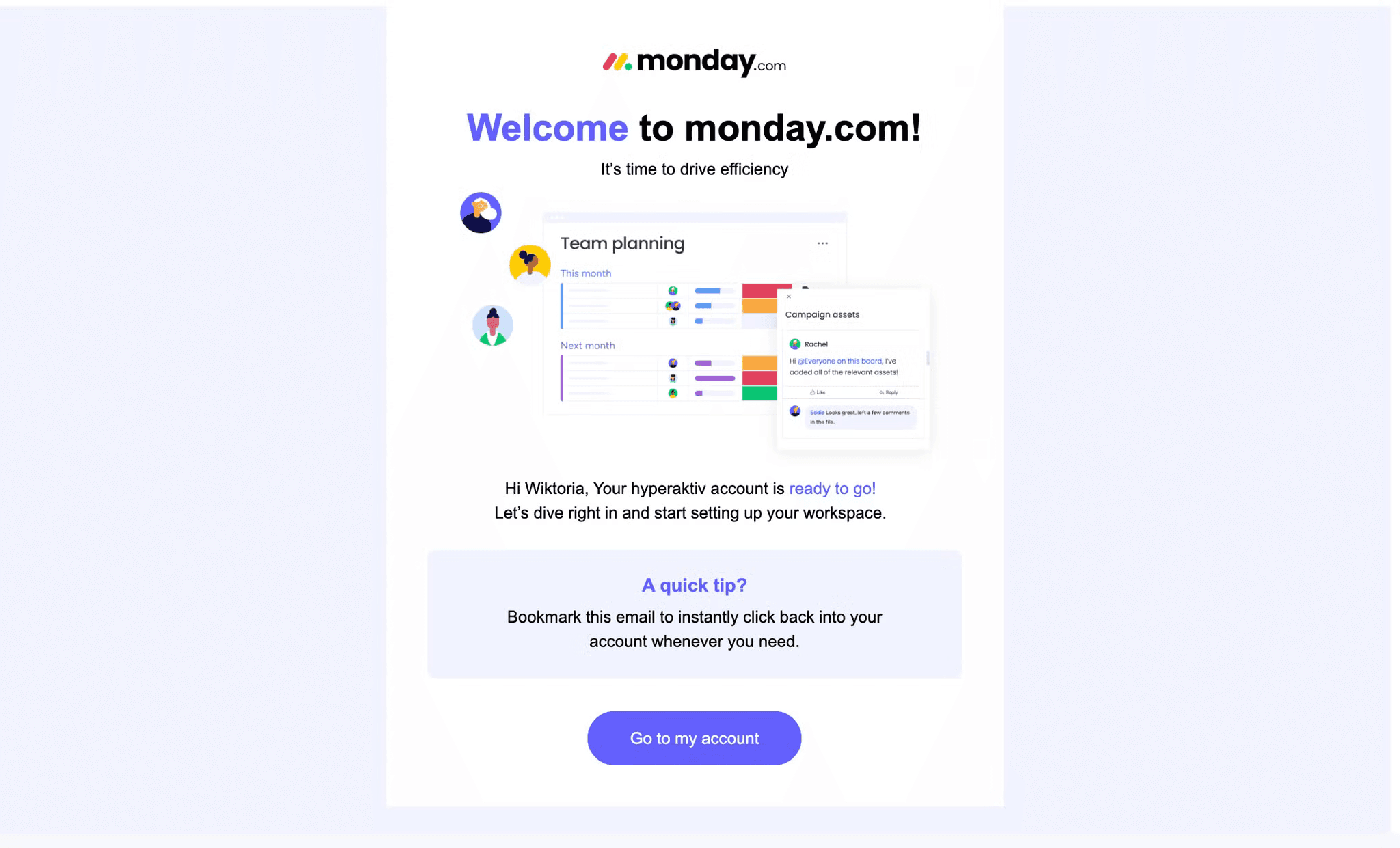
1. Monday.com is a versatile work operating system and project management platform designed to help teams streamline workflows and enhance collaboration. It offers customizable boards for task management, visual project planning tools, and integrations with various business applications, catering to organizations of all sizes across different industries.
Let's break down why this welcome email nails it:
Clear Value Proposition: Immediately communicates the core benefit with "It's time to drive efficiency," reminding users why they signed up
Visual Preview: Includes a graphic of the interface, setting clear expectations and potentially reducing anxiety about using a new tool
Strong Call-to-Action: Features a prominent "Go to my account" button, making the next step obvious and easy for the user
Added Value: Provides a useful tip about bookmarking the email, increasing the chances of repeat engagement and demonstrating a focus on user success
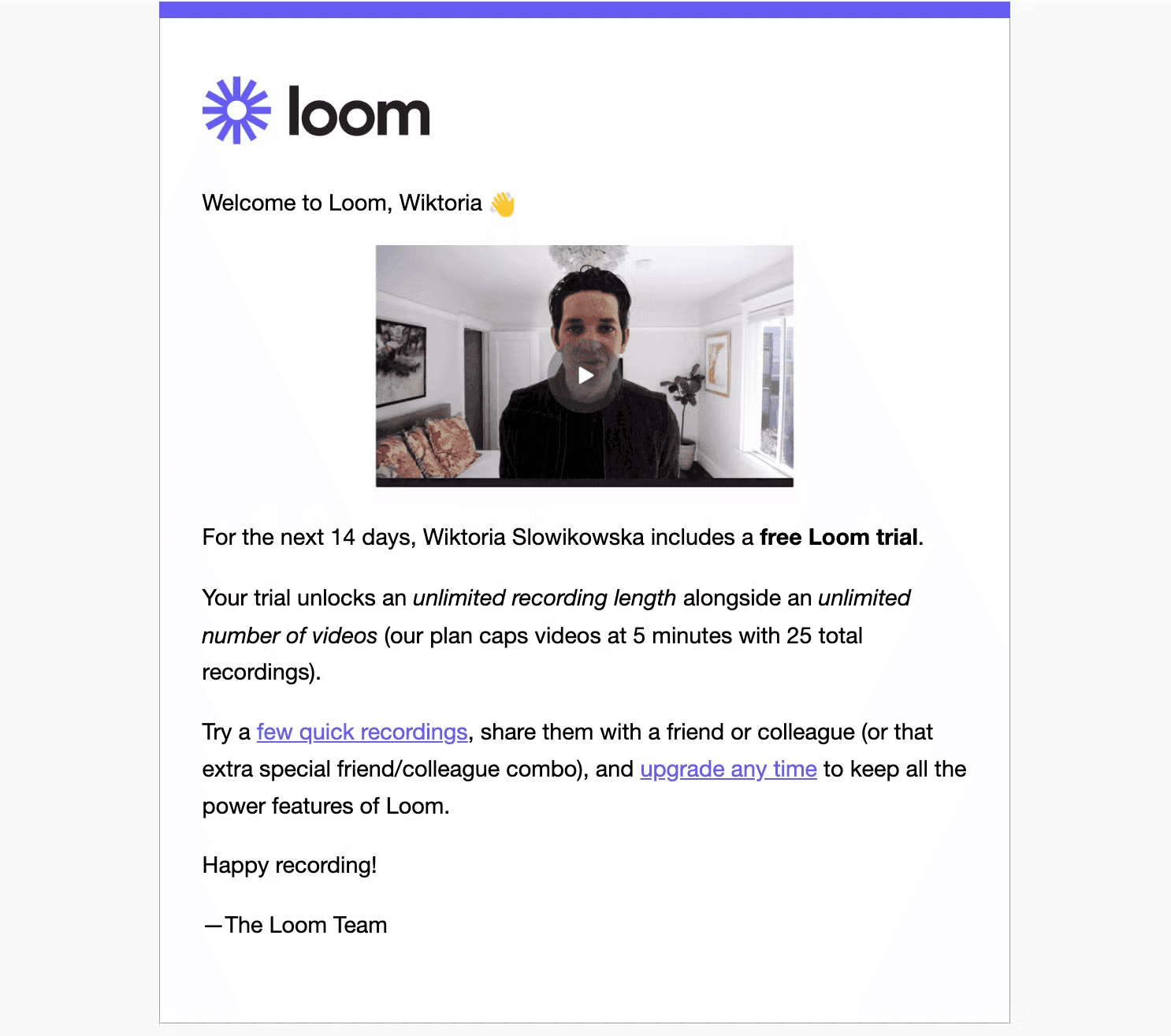
2. Loom.com is a video messaging tool that helps you get your message across through instantly shareable videos. With Loom, you can record your camera, microphone, and desktop screen simultaneously. Your video is then instantly available to share through Loom's patented technology.
Let's break down why this welcome email is effective:
Clear Trial Information: Clearly states the duration (14 days) and specifics of the free trial, including unlimited recording length and number of videos
Call-to-Action: Encourages users to "Try a few quick recordings" and share them, promoting immediate engagement with the product
CEO Involvement: The inclusion of a video featuring the CEO using the product adds credibility and shows that the company leadership believes in and uses their own product
Upgrade Option: Mentions the ability to "upgrade any time", planting the seed for conversion while not being pushy
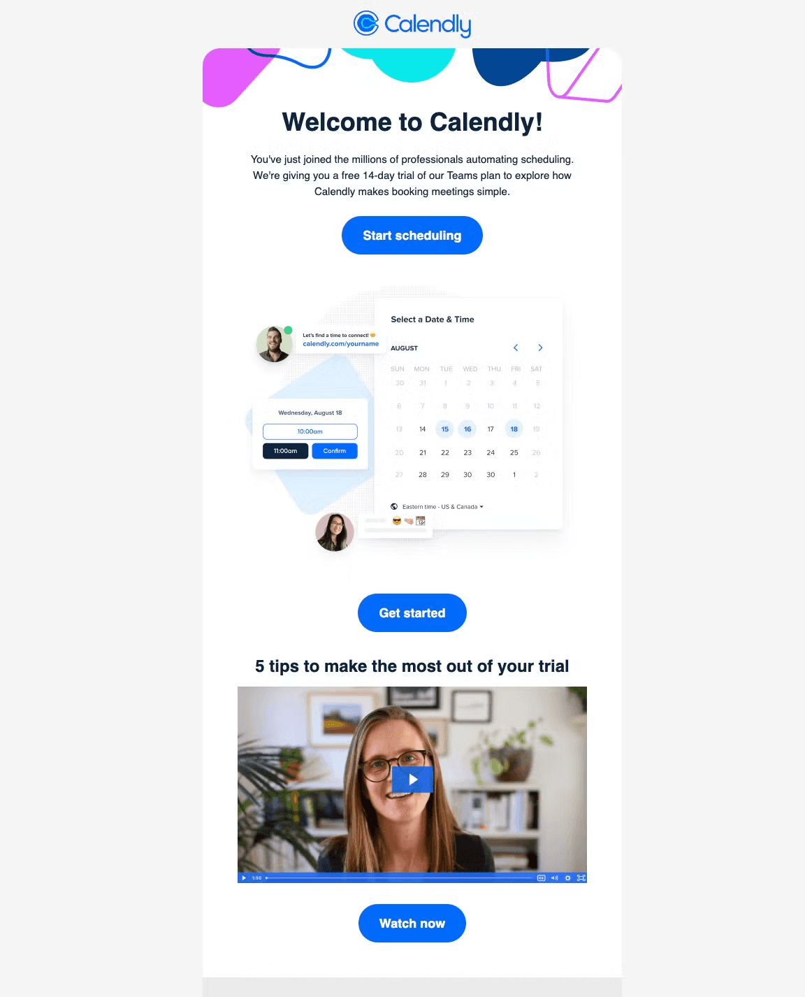
3. Calendly is an online scheduling tool that helps professionals easily organize meetings without the back-and-forth of emails. It simplifies the process of booking appointments by allowing users to share their availability and let others select a convenient time.
Product Visuals: The inclusion of a screenshot showing how to schedule a meeting gives users a hands-on understanding of the platform's functionality, making the process feel intuitive and easy
Educational Support: The "5 tips to make the most out of your trial" video provides users with practical guidance, ensuring they are fully equipped to utilize the platform effectively during the trial period
Seamless Design: The email's clean and minimalist design, with clear sections and bold buttons, makes it easy for users to navigate and absorb the information without feeling overwhelmed
Immediate Engagement CTA: The "Start scheduling" button is placed at the top and is highly visible, encouraging users to begin using the tool right away without any distractions
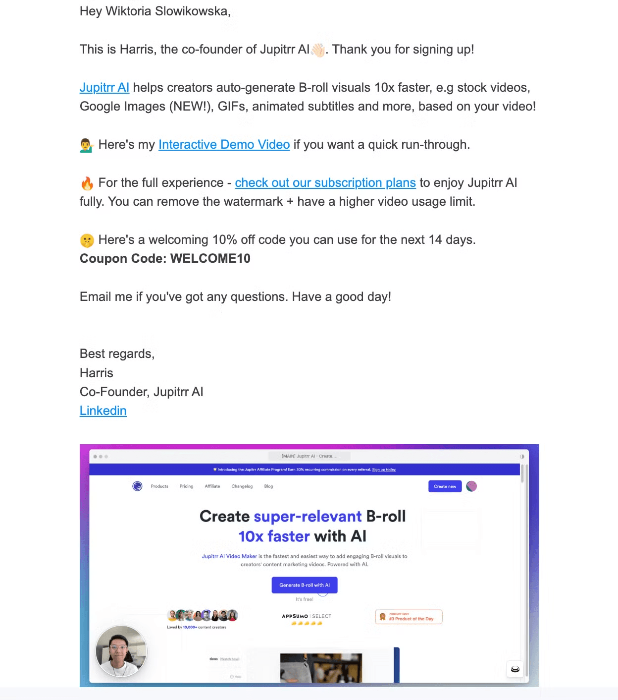
4. Jupitrr AI is a tool that helps creators generate B-roll visuals 10x faster using AI, with features like stock videos, Google Images, GIFs, animated subtitles, and more, all based on a user's video.
Key elements in this welcome email:
Personalized Introduction: The email is sent by the co-founder, Harris, creating a personal and trustworthy tone. Addressing the recipient by name adds a customized feel
Discount Code: To encourage conversion, the email includes a 10% discount code, valid for 14 days. This creates a sense of urgency and incentivizes users to act quickly
Casual and Open Communication: The line, “Email me if you've got any questions,” establishes an open line of communication, making the co-founder seem approachable and supportive
Interactive Demo Video: A link to an interactive demo video is included, offering recipients a quick and engaging way to understand how the product works, which can increase user engagement early on
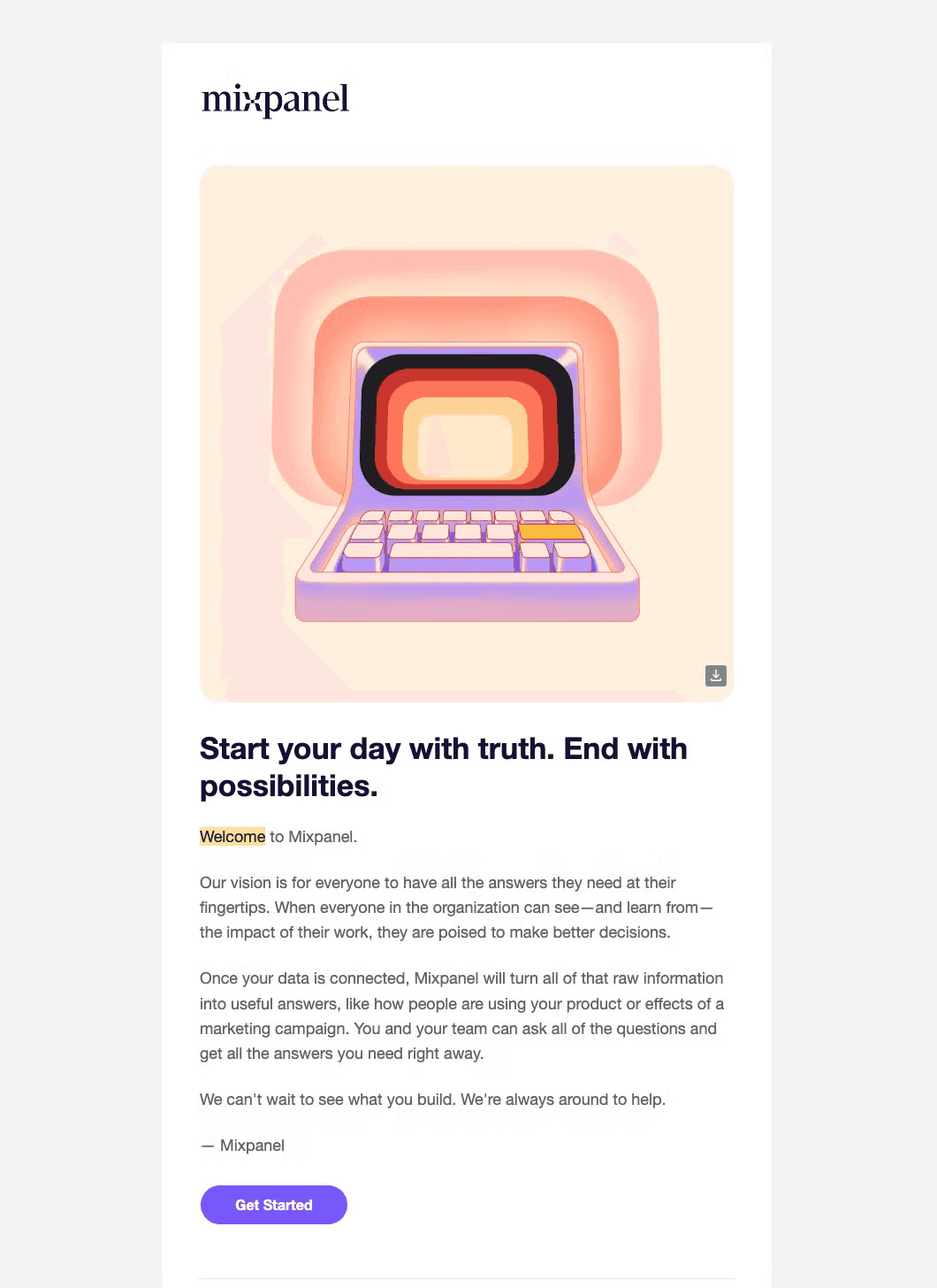
5. Mixpanel is an analytics tool that helps businesses track user interactions with their digital products and make data-driven decisions. It turns raw data into actionable insights, allowing teams to better understand user behavior and improve their offerings.
What’s good about their welcome email?
Explaining the Product: The email outlines how once users connect their data, Mixpanel will transform raw data into useful answers, such as understanding how people use the product or measuring the success of marketing campaigns. This helps users see immediate value in using the tool
Inspiring Headline: The email opens with the bold statement, "Start your day with truth. End with possibilities," which sets a positive and motivational tone, encouraging users to see Mixpanel as a tool that will help them achieve clarity and growth
Explaining the Product: The email outlines how once users connect their data, Mixpanel will transform raw data into useful answers, such as understanding how people use the product or measuring the success of marketing campaigns. This helps users see immediate value in using the tool
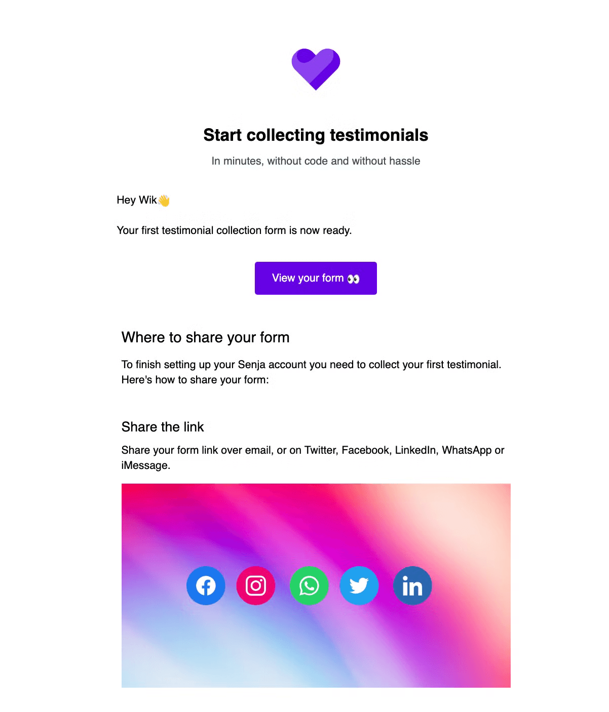
6. Senja is a tool that helps users collect testimonials quickly and easily, without coding and with minimal hassle. It allows users to create testimonial collection forms and share them across various platforms.
Let’s have a look at their welcome email and see what’s good:
Immediate Action Item: The email informs the user that the first testimonial collection form is ready, providing a clear "View your form" button to encourage immediate engagement
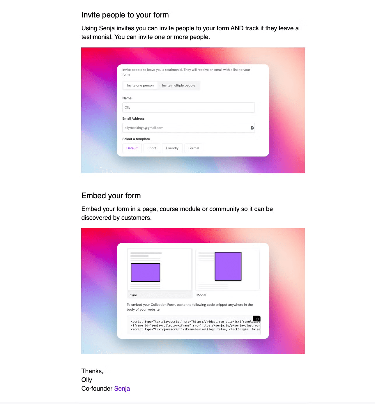
Feature Highlight: The email showcases the "Invite people to your form" feature, which allows users to directly invite individuals to leave testimonials and track their responses
User Onboarding: The email guides the user through the next steps to finish setting up their account, explaining that collecting their first testimonial is part of the process
This welcome email effectively introduces the user to Senja's key features, provides clear next steps, and encourages immediate action to start using the product
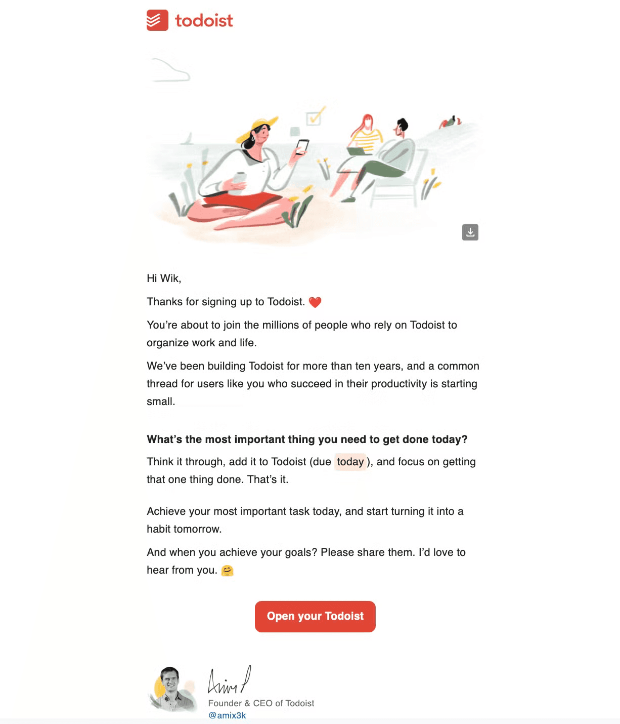
7. Todoist is a productivity and task management tool designed to help users organize their work and personal life. It allows users to create, manage, and prioritize tasks across various projects and categories.
Let's break down their welcome email and explore its winning features:
Social Proof: The email mentions "millions of people who rely on Todoist," establishing credibility and creating a sense of community
Company History: By mentioning "We've been building Todoist for more than ten years," the email emphasizes the company's experience and longevity in the productivity space
Immediate Action Prompt: The email encourages the user to add their most important task for the day, providing a clear, actionable first step to start using the app
Founder's Signature: The email is signed by Amir, the Founder & CEO of Todoist, adding a personal touch and showing leadership engagement with new users
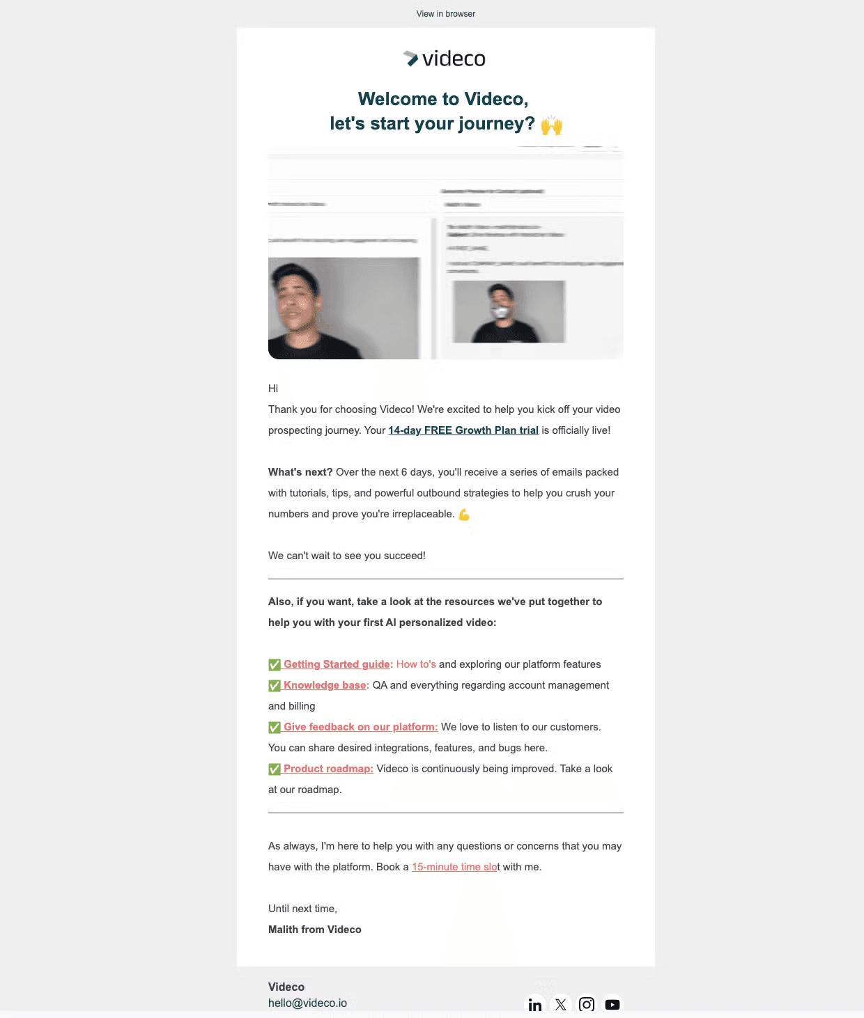
8. Videco is a platform that offers AI-powered video prospecting tools, helping users create personalized videos for outbound marketing strategies.
Time to dissect their welcome email and spotlight its most impressive elements:
Onboarding Roadmap: It outlines what the user can expect over the next 6 days, promising a series of emails with tutorials, tips, and strategies. This sets clear expectations and encourages continued engagement
Personal Touch: The email is signed by Malith from Videco, and offers a 15-minute time slot for questions or concerns, adding a personal and supportive element to the onboarding process
Trial Activation: The email immediately confirms that the user's "14-day FREE Growth Plan trial is officially live!", creating a sense of excitement and urgency
9. DocuSign is a platform that provides electronic signature and digital transaction management services, allowing users to sign and manage documents electronically.
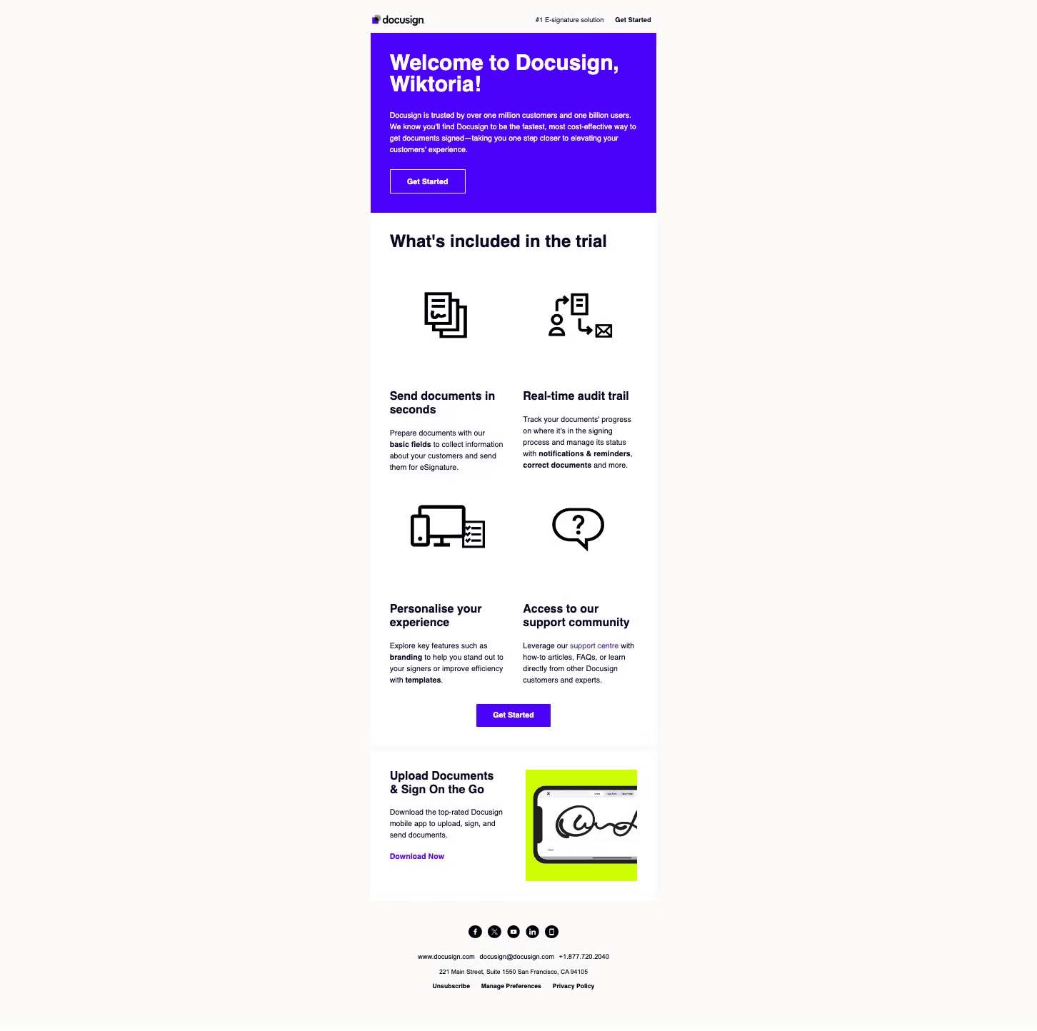
Let's unpack their welcome email and see what strategies they've employed effectively:
Social Proof: It mentions "trusted by over one million customers and one billion users", establishing credibility and widespread adoption
Clear Value Proposition: The email succinctly states the benefit of using DocuSign: "the fastest, most cost-effective way to get documents signed"
Multiple CTAs: "Get Started" buttons are prominently placed at the top and middle of the email, encouraging immediate action
Emphasis on Time Efficiency: DocuSign highlights "Send documents in seconds," showing they aim to save users time
10. Hiver is a software tool that helps businesses manage their email communication and collaborate with their teams. It works by integrating with a company's email platform, such as Google Workspace or Microsoft Office 365, and providing a range of features and tools to help users manage their email more efficiently.
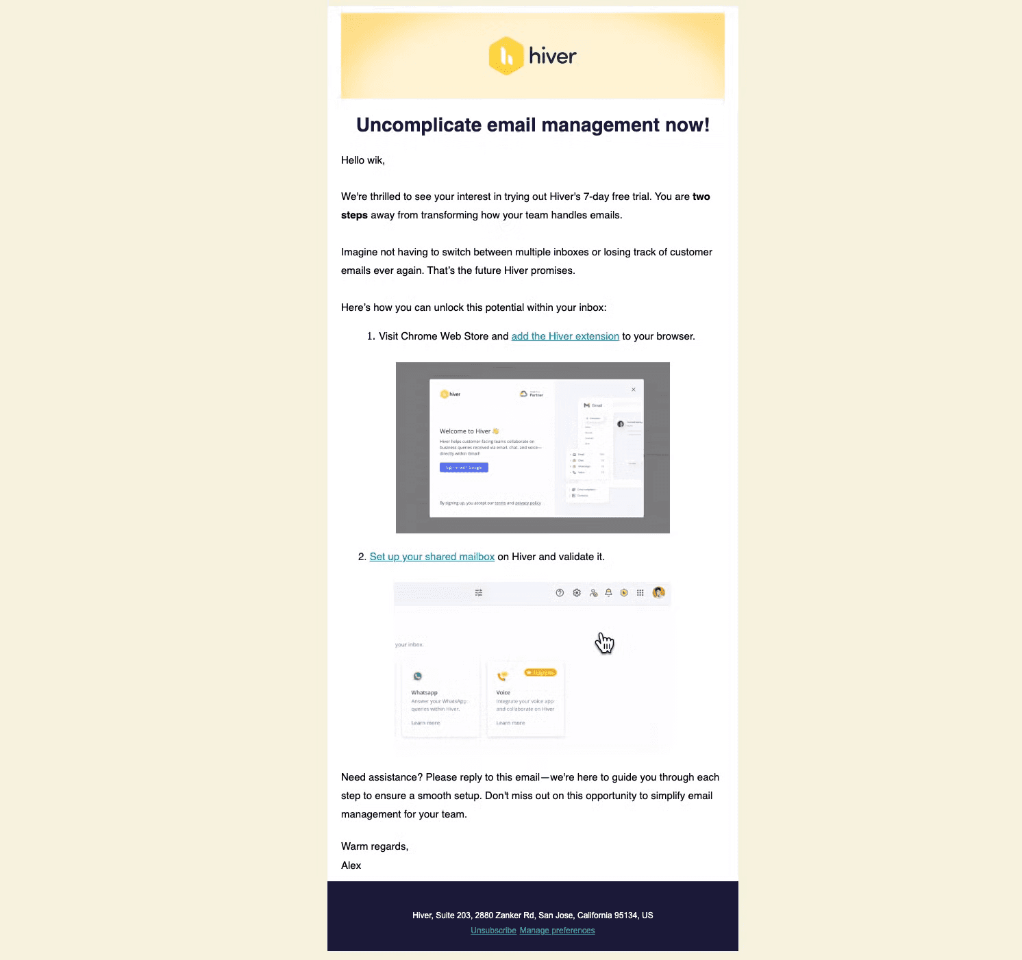
Key elements in their welcome email:
Compelling Header: The email starts with "Uncomplicate email management now!", immediately addressing the user's pain point and the solution Hiver offers
Trial Information: It mentions the "7-day free trial," clearly stating the offer and creating a sense of urgency
Clear Setup Instructions: The email provides a simple two-step process to get started, making it easy for users to begin using the product
Visual Aids: Screenshots of the Hiver interface are included, giving users a preview of what to expect and how to navigate the tool
This welcome email effectively introduces new users to Hiver by highlighting its key benefits, providing clear setup instructions, and offering support, all while maintaining a friendly and helpful tone.
To wrap it up:
Effective SaaS onboarding emails are crucial for user engagement, retention, and overall success of your product. By studying these 10 examples from industry leaders, we can identify several key strategies:
Personalization: Addressing users by name and tailoring content to their needs
Clear value proposition: Quickly communicating the core benefits of the product
Actionable next steps: Providing clear instructions on how to get started
Visual aids: Using screenshots or videos to familiarize users with the interface
Social proof: Mentioning user numbers or testimonials to build credibility
Trial information: Clearly stating the duration and terms of free trials
Support offerings: Providing easy access to help resources or personal assistance
Founder involvement: Adding a personal touch with messages from leadership


